Orange paint is having a moment, and let’s be honest, it’s about time. This color gets a bad rap for being loud, but the truth is, it’s one of the most versatile hues in the decor toolbox.
From a whisper of peach to a shout of rust, there’s an orange for every room and every mood. Here are 25 ways to use it without ending up with a space that looks like a pumpkin patch.
Terracotta Orange Walls for a Modern Organic Dining Room
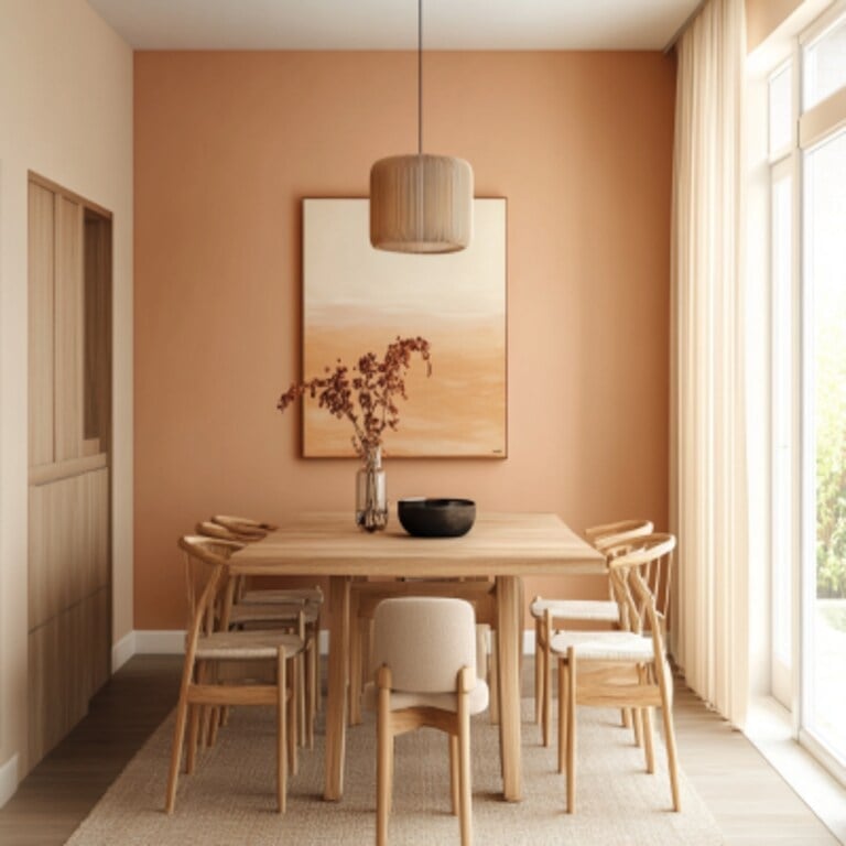
Terracotta orange walls turn a dining room into a space that feels both grounded and lively. The shade sits between clay and sunset, and against it, a large wooden table and matching chairs look like they belong in a sun-baked courtyard. Linen and ceramic accents keep the texture soft, while a pendant light and big window prevent the color from closing the room in. The palette relies on cream and beige to give the orange room to breathe. The trick with a hue this assertive is to let it lead, then step back.
Bright Orange Ombre Walls in a Modern Bedroom
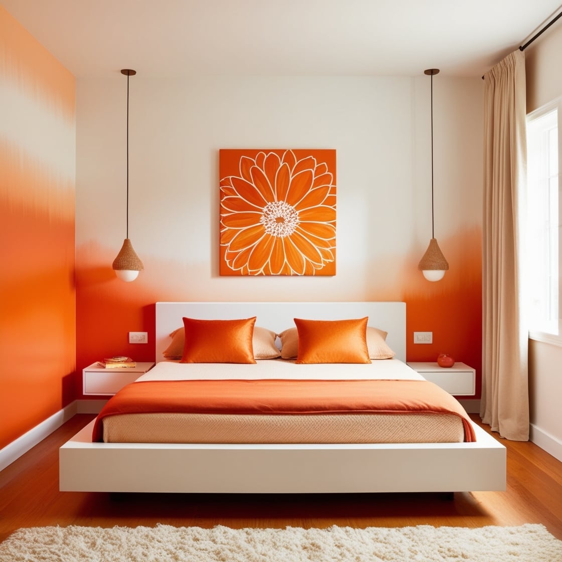
The ombre wall is a smart way to wear bright orange without committing to a full saturation. Here it fades from a punchy citrus at the base to a soft white near the ceiling, which keeps the room feeling airy rather than enclosed. A platform bed and matching pendant lights follow the minimalist script, letting the gradient do all the talking. The palette is essentially two colors, orange and white, which is exactly why it works. When a single hue shifts in intensity like this, the room reads as intentional without needing a dozen decorative objects to prove it. The gradient itself becomes the decor.
Vibrant Orange Partition Wall in a Modern Bathroom
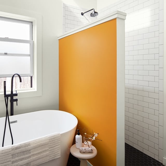
How do you add a bold color to a bathroom without overwhelming the space? A partition wall painted in vibrant orange is one answer. The wall divides the room, separating the freestanding bathtub from the shower area, and the color gives it a purpose beyond just structure. White tile and black metal fixtures keep the look clean, while the orange reads as a deliberate design choice rather than a random splash.
The layout benefits from the partition because the color defines zones without needing a full room overhaul. Natural light and ambient fixtures bounce off the painted surface, so the orange never feels flat. For a rental situation, a freestanding screen in a similar shade could deliver the same visual separation without touching the walls.
Burnt Orange Accent Wall in a Modern Living Area
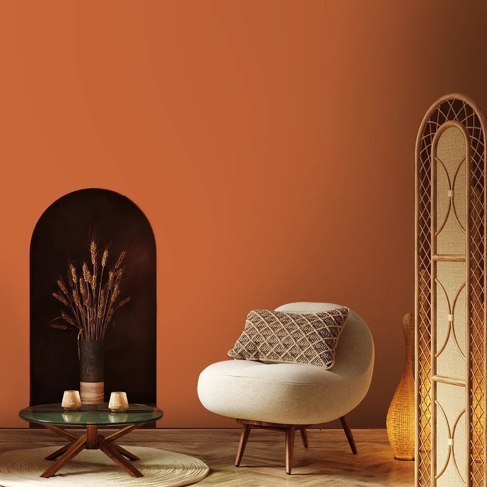
A single burnt orange wall can anchor a whole living area if the surrounding pieces know their role. The wall here is finished in what looks like plaster, giving it a subtle texture that catches daylight differently than flat paint would. A curved armchair and an arched niche echo the soft lines, while the screen divider and rattan accents add natural contrast. The cream palette and natural wood tones keep the orange from feeling aggressive. When the accent wall has texture, it becomes a material choice, not just a color decision, which makes the whole room feel more considered.
Vibrant Orange Sofa as the Centerpiece in an Eclectic Living Room
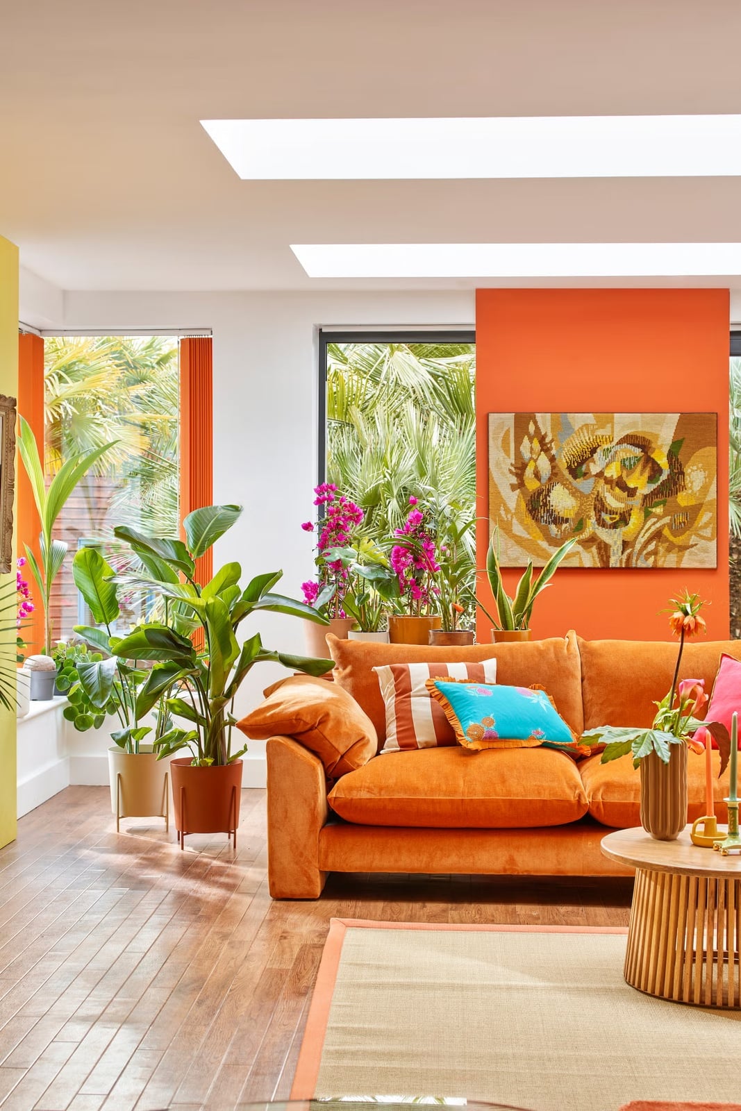
A bold sofa works best when it faces the light. Here the vibrant orange sofa faces windows and skylights, so the color catches natural brightness throughout the day and never looks muddy. The eclectic room surrounds it with large potted plants, a wooden coffee table, and colorful artwork, and the orange ties all those elements together without competing. Green leaves and yellow accents are natural partners for this shade, and they keep the palette from narrowing into a single note. The sofa is the anchor, but the plants and art give the eye places to travel after landing on it.
Burnt Orange Sofa in a Modern Grey Living Room
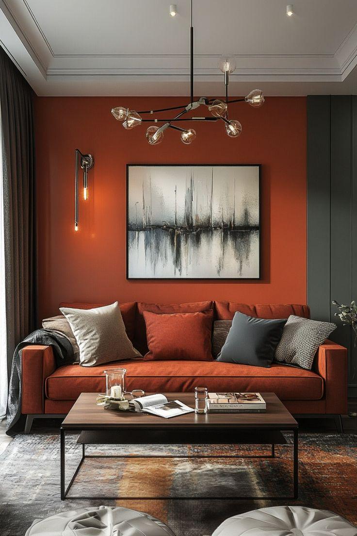
A burnt orange sofa against grey walls is a close cousin to the terracotta wall idea, but it costs less to swap out later. The sofa here anchors a modern living room with charcoal and grey tones, facing a wall with abstract art. A glass-and-metal coffee table keeps the layout airy, while a chandelier adds a polished note. The burnt orange fabric is the room’s main color, not an accent. The palette ratio is 70 percent neutral grey and 30 percent burnt orange through the sofa and a few smaller pieces. This prevents the room from looking like a Halloween display and lets the orange hold its weight as the defining element.
Deep Rust Velvet Sofa in a Modern Space
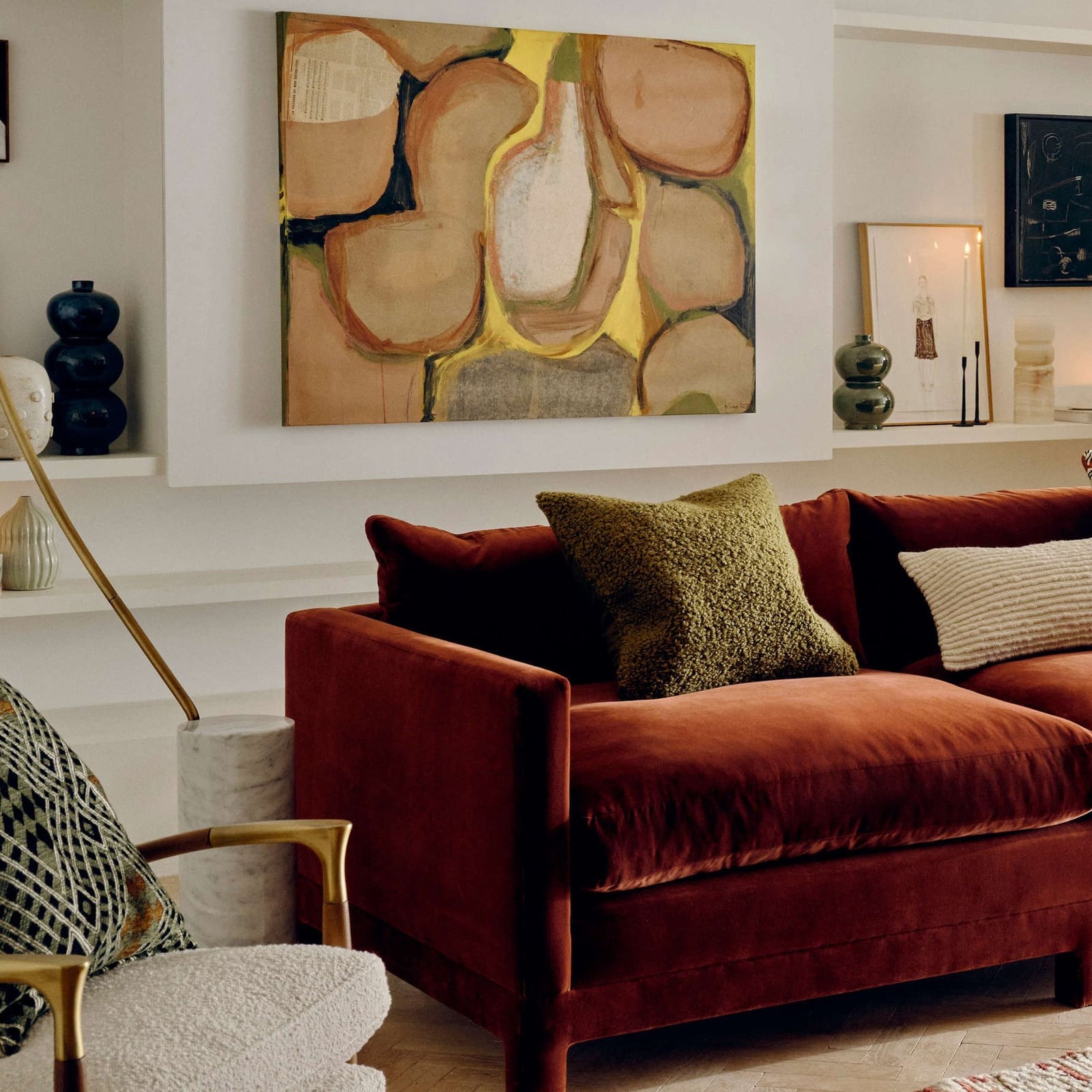
The deep rust velvet sofa has a subtle sheen that keeps the modern living room from feeling flat. An olive green armchair and beige fabric pieces balance the warm rust tone, while a marble coffee table adds a cool, smooth surface. An accent lamp on a side table provides a secondary light source for evenings. The effect relies on contrast: pair a plush velvet with hard surfaces like marble and wood to give the eye a mix of textures.
Ochre Accent Wall in a Bohemian Bedroom
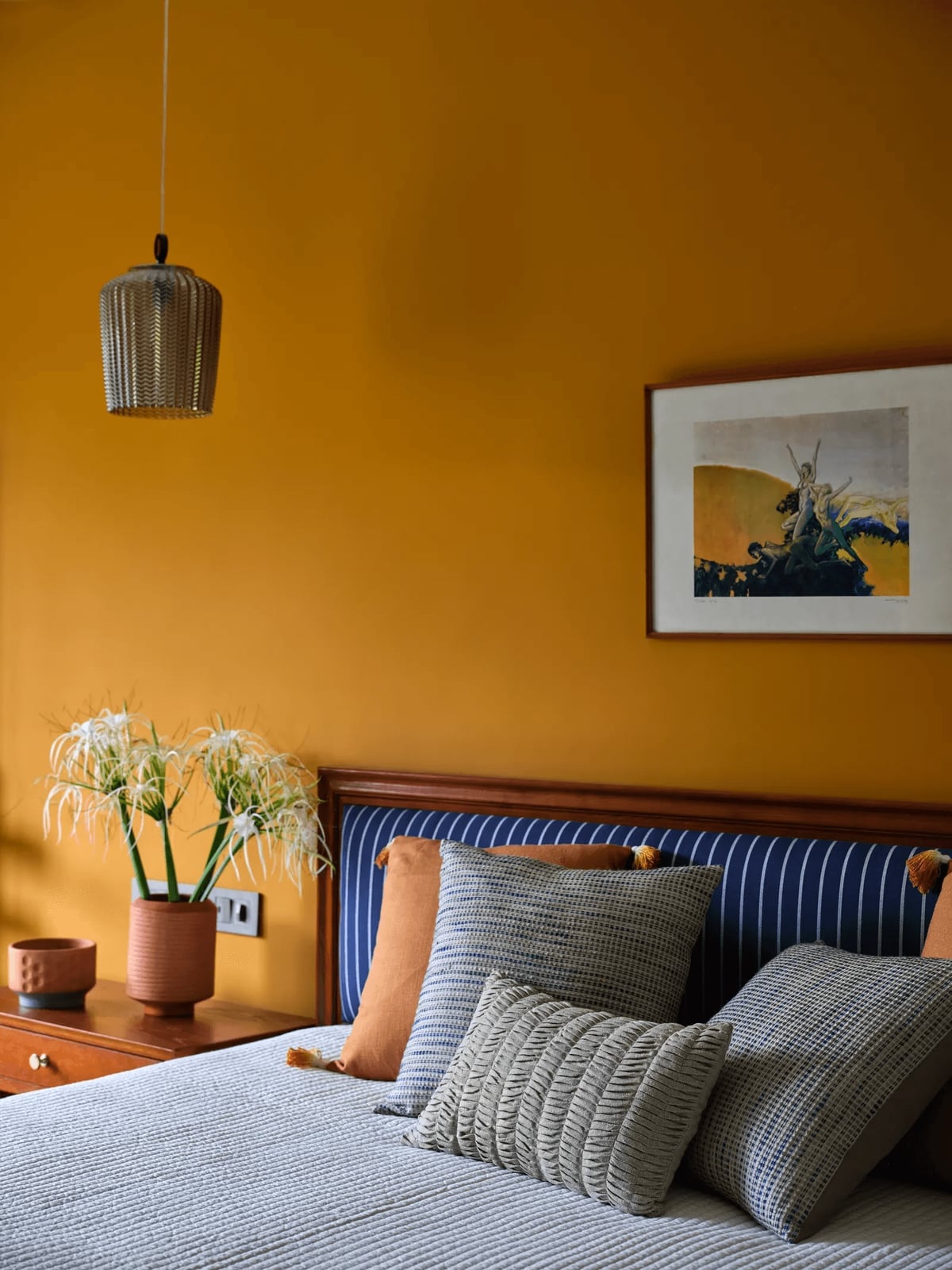
An ochre accent wall in a bohemian bedroom delivers warmth without the full commitment of painting all four walls. The vibrant ochre sits behind a wooden bed frame with a headboard, and artwork hangs above it. Blue and white textiles on the bed and a ceramic vase on a side table break up the ochre, keeping the room layered rather than one-note. A pendant light with a woven shade adds ambient light and softens the wall’s intensity. The style principle here is the break: a bohemian palette thrives on a ratio of about 60 percent neutral wood tones and white to 40 percent ochre and blue.
Textured Orange Paint in Abstract Art
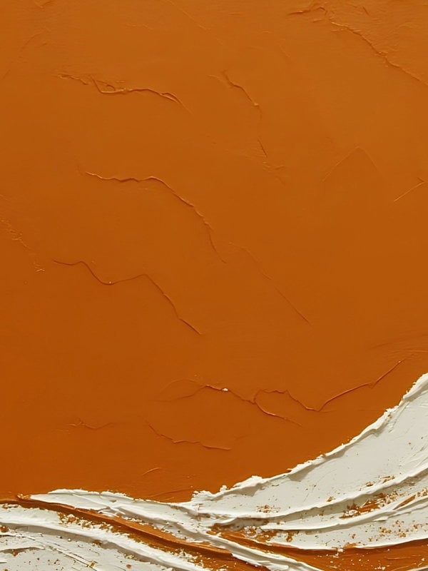
Can a textured orange painting hold its own as a wall feature? Yes, when the texture itself becomes the focal point. This close-up of an abstract piece shows thick orange paint and plaster built up on the surface, with white areas providing breathing room. The heavy application of paint creates shadows and highlights that change with the direction of studio lighting. The materials for abstract art are surface depth: a smooth painted canvas reads differently than one with visible peaks and valleys. For a rental, lean the textured canvas on a console table or mantel instead of drilling into the wall, and swap it out when your color preferences shift.
Vibrant Orange Throw on a Wooden Bed
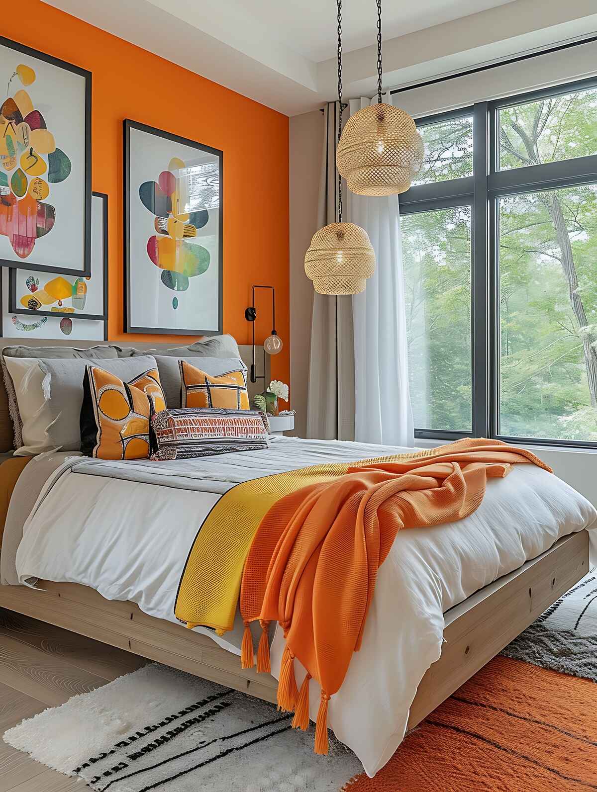
A vibrant orange throw draped across a wooden bed frame adds a concentrated pop of color without the permanence of painted walls. The wooden bed has a warm natural tone, and the throw introduces orange and yellow hues against a grey backdrop. Two woven pendant lights hang above the bed on each side, matching the natural texture of the wood. A window to the side lets in natural light that brightens the orange. The styling variation here is scale: a single throw on a bed is a small gesture, but on a neutral grey and wood palette it becomes the focal point of the room.
Burnt Orange Accents in a Creamy Living Room
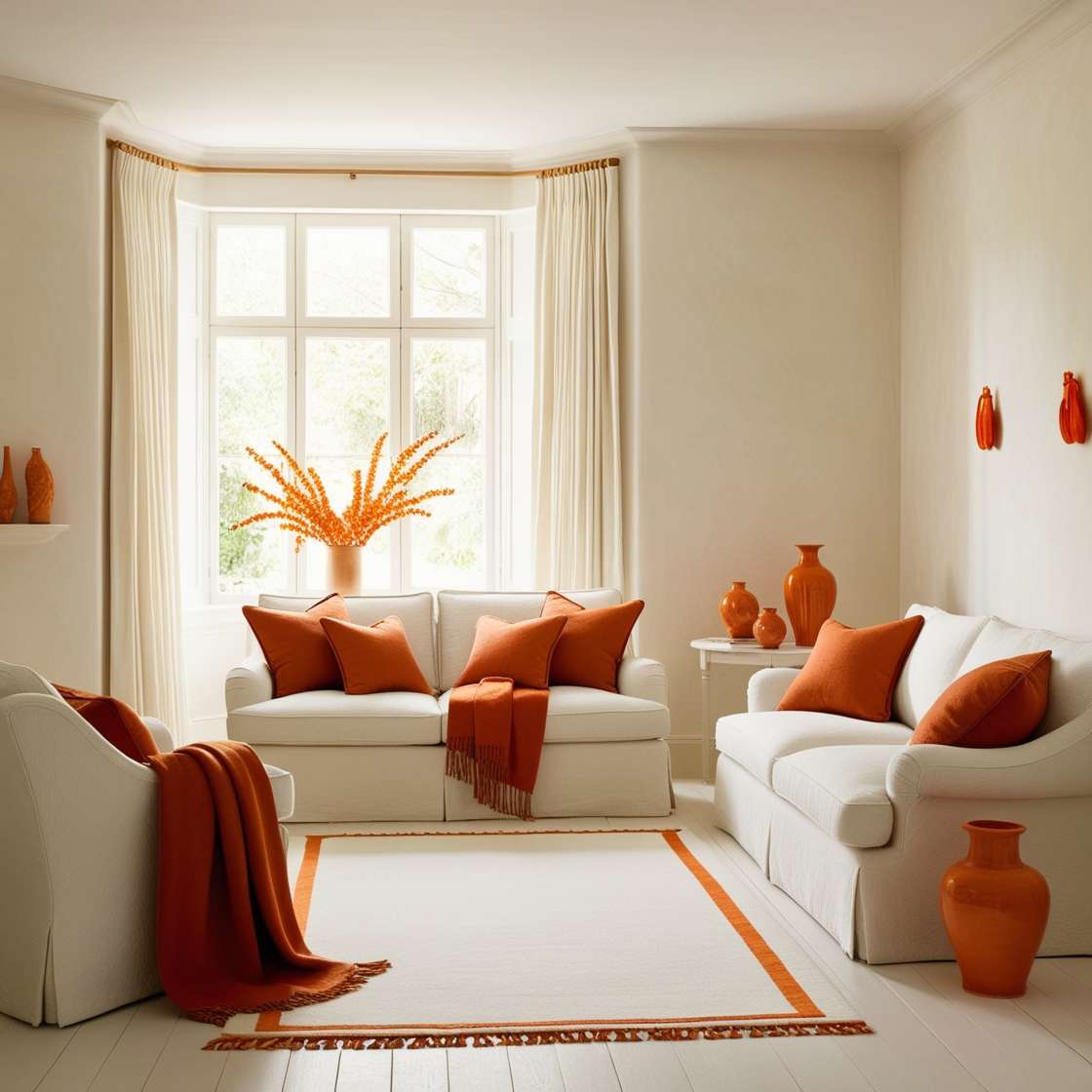
A room built on neutrals needs a single warm note to keep it from reading as unfinished. In this modern traditional living room, the creamy palette of the sofas, armchair, and rug provides a calm base, while burnt orange accent pillows and throws add the necessary contrast. The symmetrical seating arrangement around a ceramic vase keeps the eye moving, and natural light softens the transition between the white walls and the orange textiles. One useful decor principle here is that accent colors work best when they make up no more than a quarter of the visible palette. Any more than that, and the room loses its airy balance.
Orange and Yellow Accents in a Modern Bedroom
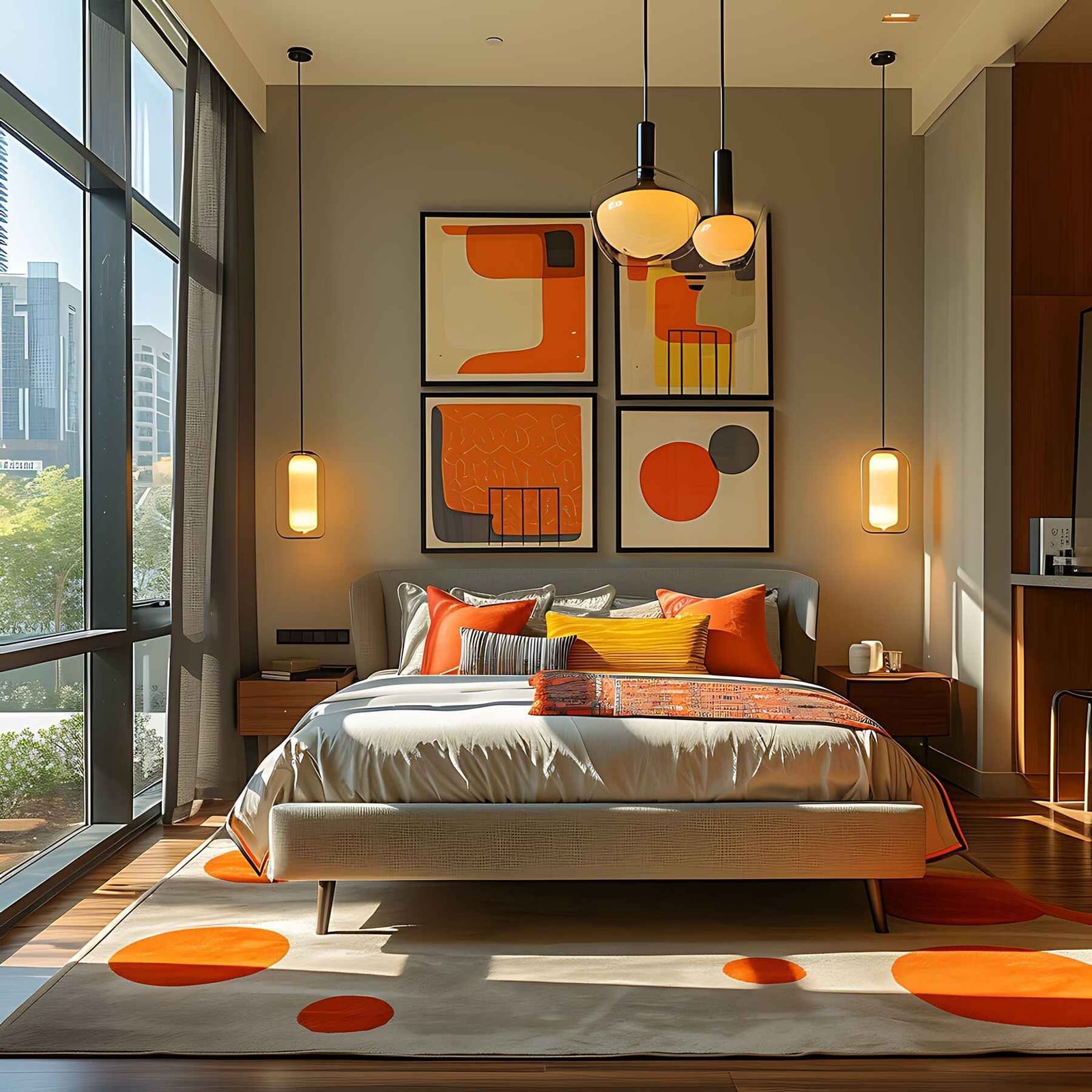
Orange and yellow are close cousins on the color wheel, which means they can blend into a single warm blur if you are not careful. The trick in this modern bedroom is to separate them with a neutral buffer. The bedding carries the orange accent, while a large abstract art piece introduces yellow as a distinct second note. Grey walls and natural wood furniture sit between them, giving each color its own visual territory.
A pair of pendant lights and a glass tabletop add lightness to the room. The palette ratio here is roughly one part orange to one part yellow to three parts neutral. That proportion lets both warm colors register as deliberate choices. For a renter-safe version, swap the painted wall for a large fabric wall hanging in orange or yellow.
Burnt Orange Wall as a Backdrop for Yellow Flowers
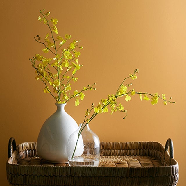
The burnt orange wall does not compete with the yellow flowers because the two colors sit on opposite sides of the warm spectrum. The orange reads as earthy and muted, while the yellow pops forward as the brighter, lighter element. A ceramic vase and a glass vase on a wicker tray add texture without pulling attention from that color contrast. Natural light hitting the wall and the flowers keeps the vignette from feeling flat. The takeaway is that a warm backdrop works best when the foreground object is either significantly lighter or significantly darker than the wall behind it.
Vibrant Orange Accent Table in a Modern Bedroom
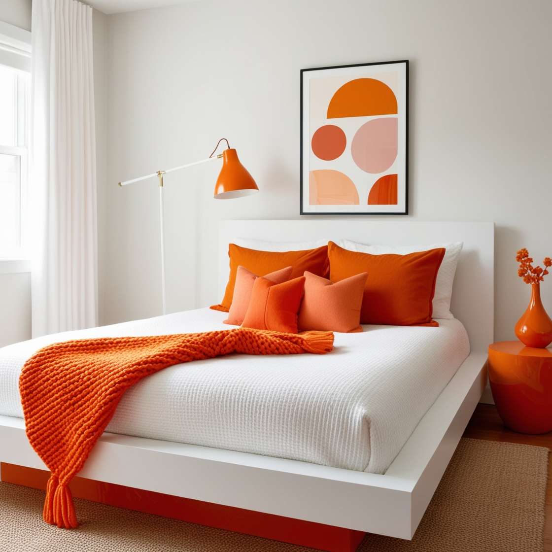
A single piece of painted furniture can anchor a minimalist bedroom without needing anything else to compete with it. The vibrant orange accent table stands against a white wall, with a task lamp and a platform bed as the only other elements in view. Natural light from a nearby window keeps the orange from feeling too intense, and the white wall gives it room to breathe. The lighting principle here is that a saturated color reads differently depending on the light source. In natural light, it looks bright and fresh. Under a warm task lamp at night, it shifts toward a deeper, cozier tone.
Vibrant Orange Sectional Sofa in a Boho Living Room
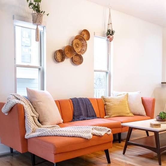
A large piece of furniture in a bold color can define a room’s personality in one move. The vibrant orange sectional sofa is the clear centerpiece here, and everything else in the boho living room is chosen to support it without competing. A rattan coffee table, woven wall baskets, and cream and navy accents keep the space grounded. The natural window light makes the orange fabric look lively, while the ambient ceiling light softens it in the evening.
For storage in a room where the sofa takes up significant floor space, look to vertical solutions. The woven baskets on the wall serve as both decor and a place to tuck small items like remotes or mail. An ottoman with hidden storage could also work here, keeping the boho look intact while adding function.
Terracotta Walls and Orange Armchair in a Boho Bedroom
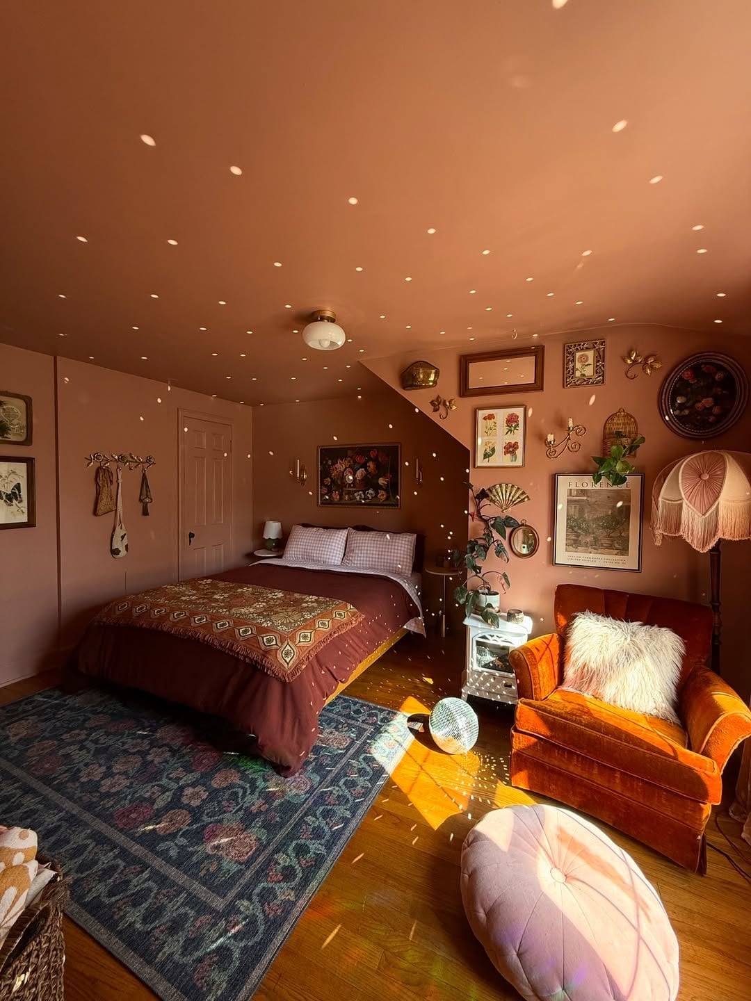
A velvet orange armchair against terracotta walls sets a boho bedroom apart without needing a full room overhaul. The palette mixes terracotta, pink, navy, and gold touches, with a disco ball throwing natural light reflections across the space. The armchair becomes the hero piece, grounding a layout that includes a bed, rug, and gallery wall. For a similar effect, swap a neutral armchair for one in a warm orange tone; it keeps the existing furniture intact while adding a focused pop of color. This approach works well for renters who want a boho feel without painting the entire room.
Rusty Orange Paint in a Craft Space
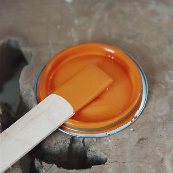
Choose a paint color for a craft space that inspires creativity without fading into the background. A can of rusty orange paint sits as the focal point, with a wooden stirrer nearby and bright, direct light hitting the metal container. The rustic style comes from raw materials: metal, wood, and the paint itself. Renters can replicate this look by using orange paint on smaller surfaces like a shelf or desk, avoiding permanent wall changes. The compact vignette keeps attention on the color, making the space feel deliberate without a large commitment.
Terracotta Painted Wall with Slatted Wood Accent
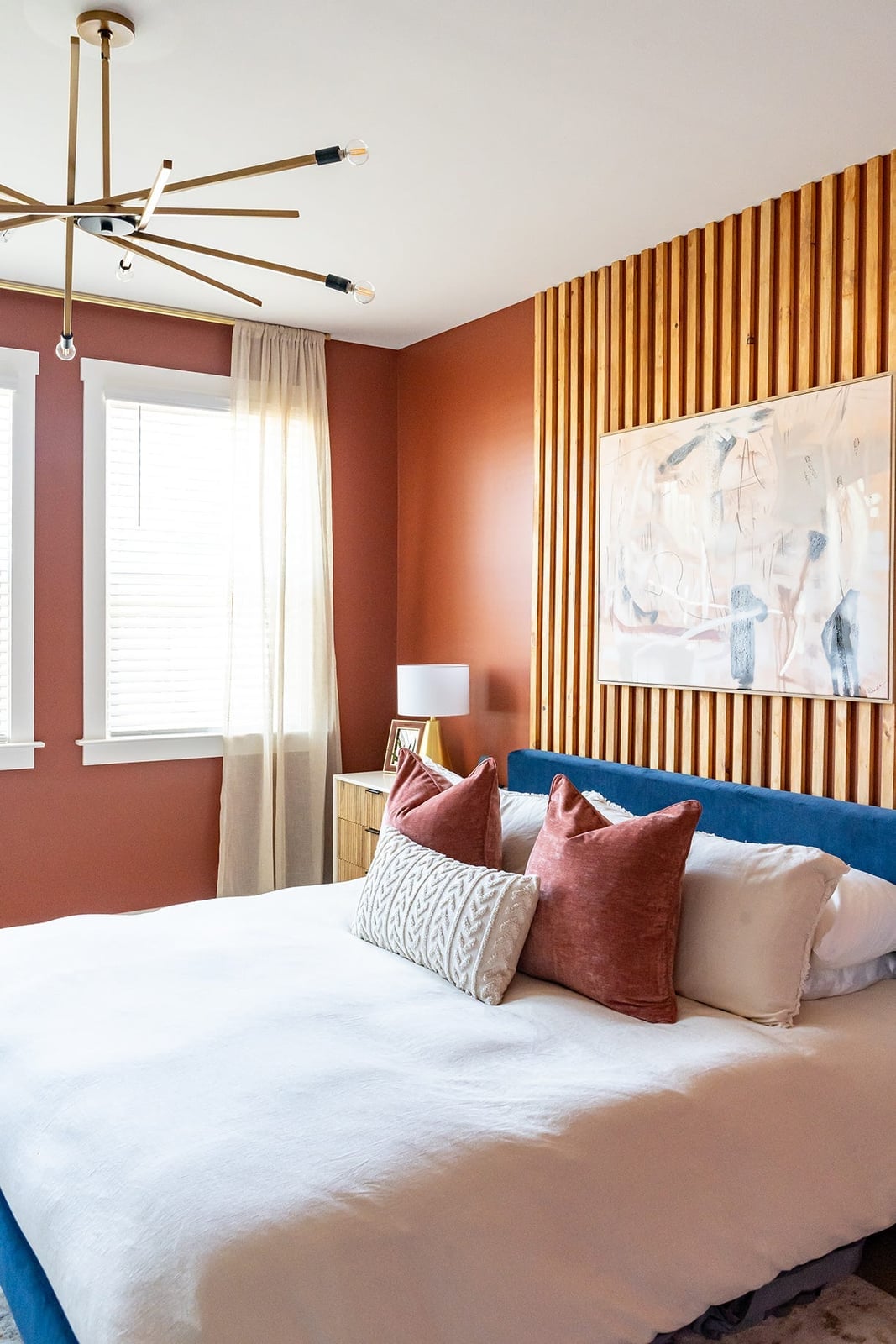
A terracotta painted wall with a slatted wood accent offers a warmer alternative to a plain white bedroom. The slatted wood panel becomes the hero element behind a centered bed, with natural light and a modern chandelier highlighting the texture. The palette combines terracotta, wood tones, white, and blue, keeping the room feeling roomy.
The slatted wood adds depth without overwhelming the space, and the terracotta paint ties the warm wood to the cooler blue accents in the artwork. Matching the wood slats to the paint tone creates a cohesive look.
Pale Orange Walls in a Modern Organic Hallway
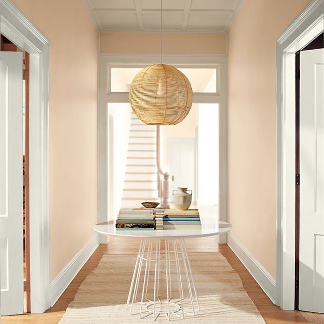
Pale orange walls in a modern organic hallway create a soft transition between rooms without feeling stark. The palette pairs pale orange with cream and natural wood, with a round table, woven pendant light, and books adding texture. Natural light from the doorway and an overhead pendant keep the space bright, while the symmetrical doorways frame the view. This shade works because it is muted enough to feel neutral but warm enough to avoid the flatness of plain white. For a hallway that connects multiple rooms, pale orange helps the flow feel continuous rather than abrupt.
Coral Painted Walls in an Eclectic Bohemian Bedroom
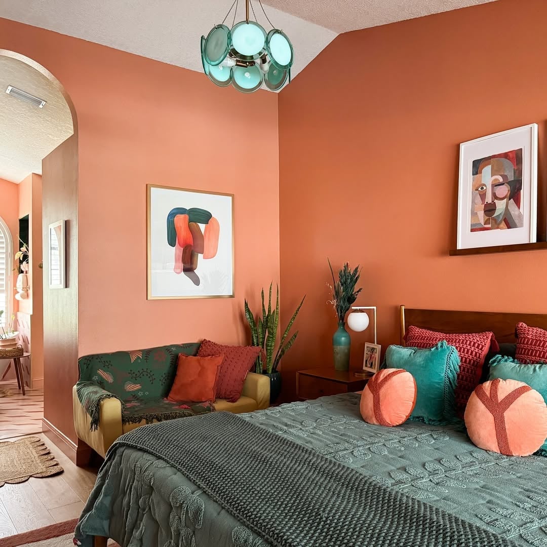
Coral painted walls in an eclectic bohemian bedroom make a strong statement without feeling overwhelming. The palette combines coral, teal, green, and orange, with a bed, sofa, and abstract art filling the open plan space. Overhead and natural light balance the vibrant coral, stopping it from dominating the room. The key is proportion: coral covers the walls, but the other colors appear in smaller doses through textiles and art. For a similar effect, try coral on one wall first to see how the light changes it throughout the day before committing to the whole room.
Abstract Strokes of Orange Paint on Canvas
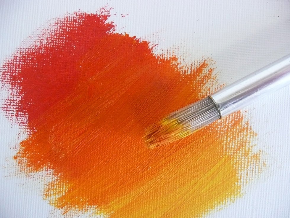
The best abstract art often breaks its own rules. Here, thick strokes of orange and red paint layer across a canvas, with a metal paintbrush resting nearby as an honest tool, not a prop. The bright, even light of the art studio makes every ridge of the textured paint visible, so the color feels active rather than flat. This is style mode at work: the look is pure abstract expressionism, defined by visible gesture and a limited palette of warm tones. What breaks it would be anything overly neat or symmetrical. The useful principle here is about materials: on a compact canvas, let the paint itself be the texture. No gesso, no gloss, just the body of the color doing the work.
Geometric Orange Wall Pattern in a Modern Living Room
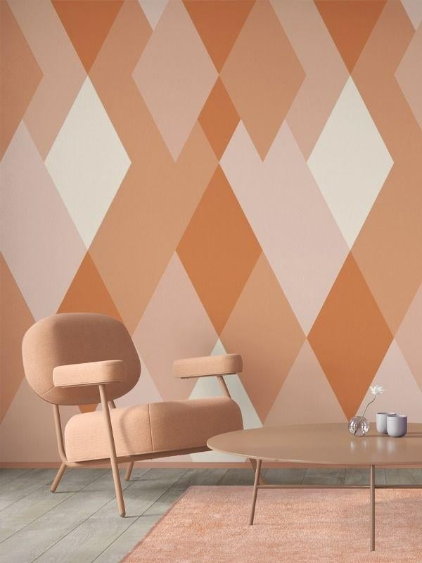
A geometric wall pattern in shades of orange and cream runs across one wall, turning a flat surface into the room’s main event. The pattern is the hero element here, and everything else in the room supports it: a curved armchair, a round coffee table, and a rug all stay neutral and low-profile. Daylight hits the pattern at an angle, which keeps the color from feeling flat. This design works because the geometry is scaled to the wall, not too large or too small for the room’s proportions. The approach is about layout: when a pattern is the focal point, arrange the furniture so it faces or frames that wall, not competes with it.
Bold Orange Accent Wall in a Contemporary Living Room
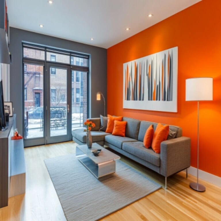
A bold orange accent wall can anchor an open-plan room without overwhelming it, provided the palette stays quiet. Here, the orange wall sits behind an L-shaped sectional sofa, with a coffee table, floor lamp, and artwork in grey, white, and black. The materials matter: glass, metal, and wood in the furniture keep the look from feeling one-note. Recessed lights and a floor lamp provide layered illumination, so the orange wall appears warm. The practical rule is about the hero element: an accent wall works best when it has a clear visual boundary, like the edge of a room or a change in ceiling height.
Two-Tone Orange and Beige Wall in a Modern Area
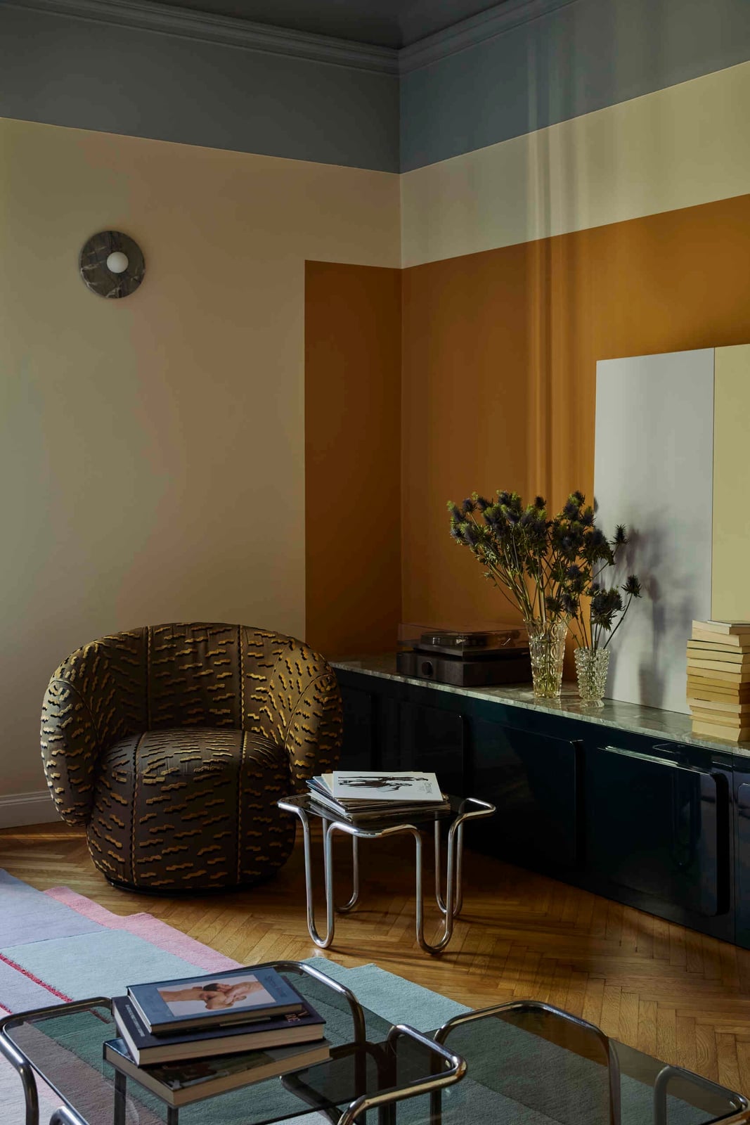
A two-tone wall might feel safer than a full orange room, but it still needs a deliberate approach to lighting. The orange and beige color blocking here creates a geometric division that structures the whole living area, with a curved armchair, side tables, and a cabinet in grey, dark green, and wood tones. The difference from a single-color wall is that the two-tone approach asks you to consider the line: where it lands, how it relates to furniture heights, how light changes it from morning to afternoon. Ambient and natural light both play a role, casting the beige section as a soft contrast to the orange. The lighting principle is that color blocking reads best when the lighter tone sits near the window, letting daylight soften the transition.
Burnt Orange Gradient Wall in a Minimalist Bedroom
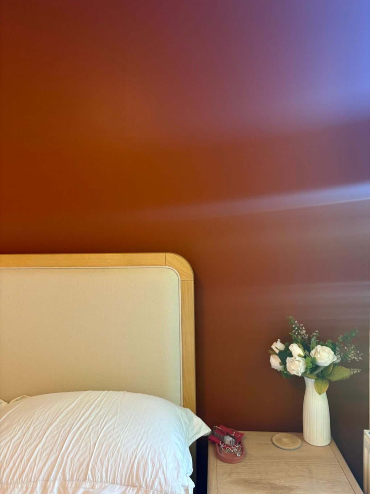
The burnt orange gradient on this bedroom wall moves from deeper at the base to lighter near the ceiling, a precise observation about how color can shape a small room. With the bed against the wall and a wood nightstand and vase as the only other pieces, the gradient becomes the entire palette story. The look is defined by this single, smooth transition, and what breaks it would be adding pattern or clutter. The principle here is about palette: a gradient wall reduces the need for decorative objects, because the wall itself provides the visual interest. In a compact bedroom, that means more floor space and fewer surfaces to dust.
Final Thoughts
Orange paint works because it adapts to the light and the company it keeps. A muted terracotta reads calm next to natural wood, while a punchy citrus shade wakes up a neutral corner. The trick is to test your sample at different times of day and against your existing fabrics. Dust walls regularly with a soft brush attachment to keep the color looking clean. If you rent, check with your landlord before painting, or use peel-and-stick wallpaper in an orange pattern instead. The best orange spaces feel grounded, not gimmicky.