Pastel paint has a way of softening a room without washing it out. If you’ve been searching for aesthetic pastel paint ideas that feel fresh rather than juvenile, these 35 looks show how to use it across bedrooms, living rooms, and even art pieces. You’ll see pastel pink, lavender, sage, and blue in spaces that range from modern to traditional, proving this palette can read as sophisticated.
The trick is pairing the right shade with the right texture and accent colors, which is what each of these photos demonstrates. Whether you’re planning a full room or a small corner, this collection gives you a clear starting point for your own project.
Modern Bedroom with Wavy Pastel Walls in Pink, Sage, and Mauve
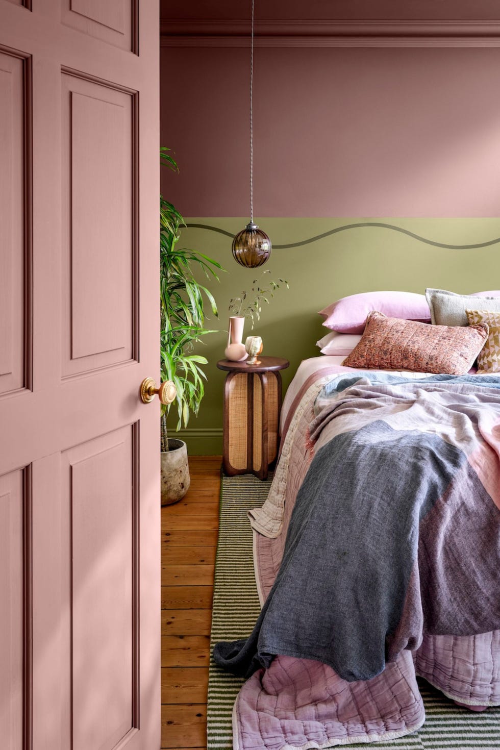
A wavy paint line cuts across the corner of a modern bedroom, separating a pastel pink wall from a sage green one with a mauve stripe. That hand-drawn curve does the work: it breaks up the pastel palette without a single piece of furniture. The palette stays in three soft tones, pink and sage and mauve, so the room reads as calm even with the bold line. A wood bed frame and rattan pendant light keep the look grounded. What defines the style here is the ratio: the wavy line takes up about a third of the wall height, leaving the rest plain. The wood and rattan pieces break any chance of the room feeling too sweet.
Coastal Bedroom Oasis with Pastel Pink and Lavender Linen
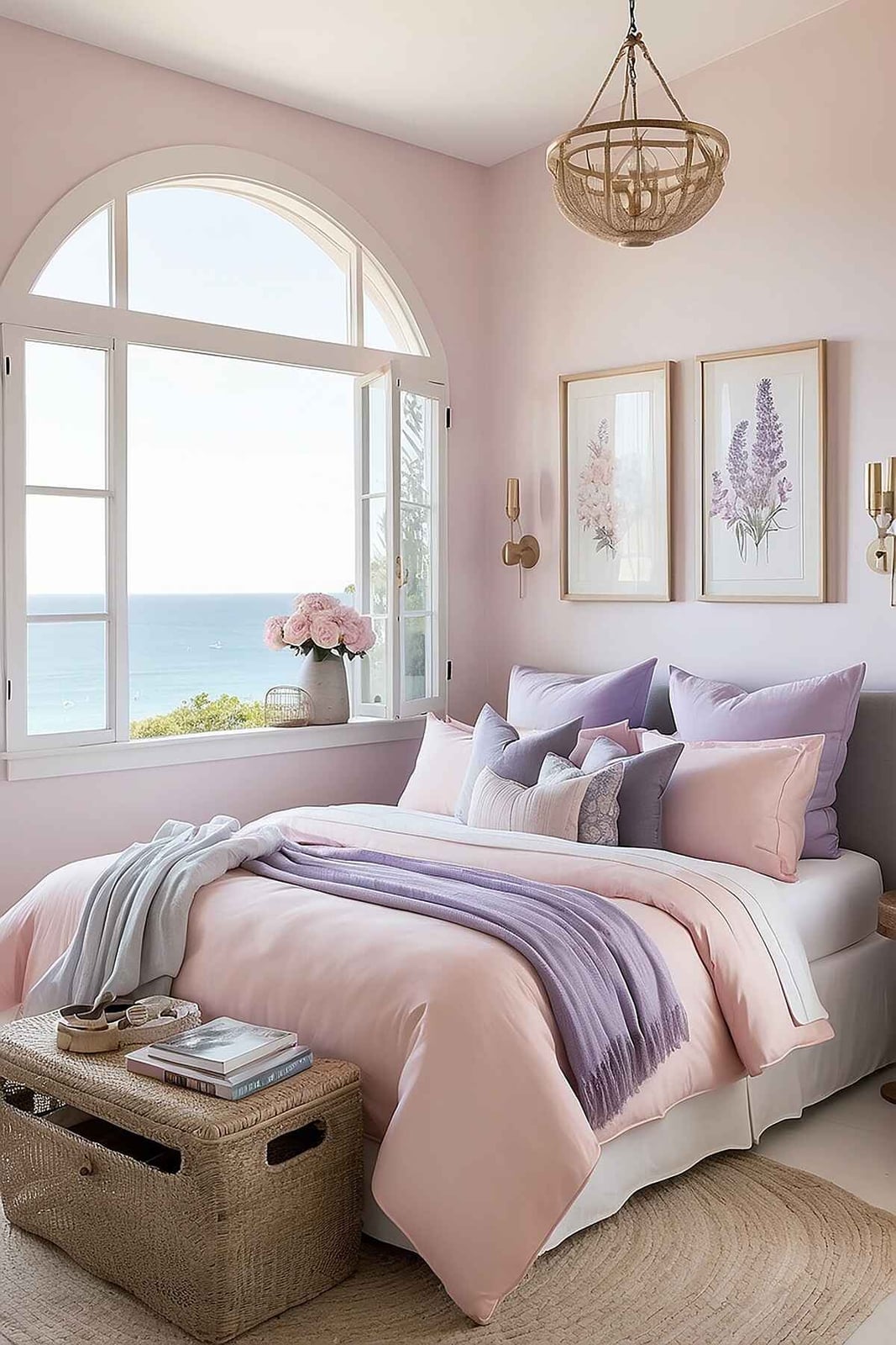
This coastal modern bedroom gets its softness from linen bedding in pastel pink and lavender layered over a cream base. The linen brings texture that keeps the pastels from reading as flat or childish. An upholstered bed in a neutral fabric anchors the bed, while a wicker trunk at the foot adds natural warmth. The arched window frames an ocean view, and wall sconces on either side of the bed provide soft reading light without cluttering the nightstands. The style is defined by the mix of crisp linen and natural wood and wicker. What breaks the coastal cliche is the lavender tone, which adds a cooler note to the pink and keeps the palette from being too sweet.
Glam Bedroom Accented with Pink Floral Wallpaper and Velvet
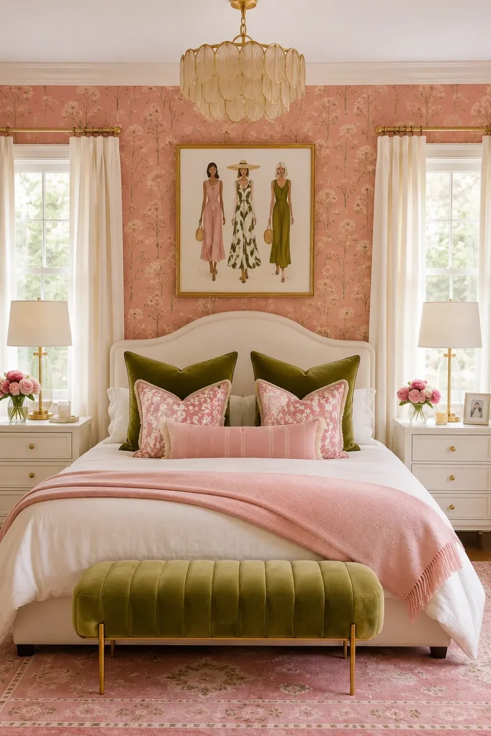
How do you keep pink floral wallpaper from looking like a grandmother’s guest room? You add velvet and gold. In this glam bedroom, a white bed with pink bedding sits centered against a wall covered in pink floral wallpaper. A green velvet bench at the foot of the bed adds a deep, rich color that balances the pink. Gold accents in the chandelier and bedside lamps bring a metallic shine that lifts the whole room.
This style contrasts the soft floral pattern with plush velvet and shiny gold. The green velvet bench breaks the pink-heavy palette, giving a visual rest point. Daylight from the windows mixes with the warm glow of the chandelier and lamps, making the wallpaper feel layered rather than overwhelming. The room feels roomy because the bed is centered with nightstands on either side, leaving the floor plan open.
Feminine Living Room with Blush Pink Armchair and Gallery Wall
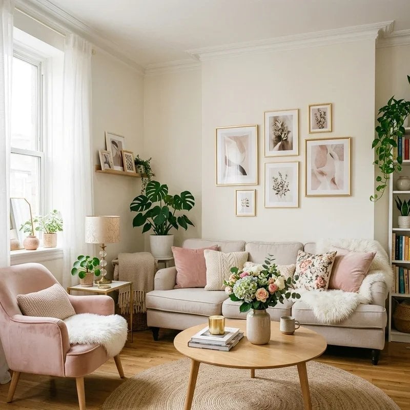
A blush pink armchair sits opposite a cream sofa, with a coffee table between them and a gallery wall behind the sofa. The blush pink armchair is the standout piece, drawing the eye and setting the room’s soft, feminine tone. A table lamp on a side table provides warm light that complements the natural light. The gallery wall mixes frames in different sizes and finishes, adding visual interest. The blush pink against the cream and green from the plants defines the style. The mix of frame styles on the gallery wall breaks any risk of the room looking too matched.
Open Plan Living Room with Pastel Pink Walls and Sectional Sofa
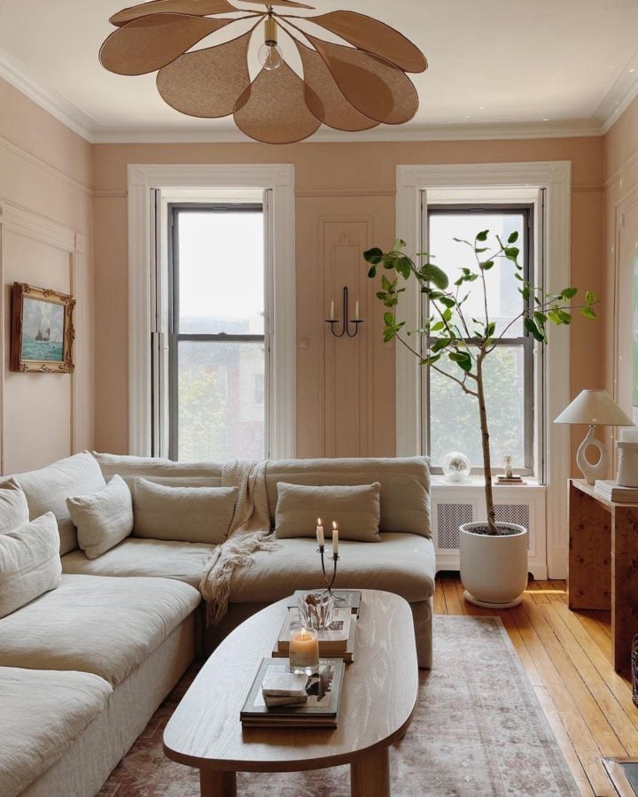
In an open plan room, color helps define zones. Pastel pink walls wrap the living area, while a large beige sectional sofa faces an oval coffee table. The pink walls create a distinct living zone without needing a wall or rug. A large potted plant in the corner adds height and a natural element. A table lamp on a side table provides warm light, balancing the natural light from the windows. The soft pink walls contrast with the beige sofa and wood tones. The large plant breaks the pastel palette, adding a bold, organic shape that prevents the room from feeling too delicate.
Bohemian Bedroom Featuring Pastel Pink Walls and Rattan Accents
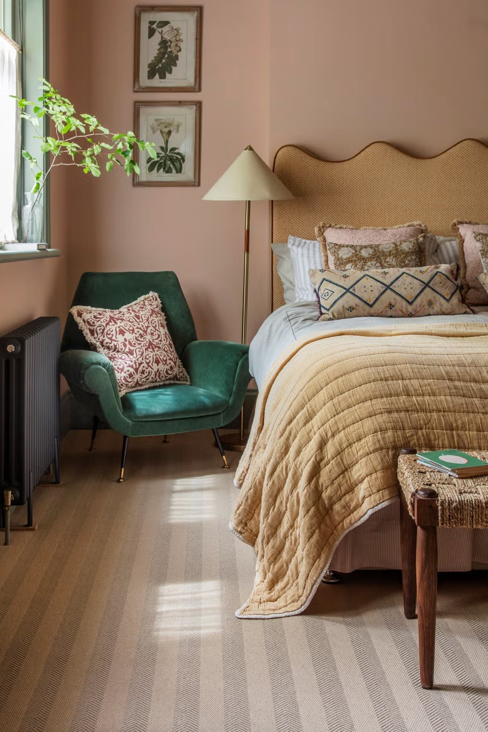
Pastel pink walls set the tone for a bohemian bedroom that feels grounded. The wicker headboard and a velvet armchair in a soft yellow bring in texture, while a quilted throw in green adds a punch of contrast. A floor lamp with a natural linen shade keeps the corner vignette warm. The pastel palette is balanced by the mix of materials, which prevents the room from reading as overly sweet. What defines this style is the balance between soft paint and tactile furniture. The ratio of painted surface to natural fiber is about two to one, and the green accents break the pink enough to make the space feel curated.
Traditional Bedroom with Tufted Pink Headboard and Floral Bedding
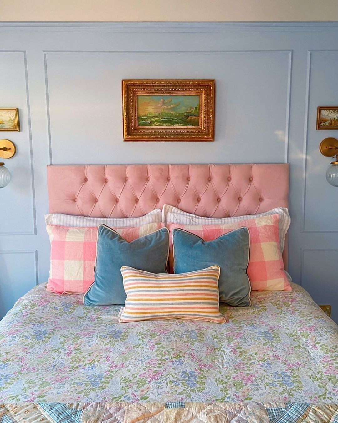
A tufted pink velvet headboard anchors this traditional bedroom with a soft, sculptural presence that patterned bedding and wall sconces echo rather than overpower. The pastel blue walls keep the palette muted so the headboard reads as the focal point without competition. For renters, a large tufted headboard that leans against the wall instead of being mounted can mimic this look without drilling into plaster.
Farmhouse Hallway with Pastel Blue and White Striped Walls
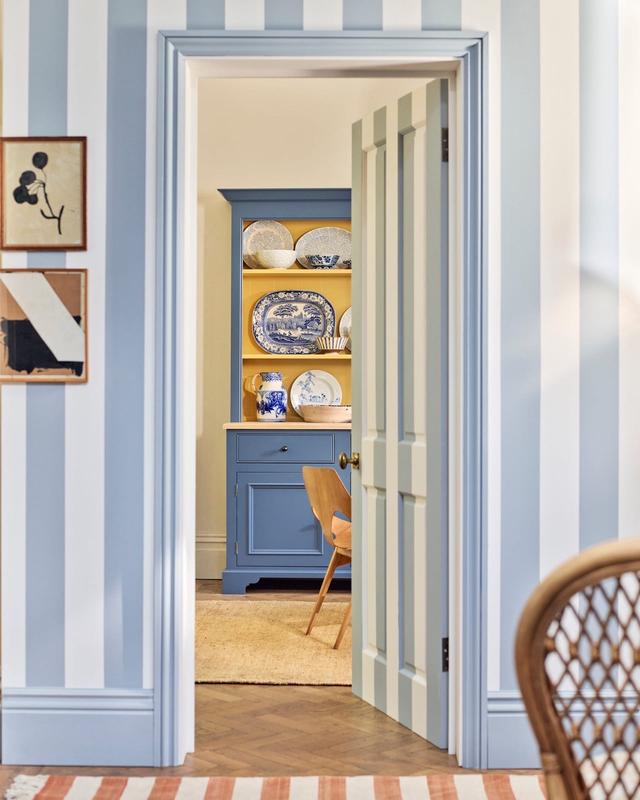
Pastel blue and white striped wallpaper turns a narrow hallway into something that feels wider and more deliberate. The vertical lines draw the eye up, and the pale palette keeps the space airy rather than busy. A blue dresser and a wooden chair sit against the wall, their solid forms balancing the pattern. The yellow in the artwork adds a small warmth that stops the blue from feeling cold. The ratio of stripe to solid surface is roughly half and half, and the dresser breaks the pattern just enough to keep the hallway from feeling like a wallpaper sample room.
Cottagecore Bedroom with Pink Walls and Floral Accents
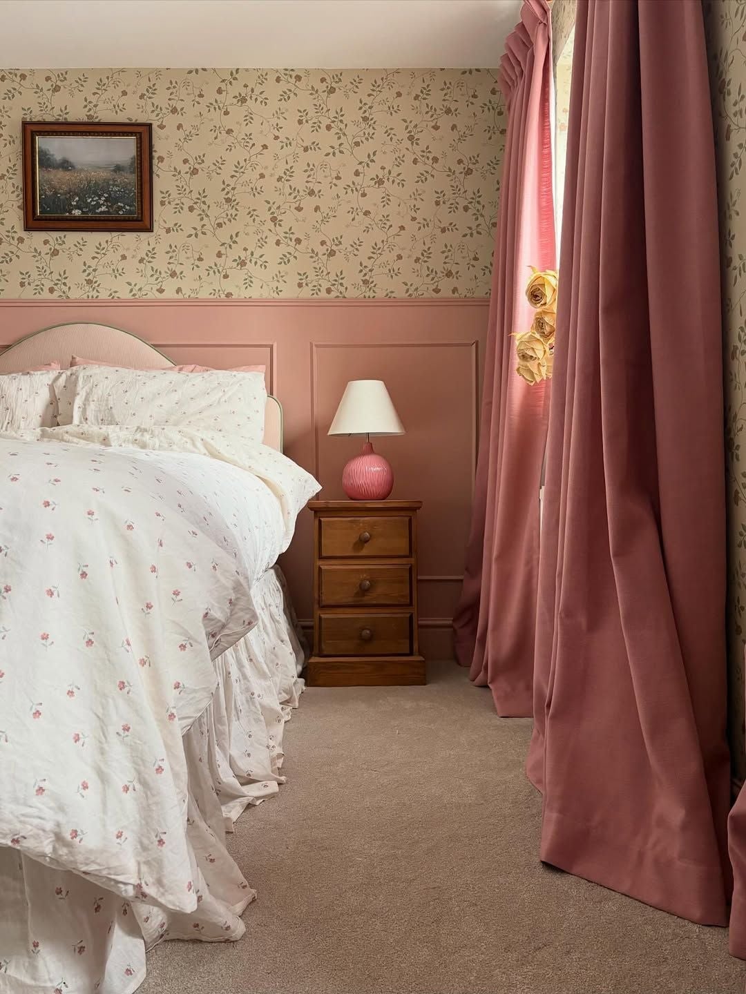
Can pastel pink walls feel cozy without turning childish? This cottagecore bedroom proves they can, with a palette that leans into beige and soft floral pink. The pink velvet curtains frame the window, and the floral bedding echoes the wallpaper without matching it exactly. A wooden nightstand and a pink bedside lamp keep the look grounded in natural materials. The lighting mix of sunshine and pink lamp glow warms the room even on gray days. The bedding defines the cottagecore style with its floral pattern. The ratio of floral to solid is roughly one to three, and the beige accents break the pink just enough to avoid a candy box effect.
Elegant Bedroom with Pastel Pink Walls and Crystal Chandelier
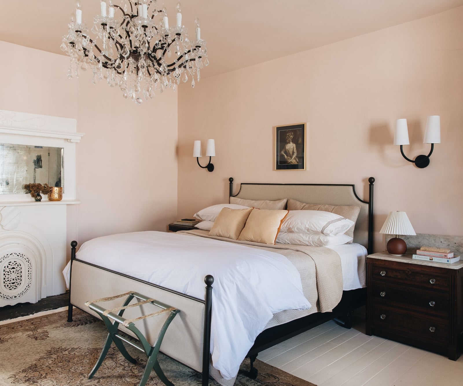
A crystal chandelier hangs above a metal bed frame in this traditional bedroom, its sparkle amplified by the pastel pink walls. The cream and gold palette keeps the room soft, while the wall sconces add a secondary light source that prevents the chandelier from working alone. The ornate fireplace at the far end anchors the room with a heavy, solid form that balances all that delicate crystal and fabric. The scale of the chandelier matters here: too small and it would get lost against the pink walls; too large and it would overwhelm the bed.
Modern Corner with Artwork Featuring Pastel Pink Sails
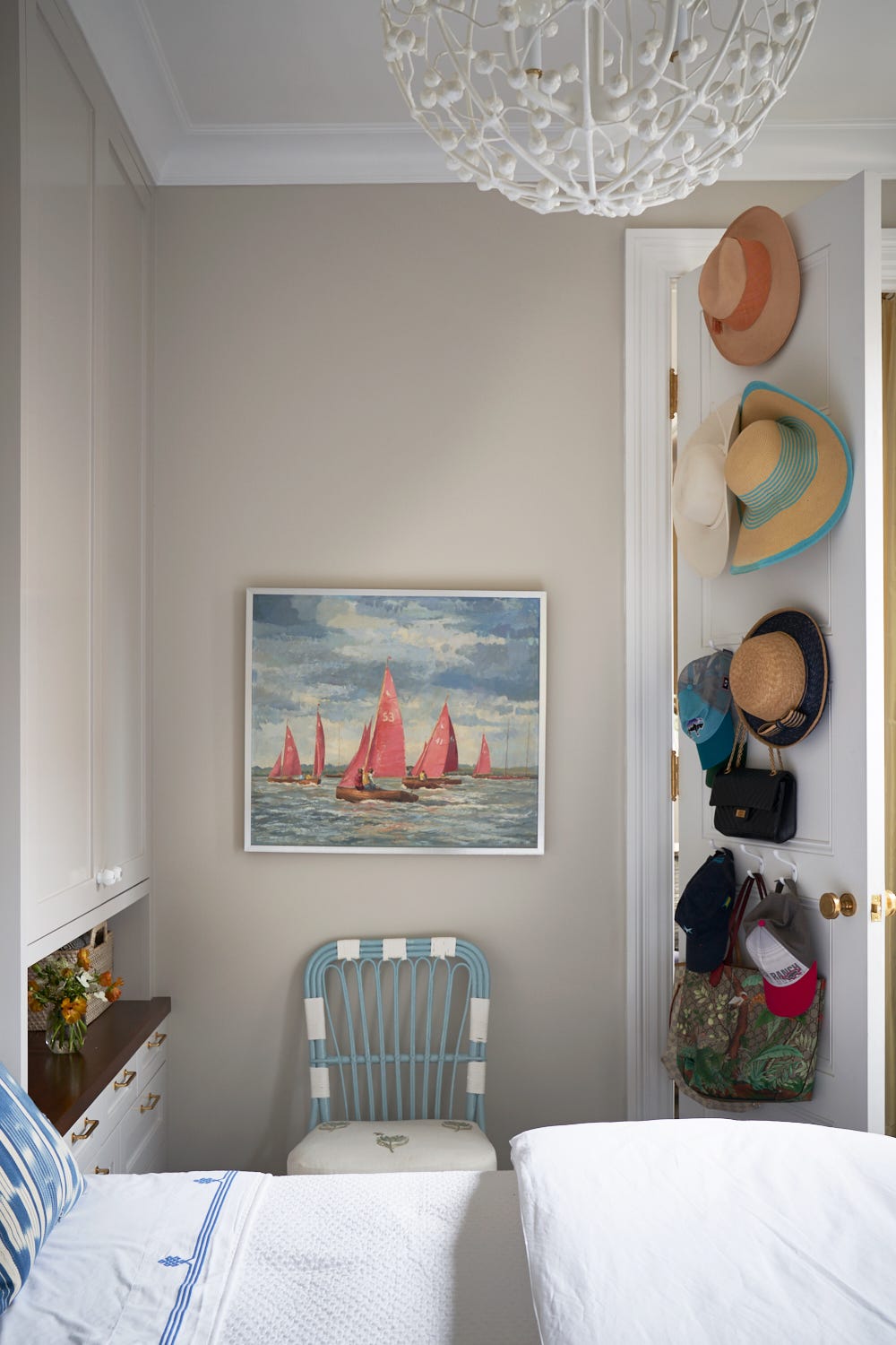
A compact corner feels more intentional when the artwork anchors the eye before the function does. In this modern bedroom closet area, a painting of pastel pink sails against a blue sky hangs above a simple wooden chair, while hats and bags hang on wall hooks nearby. The neutral wall and the chair’s fabric keep the palette quiet so the blue and pink in the art stand out. For a corner like this, let the art set the color story first, then pull in storage pieces that match its lighter tones.
Modern Bedroom with Pastel Pink Walls and Rattan Pendant Lights
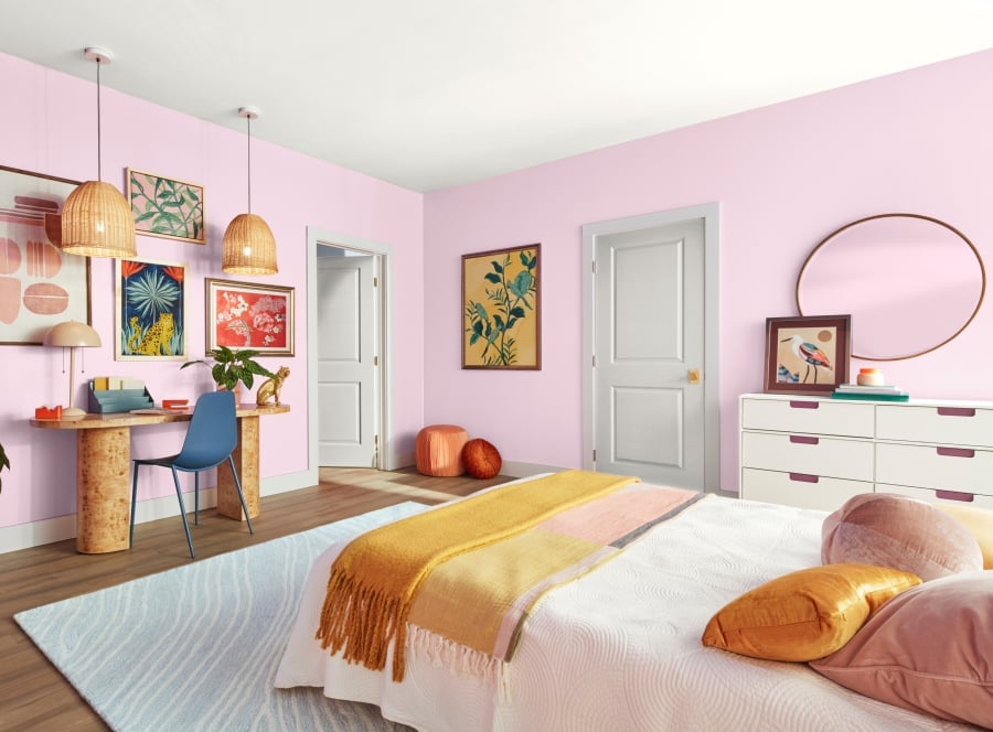
Pastel pink walls can lean too sweet if the room is all blush, but this modern bedroom sidesteps that by pairing them with warmer tones. Yellow, orange, and blue appear in the rug, the desk chair, and the bed linen, creating a palette that feels gathered rather than matched. Natural daylight from a window balances the pendant lights, which are made of rattan and hang above the corner desk.
The pendant lights do double duty here. Their open weave lets light pass through and cast soft shadows on the pink walls, preventing a flat look. The bed faces the dresser, and the layout leaves the center open, allowing the eye to travel across the pastel pink surfaces without hitting clutter. The takeaway is that a pastel wall benefits from surrounding colors that have warmth.
Abstract Art with Textured Pastel Paint Strokes
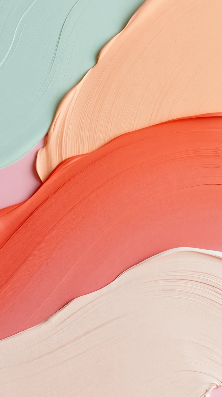
The texture catches studio light in a way that makes the painting feel dimensional, almost sculptural. Abstract art like this is defined by how much paint stays on the surface, and here the ratio favors visible, raised marks over smooth washes. What breaks the softness is the contrast between the mint green and the coral, which keeps the piece from reading as purely feminine.
Modern Eclectic Living Room with Pastel Lavender Walls
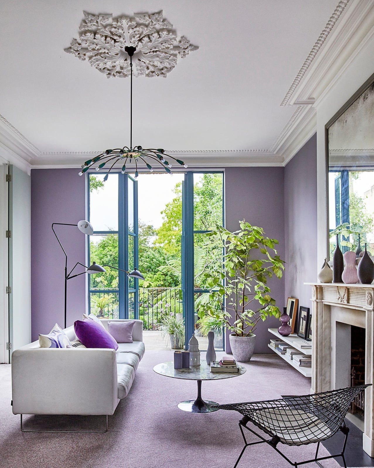
Pastel lavender walls are a confident choice for an open plan living room because the color has enough pigment to define the room without darkening it. In this modern eclectic space, the lavender sits behind a white sofa and a green armchair, with a metal and glass coffee table and a tall plant adding contrast. Natural daylight from large windows keeps the lavender looking airy, while a single pendant light provides warmth in the evening. The palette stays in three clear parts: lavender as the base, white for the large furniture, and green for the living accents. That ratio prevents the pastel from feeling washed out or overly precious.
Traditional Bedroom with Pastel Pink Walls and Large Patterned Rug
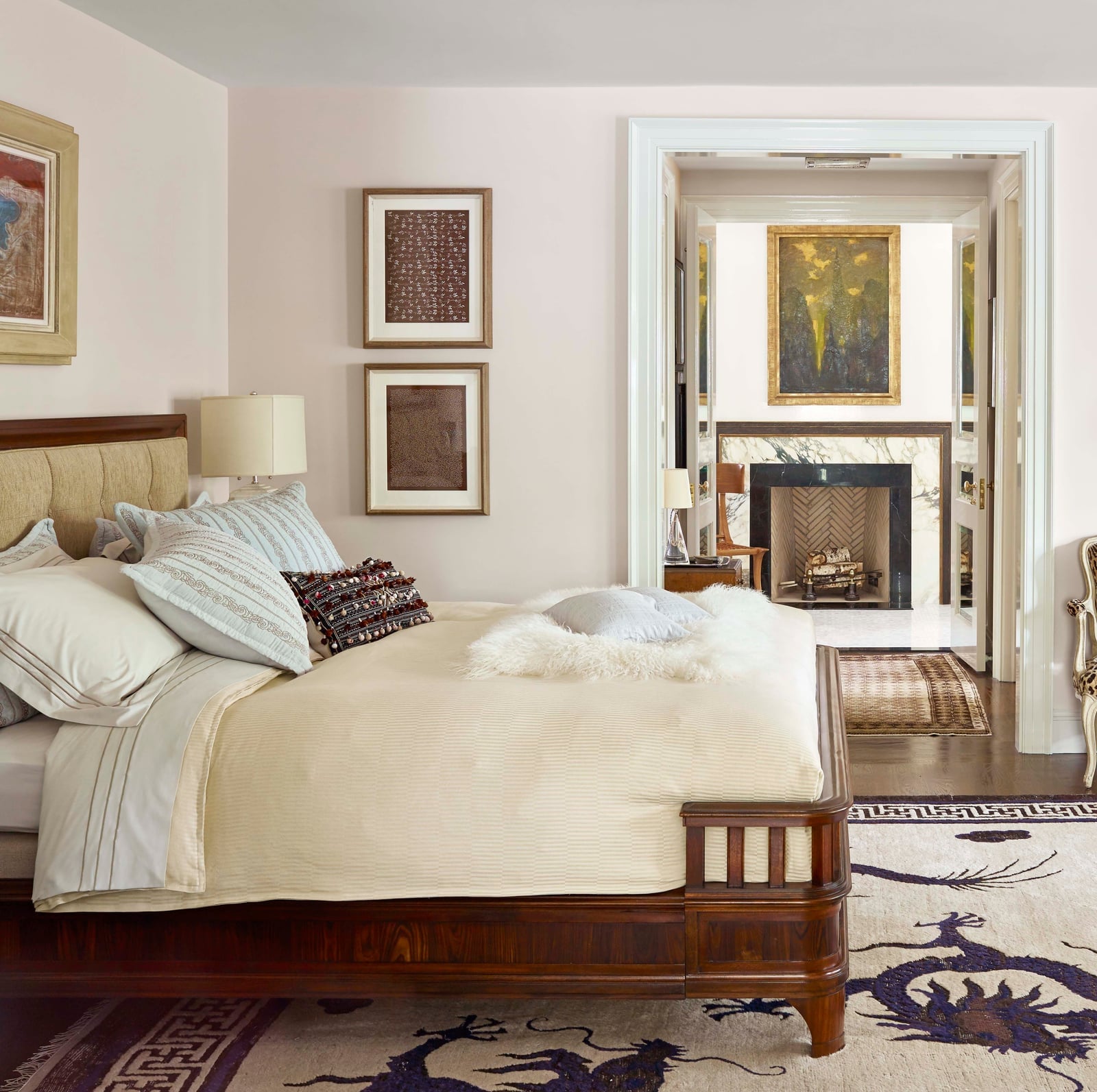
A large patterned rug can ground a traditional bedroom and give the pastel pink walls something to push against. Here the rug introduces cream and brown tones that warm up the pink, while the bed’s wooden frame and the glass bedside lamps keep the look from feeling too delicate. The bed sits in the foreground, and a doorway leads to another room, which makes the pink feel like part of a larger flow rather than a closed-off color choice.
A practical rule for a room this size is to choose a rug that extends past the bed on both sides. The pattern breaks up the pink wall area and adds visual weight at the floor, which balances the softness above. The bedside lamps cast light upward, so the pink walls catch a warm glow in the evening rather than going cold.
Traditional Bedroom with Soft Pink Walls and Plaid Accents
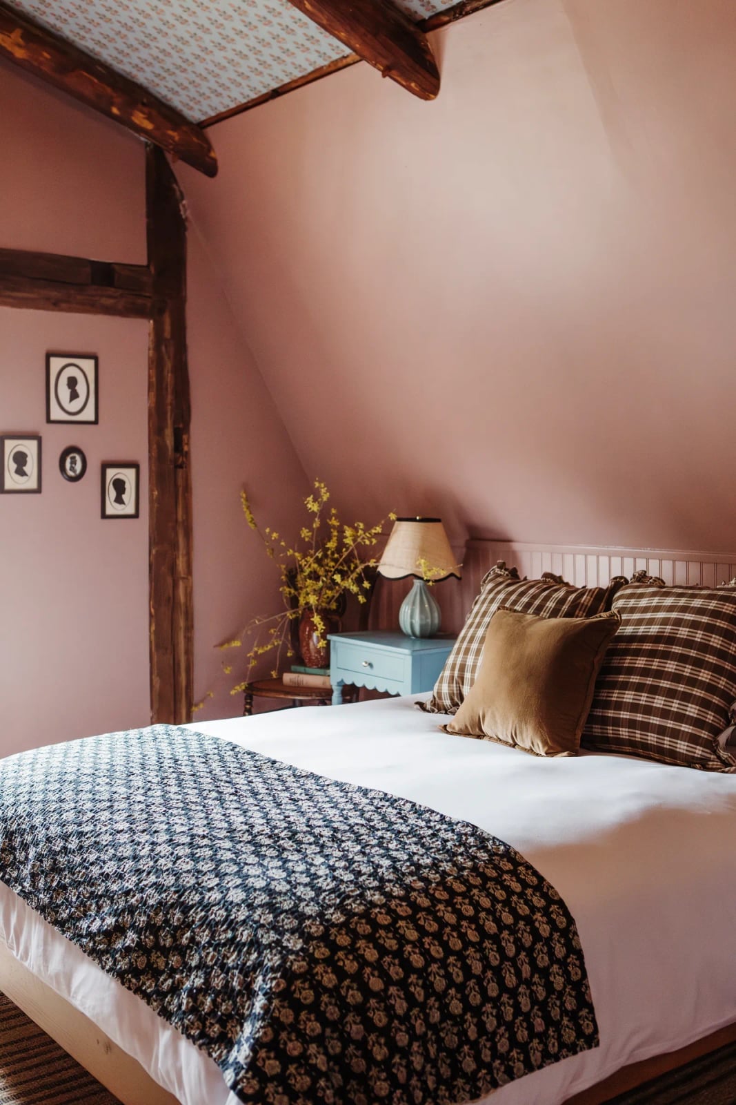
Soft pink walls set a calm backdrop in a traditional bedroom, where plaid bedding and patterned pillows add a structured, preppy note. The palette is pink, brown, white, and green, with wood furniture and a blue nightstand grounding the look. Plaid covers about a third of the bed layers. The rest stays solid or small scale floral, so the pattern looks planned. That ratio makes the room feel collected, not fussy.
Abstract Expressionist Painting with Thick Pastel Brushstrokes
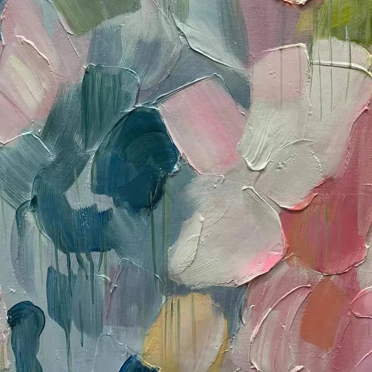
A practical rule for working with thick pastel paint is to let the texture do the talking. In this abstract expressionist piece, the impasto brushstrokes in pink, blue, green, and white create a surface that shifts with the light. The paint itself becomes the subject, with the canvas texture amplifying the soft pastel tones. For a renter-friendly take, a large canvas like this can be leaned against a wall instead of hung, adding depth without a permanent commitment. The soft studio lighting here catches the raised edges, making the piece feel dimensional even from a distance.
Modern Bedroom with Pastel Pink and Teal Walls and Abstract Duvet
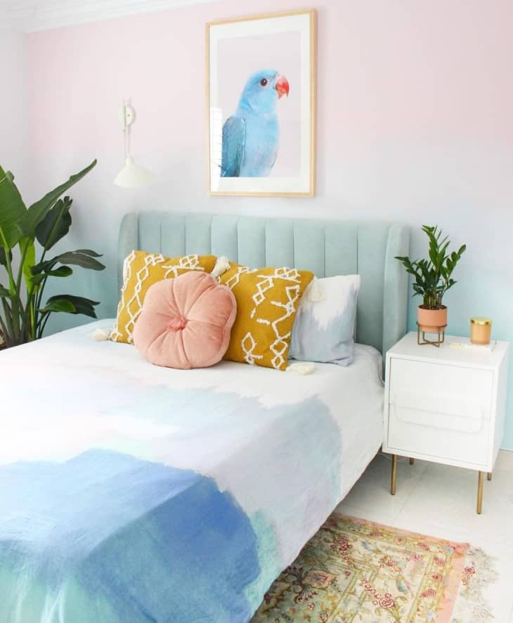
Where a pastel pink wall alone can feel too sweet, this modern bedroom pairs it with teal for contrast. The bed stays centered with a bedside table to one side, and the abstract painted duvet cover ties the two colors together. Natural light from a window and a wall sconce keep the room from feeling dim. The hero element here is the bed, with the duvet acting as the visual anchor, coordinating the pink wall with the teal accents on the pillows and plant. The result is a space that feels playful but grounded, with the two-tone wall creating a clear focal point without overwhelming the room.
Abstract Watercolor Painting with Wavy Pastel Layers
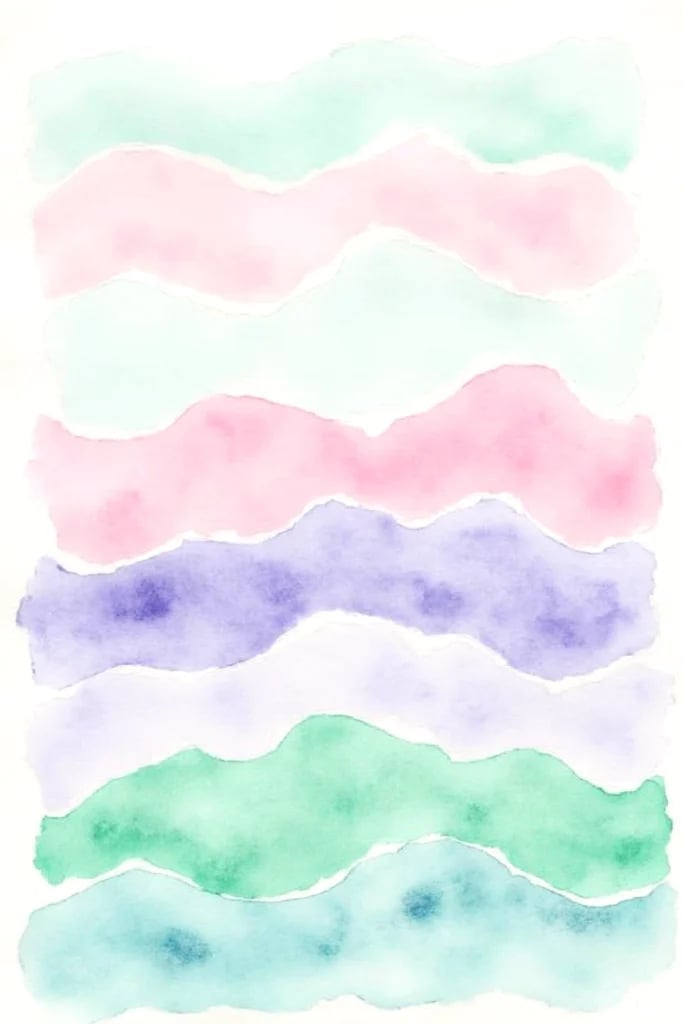
The wavy pastel layers in this watercolor piece create a sense of movement across the vertical composition. Soft green, pink, and purple washes overlap without blending into mud, a sign of controlled layering on the paper. The neutral lighting lets the transparent qualities of the watercolor come through, with each wave keeping its own edge. This kind of abstract work works well in a spot where you want color but not a literal image, like above a console table or in a reading nook.
Modern Bedroom with Sage Green Wall and Blush Pink Accents
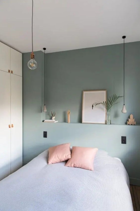
A sage green accent wall paired with blush pink accents creates a sophisticated look. The bed sits centered with a wardrobe to the side, and the linen textures on the pillows soften the modern lines. Pendant lights and natural light keep the room bright, while the sage wall grounds the pink accents. The palette ratio leans heavily on the green, maybe sixty percent, with blush pink used on the bedding and a few accessories. That split gives the eye a clear resting place.
Abstract Painting with Soft Pastel Pink Horizon Line
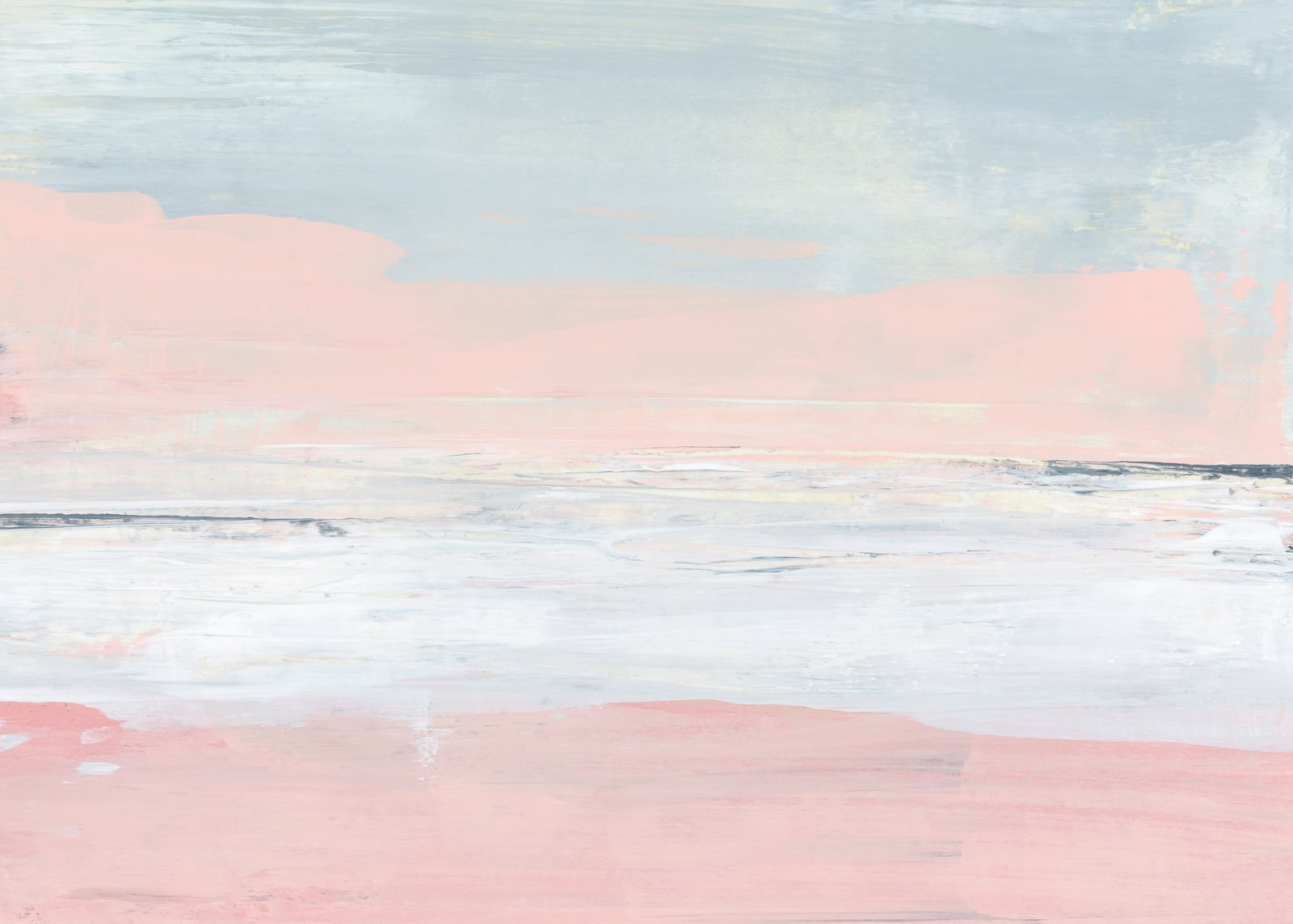
A single horizontal band of pastel pink against gray and white reads as a horizon, even when the rest of the painting stays abstract. The soft daylight hitting the canvas keeps the pink from feeling flat, while the gray grounds it. What defines this look is the ratio: one pastel line against mostly neutral space. Break that ratio and the horizon disappears into pattern. For wall art, the same rule applies to a room. Let one pastel element lead, and let the walls around it stay quiet. That way the color lands without competing with itself.
Traditional Bedroom with Pastel Yellow Ceiling and Blue Walls
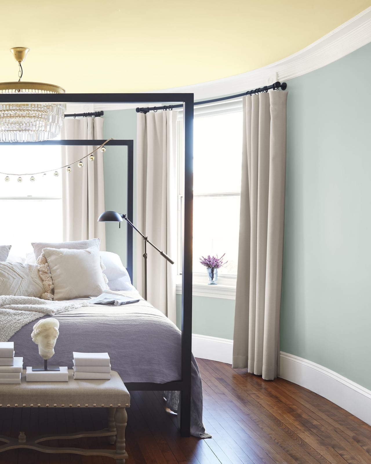
The pastel yellow ceiling reads as a fifth wall, not an afterthought, because the cream and light blue palette below it stays soft. A four-poster bed, chandelier, and curtains in linen and metal keep the room traditional without weighing it down. The yellow draws the eye up, making the room feel taller than it is. The palette works because the ceiling is the only warm pastel; the blue walls and cream linens let it stand out. Break that balance by adding another warm pastel at eye level, and the ceiling loses its lift.
Abstract Art with Overlapping Pastel Geometric Shapes

For abstract art with overlapping shapes, let the background shape set the tone and the foreground shape add the tension. Here, pastel peach sits behind coral and teal rectangles, so the coral appears warm and the teal provides contrast. The even lighting on a print keeps the colors true, which matters for digital art where glare can wash out pastels. The overlap itself defines the look. Without it, the shapes are just colored blocks. Spacing them apart breaks the overlap, and you lose the layered depth that makes geometric pastels feel deliberate.
Traditional Living Room with Sage Green Walls and Wicker Chairs
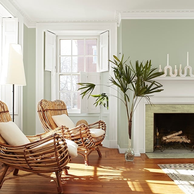
Sage green walls can lean either cool and coastal or warm and traditional depending on the materials you pair them with. Here, wicker chairs and a tile fireplace keep the room on the traditional side. Sunlight hits the sage and brings out its yellow undertone, which stops the room from feeling cold. The wicker adds texture without adding color, so the sage green stays the main event. If you swapped the wicker for a glossy material, the room would shift modern. The material choice matters as much as the paint color itself.
Monochromatic Bedroom in Aesthetic Pastel Pink
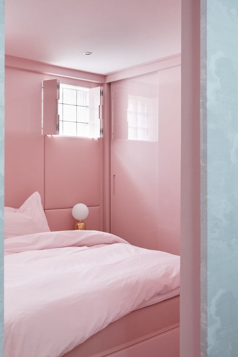
The walls, bed, shutters, and lamp all sit in the same pastel pink, yet the room does not read as flat. The lacquer finish on the furniture catches the soft ambient light differently than the fabric on the bed, so the pink shifts between matte and sheen. That variation in finish is what saves a monochromatic palette from feeling like a single wash of color. The palette works because every surface is pink, but no two surfaces reflect light the same way. Break that by using one finish everywhere, and the room would lose its depth.
Eclectic Bedroom with Dusty Rose Walls and Vibrant Accents
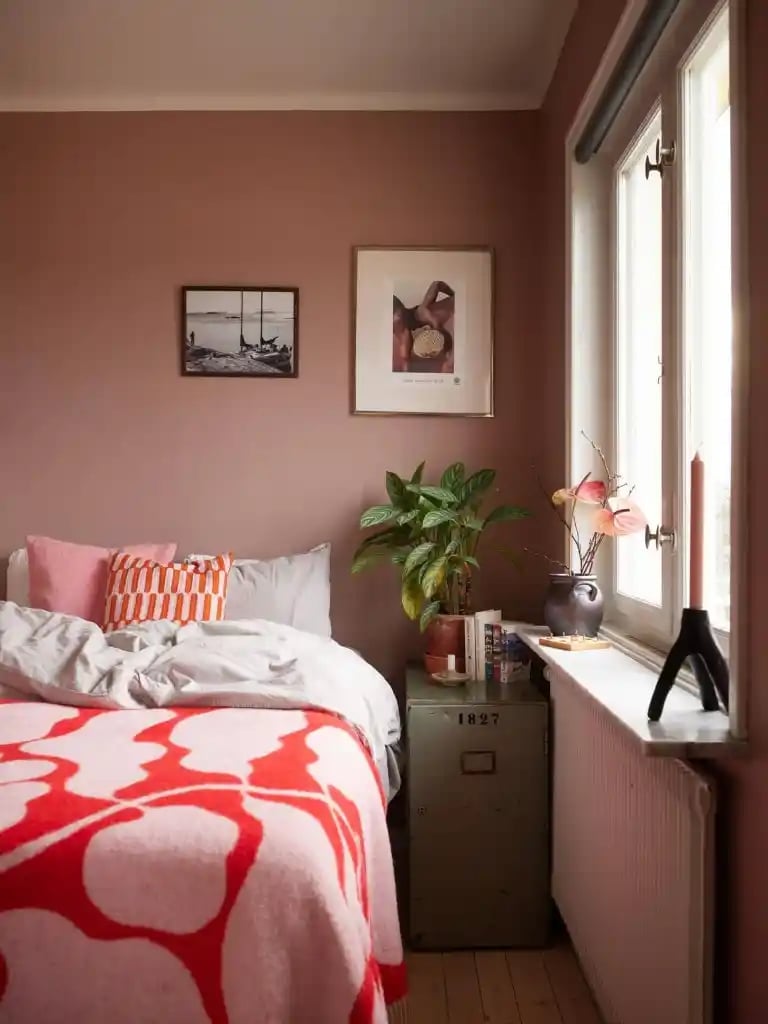
Dusty rose walls prove pastel can carry a punch. In this compact corner, the soft pink backdrop gets a jolt from an orange patterned blanket and a green cabinet, proving that eclectic style thrives on contrast. The palette defines the look: dusty rose keeps the room grounded, while saturated orange and gray add tension. What breaks it is going too safe. If you pull the saturation from those accents, the dusty rose reads as beige. The natural light and a single candle keep the vignette warm without competing with the color.
Abstract Painting with Soft Pastel Pink and Lavender Brushstrokes
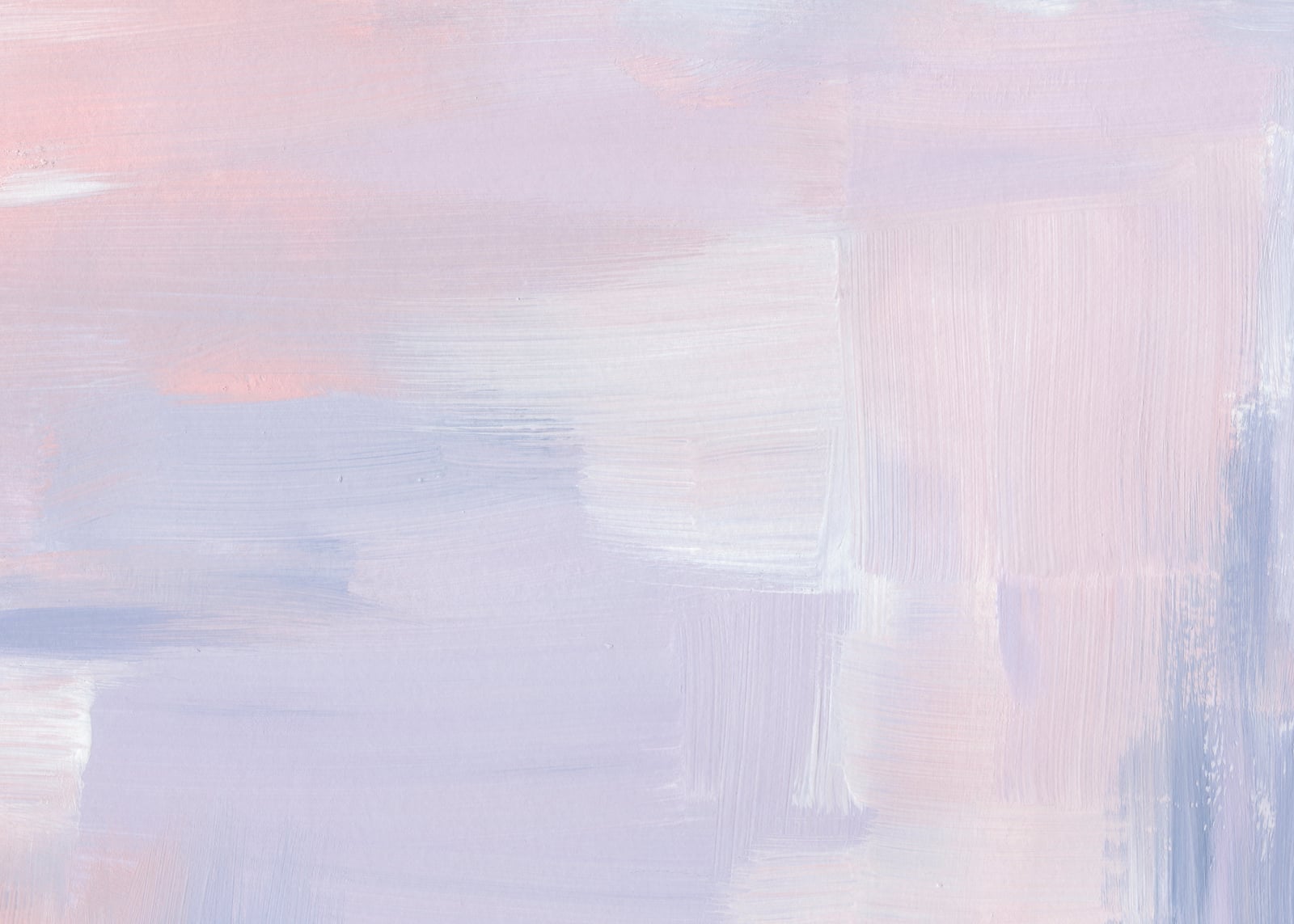
A practical rule for wall art: the best abstract pieces work from across the room and up close. This canvas uses soft pastel pink and lavender brushstrokes over a white ground, creating depth without hard edges. From a distance, the colors blur into a wash; close up, the painterly texture becomes the subject. The natural light hitting the canvas shifts the lavender toward gray and the pink toward peach, which means the piece changes character throughout the day. For renters, leaning a large canvas against the wall avoids nail holes and lets you swap art when the mood shifts. The key is scale: a piece this soft needs a generous size to hold its own on a wall.
Modern Minimalist Bedroom with Pastel Blue Walls and Pink Bedding
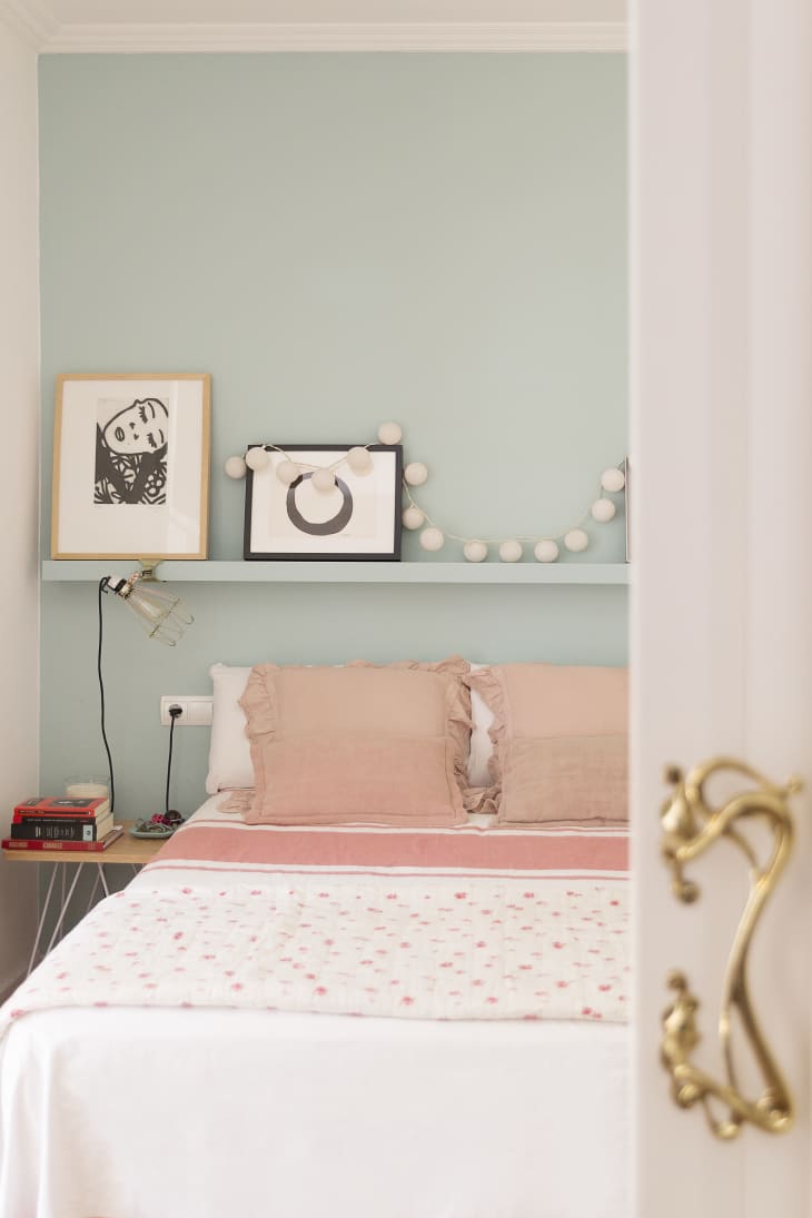
Pastel blue walls and pink bedding create a palette that reads as fresh rather than sweet. The cool blue keeps the room calm, while the ruffled pink pillows add a soft focal point at the bed. A white lamp and simple artwork on the shelf above keep the look from tipping into overly feminine territory. The ratio matters here: blue covers the walls, pink stays on the bed, and white occupies the space between them. That balance is what makes this modern minimalist rather than nursery.
Artistic Watercolor Clouds in Pastel Pink, Purple, and Blue
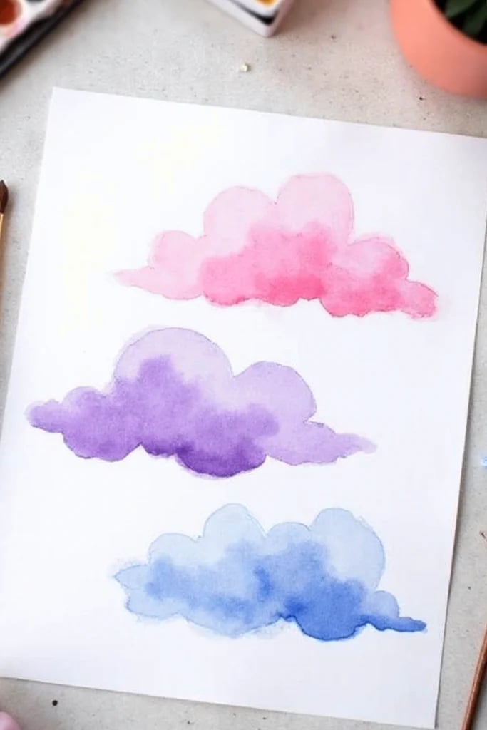
Three vertical watercolor cloud paintings stacked in a row create a rhythm that reads as both playful and deliberate. The pastel pink, purple, and blue washes bleed into each other on the paper, leaving soft edges that mimic actual clouds. The bright natural light hitting the paper keeps the translucent layers visible. Because watercolor is unforgiving, the painter had to commit to each stroke without correction. The result is a piece that feels airy but has structure. For longevity, keep watercolor art out of direct sun to prevent the pigments from fading over time.
Modern Coastal Bedroom with Mint Green Paneled Wall
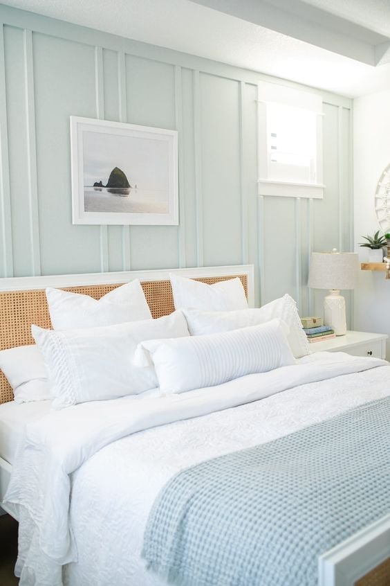
Mint green wall paneling can easily become a beach house cliche, but here it works because the surrounding decor stays restrained. The paneled wall provides texture and color, while the white bedding and light wood rattan headboard let that mint green breathe. The palette is the defining move: mint green, white, and light wood keep the room airy without leaning nautical. Adding too many coastal motifs would break the balance. A single natural fiber throw or a simple lamp is enough. The roomy layout centers the bed, letting the paneling act as a headboard backdrop instead of a competing pattern.
Abstract Painting with Soft Blended Pastel Brushstrokes
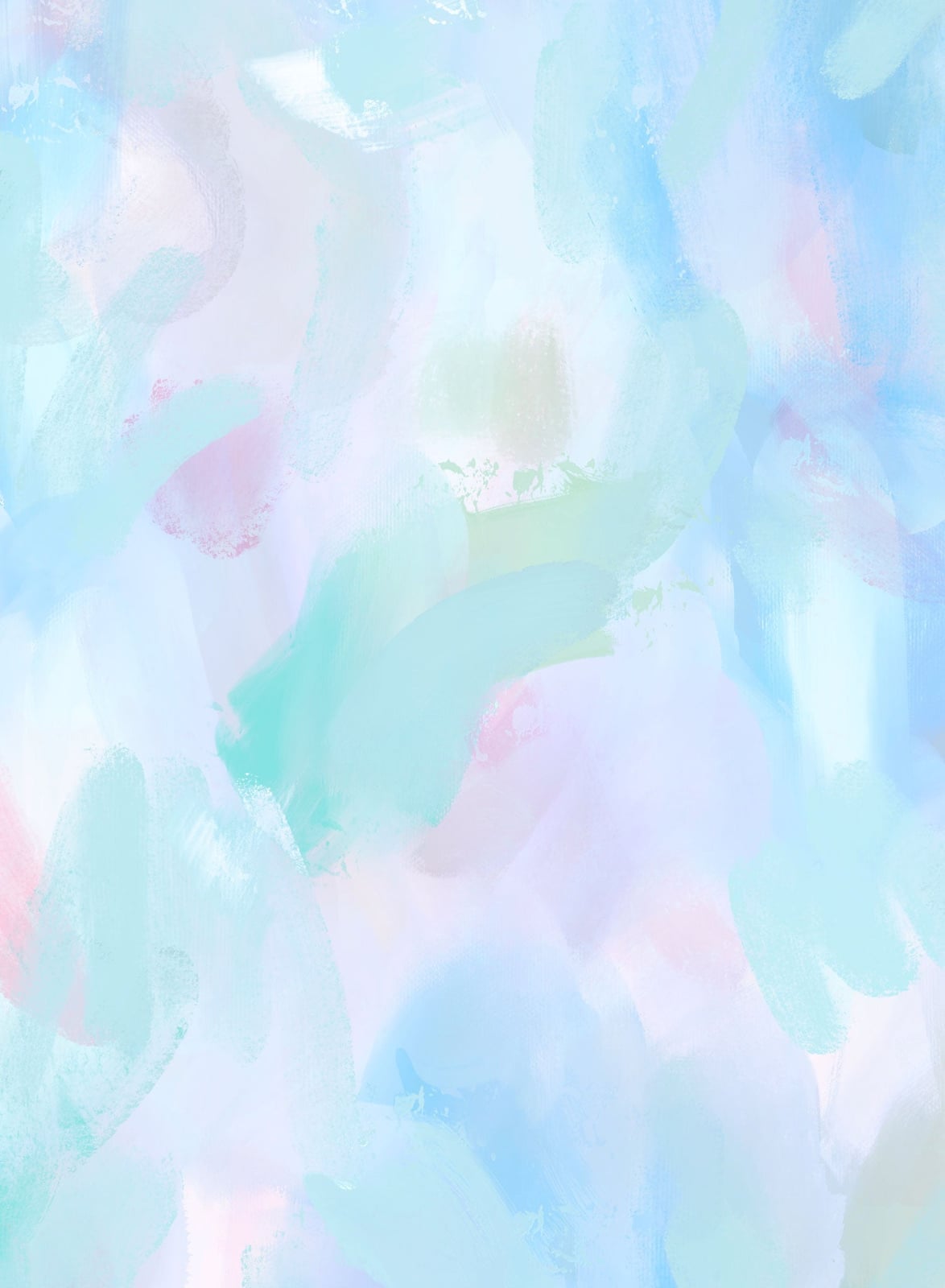
This artwork uses a palette of pastel blue, pink, and white, with the paint applied in soft, diffused brushstrokes that blend into an all-over pattern. The materials are just paint and canvas, but the effect depends on how the layers overlap without a hard edge. A style like this works when the blended areas keep a clear ratio of color to white space, so the painting reads as airy rather than muddy. What breaks it is trying to blend too many shades at once, which can turn the softness into a gray wash. Stick to three tones and let the brushstrokes stay visible.
Eclectic Bedroom with Two-Tone Pastel Lavender and Purple Fireplace
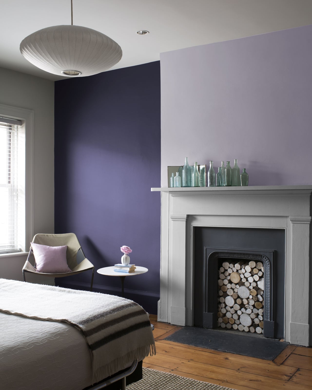
This compact bedroom centers on a fireplace with a two-tone painted wall in pastel lavender and deep purple, with the bed in the foreground and an armchair and side table completing the layout. The palette mixes cool lavender with a darker purple, grounded by gray accents in the wood, stone, metal, and glass of the room. Natural light and a ceiling fixture keep the space from feeling too dim. In this style, the defining move is the color blocking on the fireplace wall, which breaks the traditional expectation of a neutral hearth. The ratio is about two-thirds light to one-third dark, which gives the room contrast without losing the pastel feel.
Abstract Peeling Paint Texture in Pastel Blue, Pink, and Yellow

This is not a smooth painted surface but a close-up of peeling paint layers in pastel blue, pink, and yellow over plaster. The texture comes from the paint lifting and cracking, creating a physical depth that a flat brushstroke cannot match. Natural light hits the raised edges, making each layer cast a tiny shadow.
The palette stays within pastel tones, but the peeling adds a worn quality that contrasts with the soft colors. In an abstract art context, this texture works because the decay becomes the pattern. What defines this look is the ratio of intact paint to exposed plaster, roughly half and half. Too much peeling and it looks like neglect; too little and the texture disappears.
Luxurious Traditional Bedroom with Pastel Pink Walls and Floral Canopy
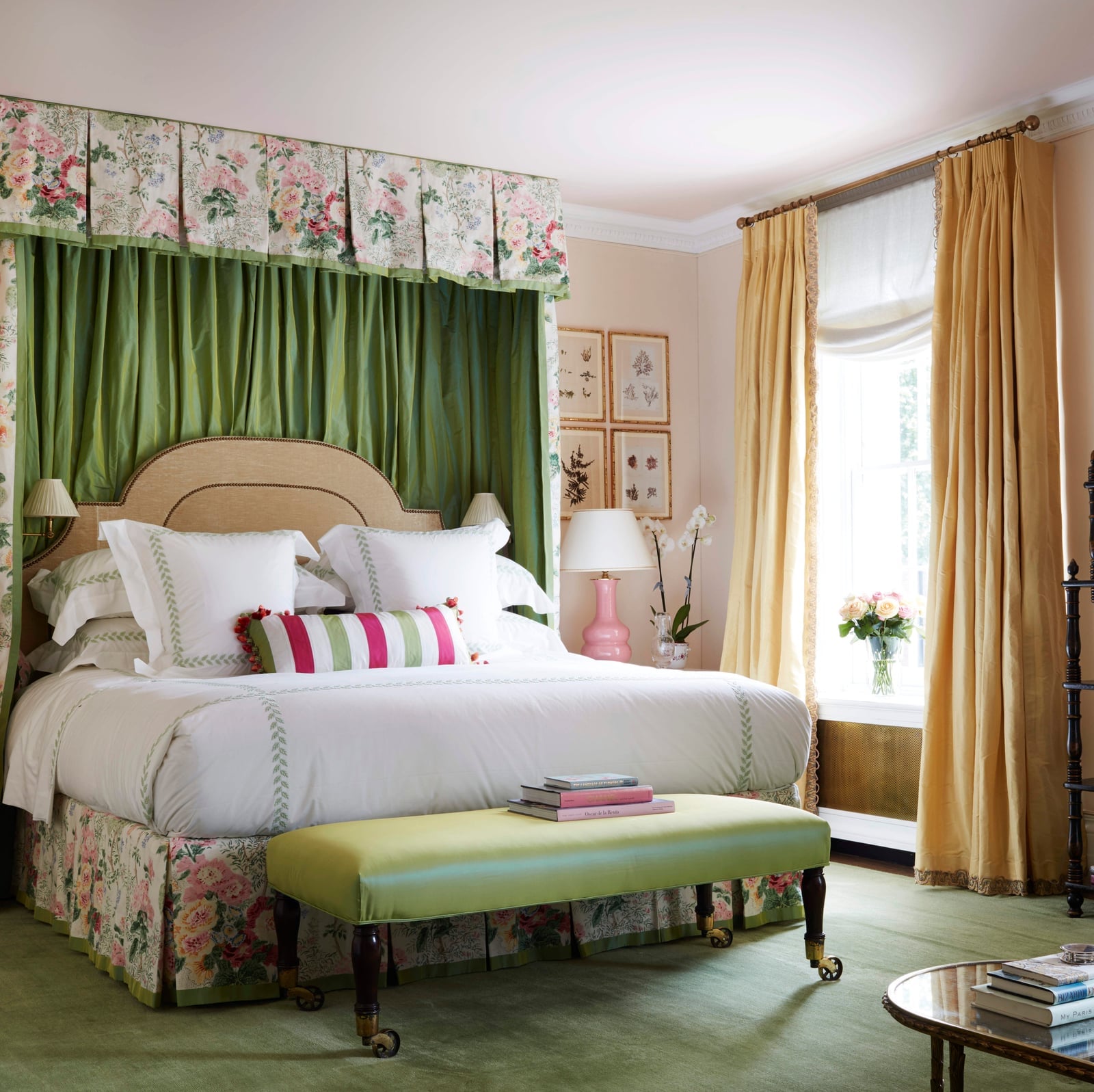
A canopy bed with a floral bed skirt and matching upholstery dominates this roomy traditional bedroom, with pastel pink walls, green drapes, and gold accents in the wood, fabric, glass, and metal details. Natural light from the windows and soft lamp glow keep the palette from feeling heavy. The defining element is the floral canopy, which draws the eye upward and frames the bed as the focal point. The ratio of floral pattern to solid pastel walls is roughly one to three, so the fabric does not overwhelm the room. What breaks it is adding more pattern on the walls or floor, which would compete with the bed.
Art Studio Detail with Pastel Paint Swirls on Palette
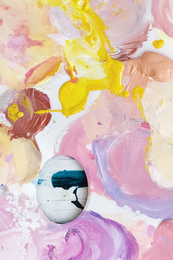
An art studio close-up shows a paint palette holding swirls of pastel pink, yellow, and purple, with a small painted stone nearby and canvas in the background. The studio lighting makes the paint look glossy and wet, so the swirls read as fresh rather than dried. In this style, the palette itself becomes the hero element, not just a tool. The ratio of paint to bare palette is about equal, which shows both the colors and the mixing process. What breaks the look is overmixing the swirls into a single muddy tone. Keep each color distinct on the palette to preserve the pastel clarity.
Final Thoughts
Pastel paint works best when you commit to the undertone and repeat it in at least two surfaces. Stick to matte or eggshell sheens to keep the color soft, and use natural light as your guide before picking a shade. A single pastel wall can anchor a room, but a full pastel room needs contrast in texture or shape to keep it from feeling one-note. Let the palette lead the layout, and you will land on a look that feels both current and calm.