Neutral paint colors have a quiet authority. They don’t compete with your furniture or fight the natural light, which is why they keep showing up in homes that feel settled and grown-up. This collection of 30 looks proves that beige, cream, taupe, and off-white are anything but boring when you let the undertones do the work.
You will see how a single neutral can shift the mood of a hallway, living room, or bedroom depending on what you pair with it. The goal is to help you spot the difference between a flat white and a warm cream, and to show you how each shade earns its place in a real room.
Soft Cream Walls in a Welcoming Hallway
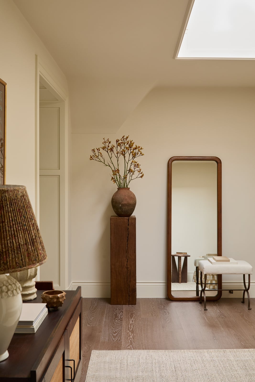
A wooden pedestal with a vase becomes the quiet center of this hallway vignette, and the soft cream walls let it hold that focus without competing. The skylight washes the space in even natural light, so the warm plaster and wood tones read as calm rather than flat. For a hallway that sees heavy traffic, a neutral cream paint color keeps the room feeling open while giving you a forgiving backdrop for everyday life, dirt and scuffs show less than they would on a bright white, and the finish stays warm even as the light shifts.
Boho Living Room with Cream Walls and Rattan Accents
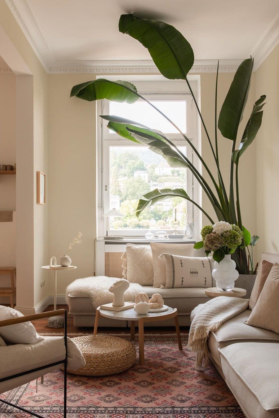
This room proves that a neutral cream paint color can anchor a boho look without making it feel washed out. The cream walls let the pink and terracotta in the textiles stand out, while the rattan coffee table and large potted plant add texture that keeps the space from feeling flat. The key is contrast: the warm cream reads as a soft base against the darker wood and glass accents, so the whole seating area feels layered rather than sparse. If you want a boho palette that stays grounded rather than chaotic, start with a creamy neutral on the walls and let the accent colors do the work.
Modern Living Space with Neutral Beige Walls and Marble Fireplace
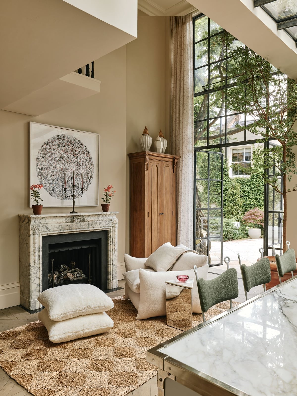
Can a neutral beige wall hold its own next to a marble fireplace? In this modern living room, it does exactly that. The beige paint picks up the warm undertones in the marble and the linen armchair, while the jute rug and wooden cabinet add natural texture that keeps the room from feeling cold. The large window brings in plenty of daylight, which helps the beige read as soft rather than drab.
The trick is in the pairing. The marble fireplace gives the room a focal point with a cool, polished surface, and the beige walls balance that by adding warmth. Without the neutral backdrop, the marble might feel too stark. A neutral beige paint color works here because it does not compete with the stone. It lets the marble be the star while keeping the whole open-plan space feeling cohesive.
Elegant Living Room in Warm Cream with Gold Accents
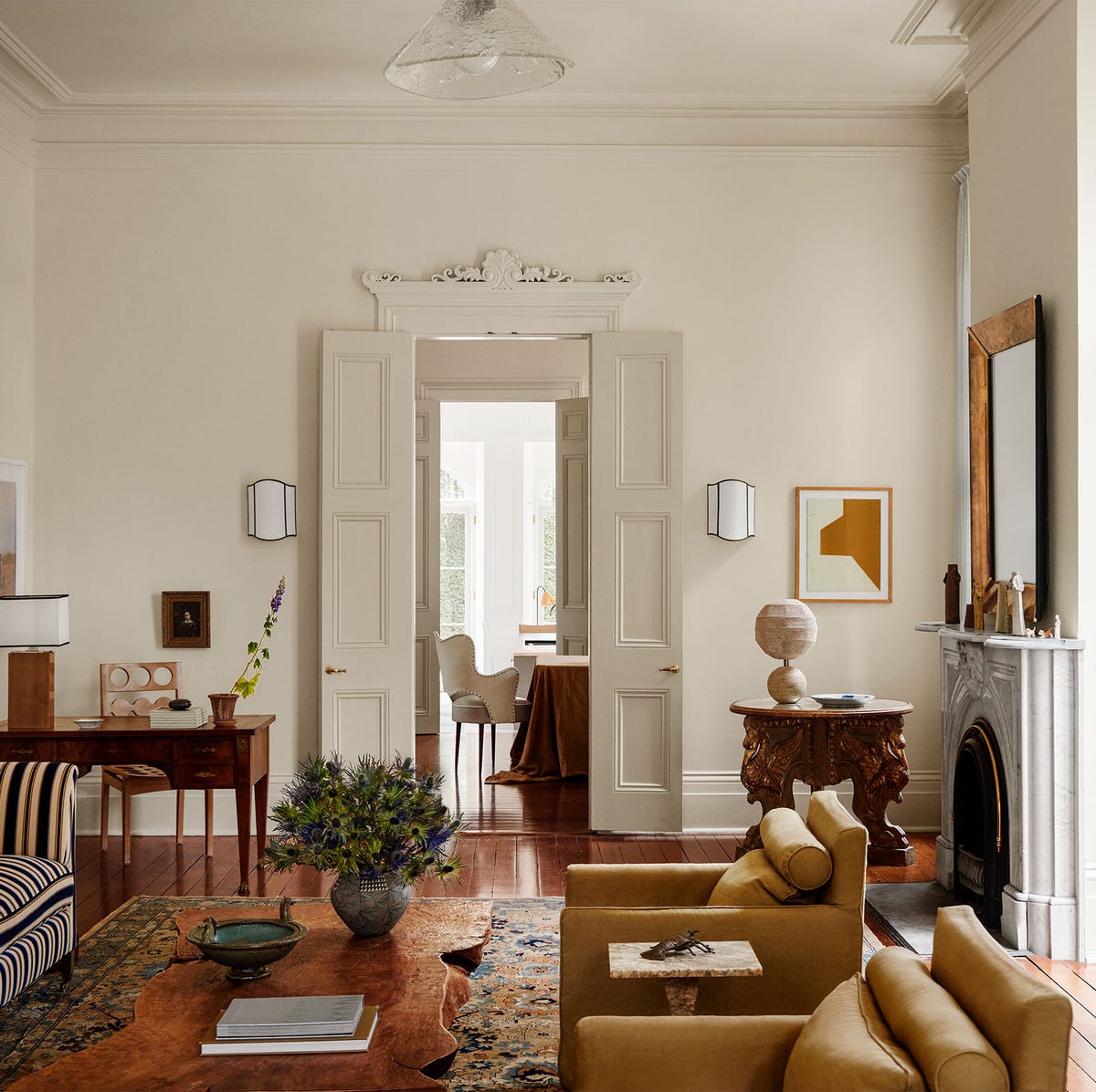
The warm cream paint on these walls catches the natural light from the windows and the glow of the wall sconces, making the room feel soft and luminous. Gold accents on the mirror frame and table lamp pick up that warmth and add a polished edge without overwhelming the space. The marble fireplace and brass details lean into the classic style, but the cream walls keep it from feeling too formal. They give the room a relaxed elegance that works for everyday living.
Minimalist Dining Room Featuring Clean White Walls
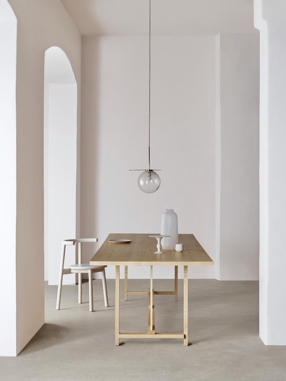
Clean white walls are the foundation of a minimalist dining room. The white paint makes the wood dining table and grey chairs stand out clearly, while the pendant light adds a sculptural element overhead. The archway brings in natural light that bounces off the white walls, making the room feel bigger and brighter than it might with a darker color. If you are renting and cannot paint, a similar look comes from using white curtains and light-colored furniture to mimic the effect of white walls.
Traditional Hallway with Neutral Mauve Walls and Arched Doorway
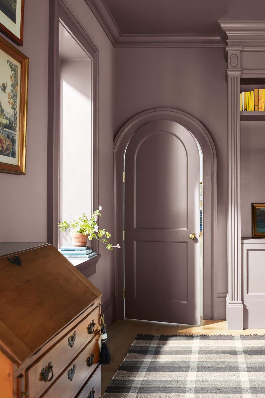
Neutral mauve is a color that sits somewhere between a dusty rose and a muted lavender, and it functions as a neutral in the same way a soft grey does. In this hallway, the arched doorway becomes the focal point, its curve softened further by the wall color. A wooden dresser and a bookshelf add warmth, and the window keeps the space from feeling too cool. For a layout that flows, keep the floor and trim light. The wood tones here break up any potential for the mauve to appear flat, giving the eye a natural rhythm from wall to floor to furniture.
Close-Up of Pale Peach Paint in a Can
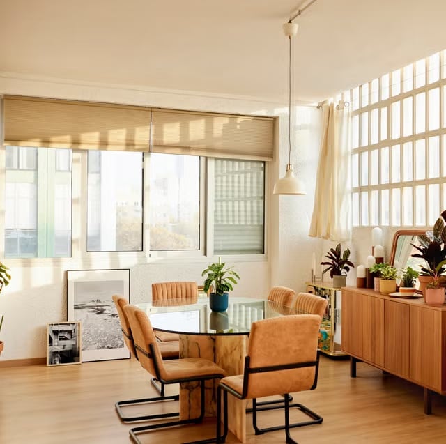
A close-up of the paint surface shows a smooth, creamy finish that catches studio light evenly. The pale peach sits next to a cream swatch, and the difference is subtle but distinct. For a renter, this is a color that works well on a single accent wall or a piece of furniture. It adds warmth without committing to a full room. A small sample can test how the peach shifts under your own light fixtures, especially in a north-facing room where it might read cooler.
Modern Bedroom with Dark Green and Grey Walls
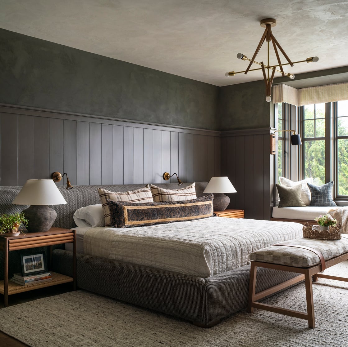
Dark green and grey make a strong pair for a bedroom that wants depth without drama. The dark green wall here uses textured paneling, while the grey is a smoother finish, and that difference in sheen keeps the palette from feeling heavy. A beige linen bed and a window seat with natural light balance the darker tones. Wall sconces and a chandelier provide layered light. For a palette like this, the ratio is roughly two-thirds dark to one-third light. A light rug or bedding breaks the weight of the darker walls and keeps the room grounded.
Farmhouse Kitchen with Cream Walls and Yellow Cabinetry
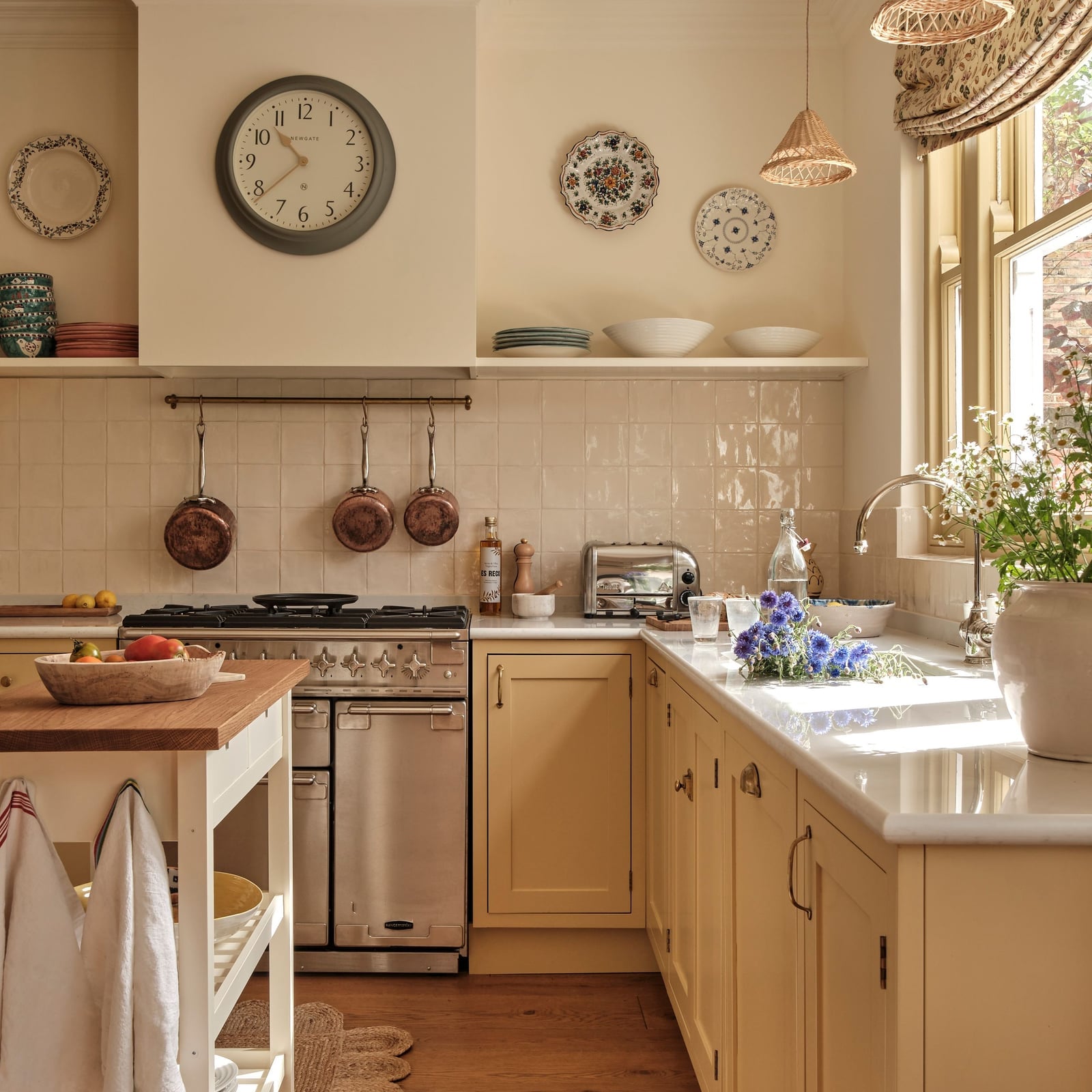
Can cream walls and yellow cabinets live together without clashing? Yes, if the cream is warm and the yellow is soft, not bright. In this farmhouse kitchen, the yellow cabinetry on the island and perimeter is balanced by white marble countertops and a tile backsplash. A blue range cooker adds a cool note. Cream walls keep the backdrop quiet, letting the yellow take the lead. For a kitchen, durability matters: a satin or eggshell finish on the walls is easier to wipe clean than a flat sheen, and it still reads as soft rather than glossy.
Open-Plan Space with Neutral Cream Walls and Vintage Chest
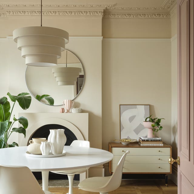
Neutral cream walls in an open-plan space act as a visual anchor, letting furniture and lighting do the talking. Here, a round dining table sits in the center, while a vintage chest of drawers on the right adds character. A tiered pendant light hangs above the table, and a large plant in a ceramic pot brings in a natural shape. For an open layout, cream walls help define zones without needing a wall. The chest breaks any monotony, and its darker wood provides contrast after the lighter cream.
Traditional Living Room with Cream and Beige Walls
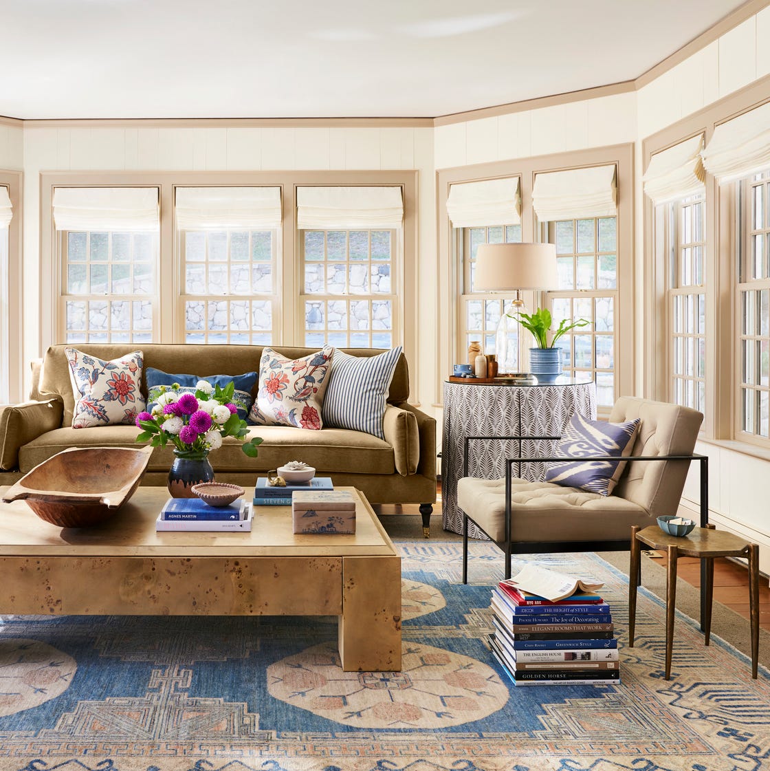
A cream and beige palette works best when the room has enough natural light to keep the wall color from looking flat. In a traditional living room, the cream walls let the large wooden coffee table and blue fabric accents stand out without competing for attention. The seating area is arranged around the coffee table, with windows on two sides framing the view outside. A table lamp on the side table adds a warm glow for evening hours. The beige sofa and armchair anchor the space, while the glass and metal details keep the look from feeling too heavy. The mix of cream and beige gives the room depth without adding pattern.
Living Room in Soft Pale Pink with Curved Sofa
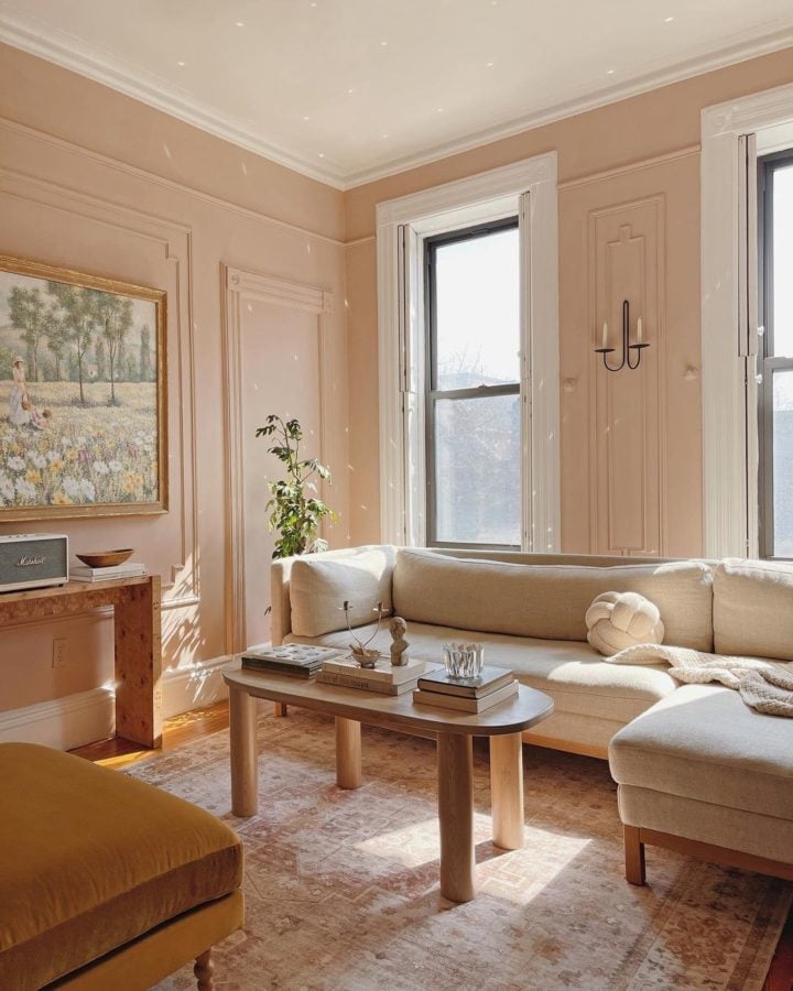
A pale pink wall can look childish if the room leans too sweet. Pair it with clean, modern shapes and natural textures. In this living room, soft pale pink walls surround a curved cream sofa and an oval coffee table, creating a seating area that feels open. Wood tones in the furniture and natural light keep the pink grounded.
The wall sconce adds a soft glow that picks up the warmth in the pink without making the room feel like a nursery. A large artwork on one wall provides a visual anchor. The plaster finish on the walls adds texture, so the color never looks flat or too sweet. The pale pink becomes a backdrop that lets the curves and natural materials take center stage.
Bedroom with Off-White Walls and Rattan Nightstands
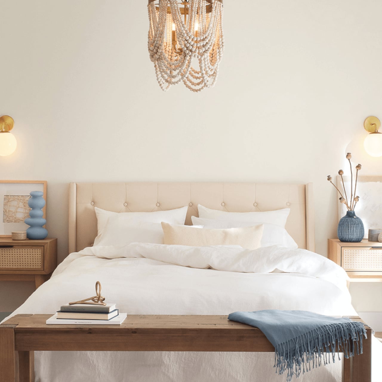
The off-white walls in this bedroom let the materials do the talking. The tufted fabric headboard adds a soft, plush texture, while the rattan nightstands bring a natural, woven element. The beaded chandelier hangs above the bed and catches daylight. The symmetrical nightstand placement gives the room a balanced look, and the linen bedding adds a casual layer. The wood bench at the foot of the bed offers a spot to sit and a place to layer a throw. The off-white walls hold all these textures together without competing with any of them.
Cozy Bedroom with Cream and Beige Neutral Palette
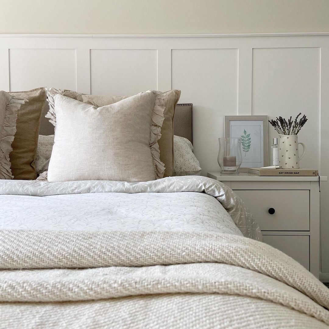
This bedroom proves that a neutral palette can still feel layered and interesting. The cream wall paneling and beige bedding create a warm, cohesive base. The ruffled pillow detail adds a soft, romantic touch without breaking the calm. A ceramic vase with lavender on the nightstand brings in a natural element and a subtle scent. The wood nightstand and soft ambient light keep the room from feeling sterile. The bed is centered in the room, with the nightstand on one side for a slightly asymmetrical layout. The cream and beige tones let the textures of the linen bedding and wood furniture stand out.
Terracotta Accent Ceiling in a Transitional Bathroom
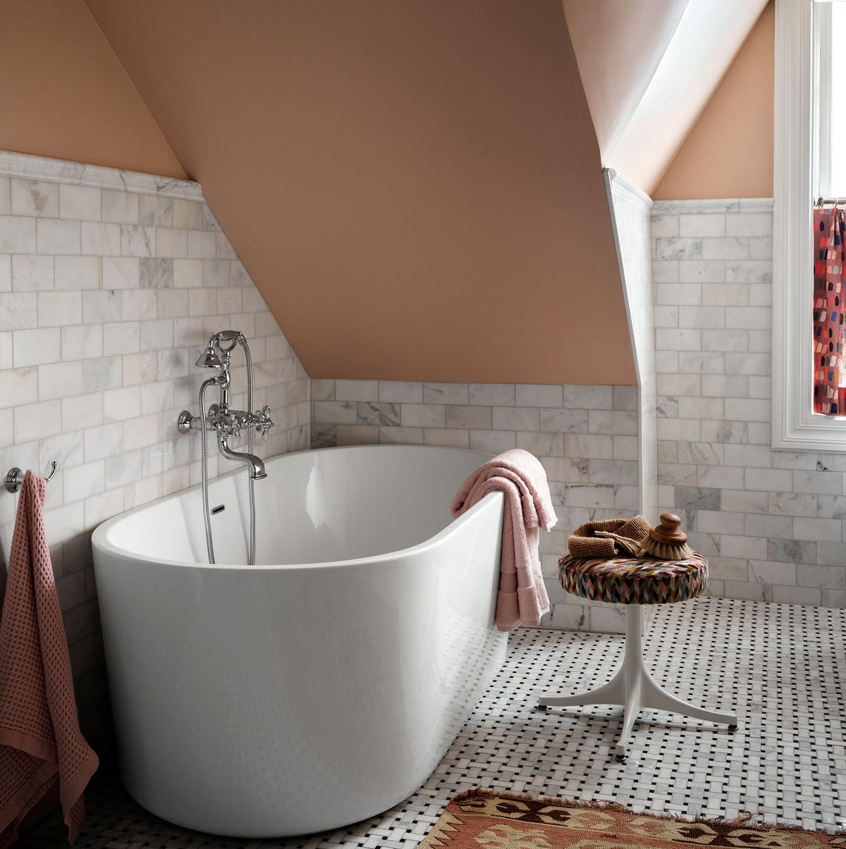
A painted ceiling is a low-commitment way to add color without overwhelming a room. In a transitional bathroom, the warm terracotta ceiling draws the eye upward and makes the space feel taller. The freestanding clawfoot tub sits in the corner, with window light highlighting the marble tile and mosaic floor. The patterned stool and rug add a touch of personality without clashing with the ceiling.
The white and grey palette on the walls and floor keeps the room calm, while the terracotta adds a surprise element. The key is to keep the room simple so the ceiling feels like an intentional accent. The window light helps the terracotta appear warm and earthy, not too orange or bold.
Minimalist Living Area in Warm Taupe
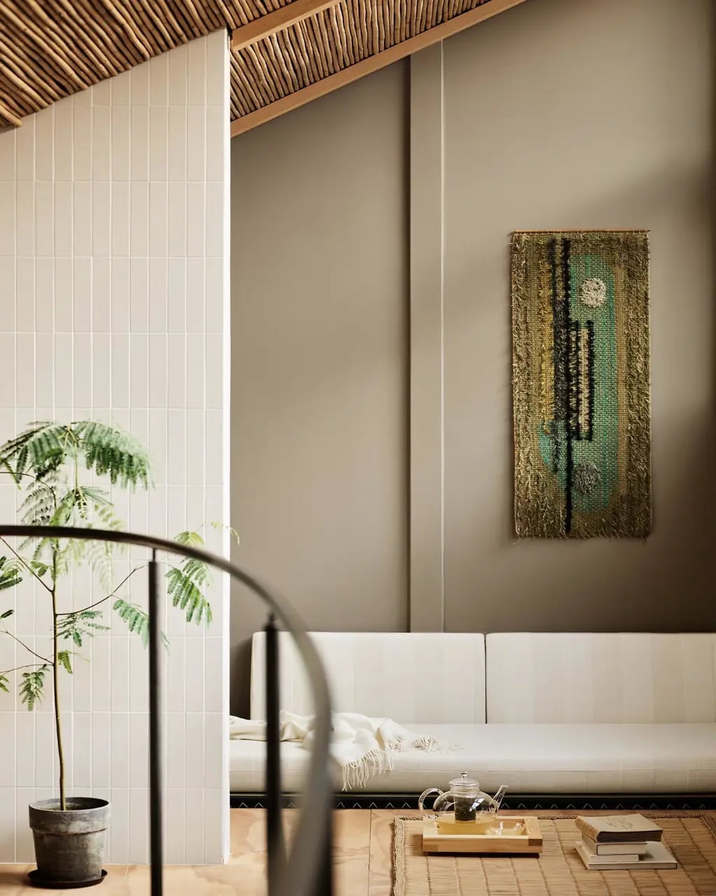
Warm taupe paint turns a minimalist living area into something that feels settled rather than stark. The matte wall acts as a neutral anchor for a room where cream, white, and natural wood are the supporting players. A woven wall hanging adds texture without clutter, and a single plant keeps the line from reading as too spare. The palette itself does the work: taupe brings warmth that a pure white or grey would not, yet it stays quiet enough to let the sofa and the tile floor hold their own space. For anyone who finds beige too flat and grey too cold, this is the middle ground that actually lands.
Traditional Living Room with Deep Green Sofa and Cream Chairs
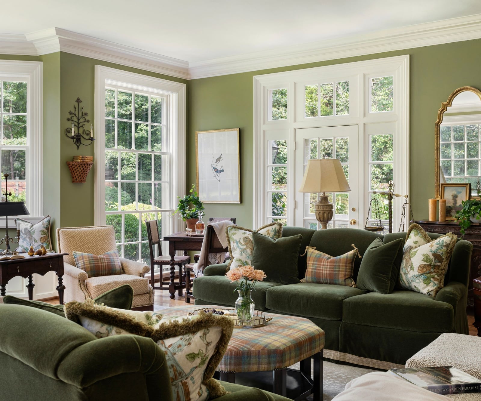
In a traditional living room with a deep green velvet sofa, the upholstery takes center stage while everything else plays a supporting role. The green sofa anchors the seating arrangement around a plaid ottoman, and cream upholstered chairs balance the weight. An ornate mirror above a table reflects natural light from large windows, and table lamps add a warm glow in the evening. For renters, swapping a built-in fireplace for a decorative mantel or a large mirror achieves a similar focal point without permanent changes. The key is choosing cream chairs that are light enough to contrast with the green but not so pale they disappear against neutral walls.
Classic Living Room with Neutral Cream Walls and Taupe Sofa
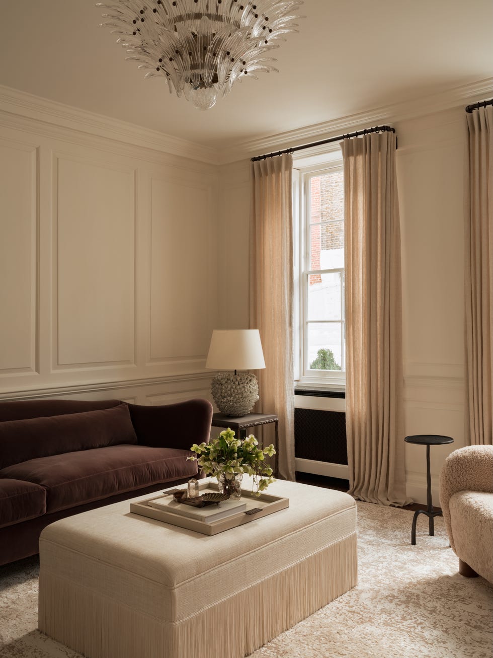
Neutral cream walls are often the safe choice, but paired with a taupe sofa the combination gains real presence. The taupe is a deeper, more grounded version of the wall color, creating a cohesive look. A fringe-trimmed ottoman adds visual weight at the center, and an armchair in a slightly lighter linen keeps the seating group from stacking too dark. The chandelier introduces a touch of formality without competing.
The material mix is what lifts this beyond basic. Plaster finishes on the walls give the cream a subtle texture that flat paint cannot match. A marble coffee table or side table adds a cool, polished surface against the soft velvet and linen. Daylight keeps the taupe from turning muddy, so check how the shade reads at different times of day before committing.
Elegant Living Room in Soft Pale Pink with Gold Accents
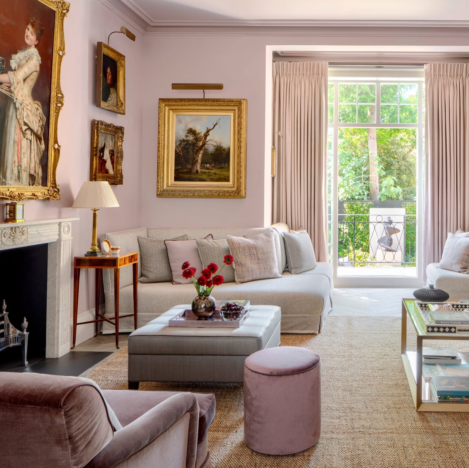
Soft pale pink paint on the walls creates a backdrop that feels both refined and approachable in this elegant living room. The color works as a warm neutral when balanced with cream upholstery and grey accents on the sofa and armchair. Gold accents on a coffee table or in the frame of a large oil painting above the fireplace pick up the warmth in the pink without tipping into sweetness. Wall sconces and a table lamp add layered light that keeps the room well lit after dark. The trick is keeping the pink muted enough that it feels like a grown-up choice.
Modern Farmhouse Bedroom with Neutral Cream Walls and Beams
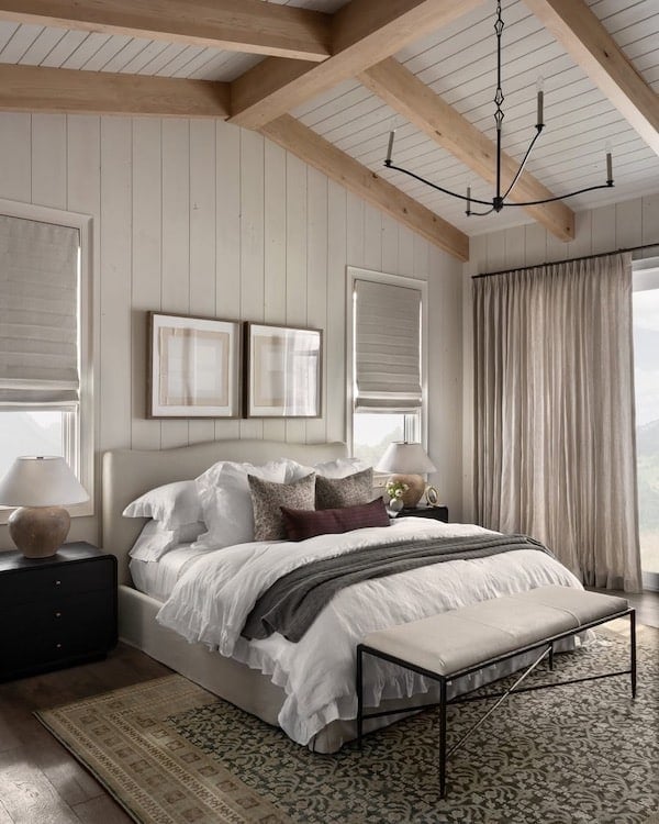
Neutral cream walls are the obvious choice for a modern farmhouse bedroom with a vaulted wood beam ceiling because the beams already carry the visual weight. The cream keeps the room bright without competing with the natural wood. A symmetrical layout with a centered bed, matching nightstands, and lamps on each side reinforces the calm, orderly feel that farmhouse style does best. A bench at the foot of the bed adds a practical spot for setting down a blanket or a tray. The chandelier hangs low enough to read as a statement but high enough to clear the line of sight. For a bedroom already rich in wood texture, this wall color is a quiet partner, not the lead.
Traditional Dining Room with Neutral Green Walls
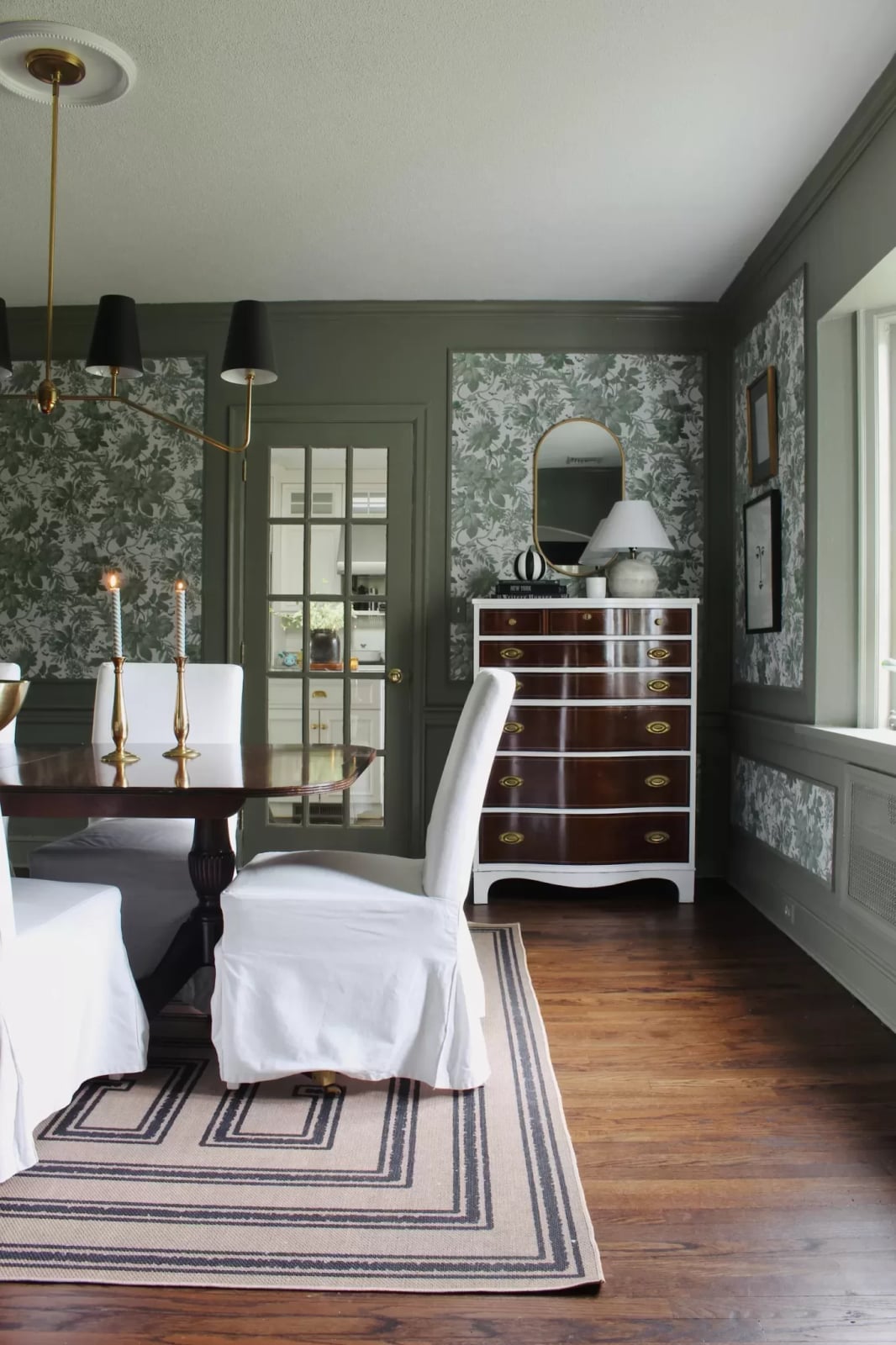
A dining room wall color sets the tone for the entire meal, so choosing a neutral green keeps things calm without feeling sterile. This traditional room uses a muted green on the walls, which pairs well with the white trim and the floral wallpaper that acts as an accent. A wooden dining table and matching chairs anchor the space, while a chest of drawers against one wall offers storage for linens or serving pieces. A window and a chandelier above the table provide balanced illumination. The palette works because it uses one main color and lets the patterns and wood grain provide the contrast.
Home Office with Grey Walls and Gallery Artwork
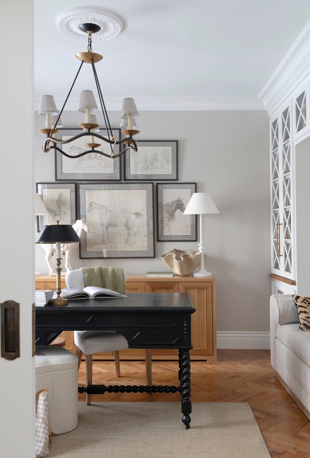
The desk sits facing the wall, which is a practical layout for focusing on a screen or paperwork without distractions. Grey walls form a neutral backdrop for a gallery wall of horse artwork, their black and white frames standing out against the muted tone. A wooden cabinet and a desk lamp add warmth, while the chandelier overhead keeps the room feeling polished. The palette of grey, wood, black, and white is easy to maintain because mixing in color through art is simpler than repainting an entire room.
Dining Area with Light Neutral Walls and Marble Table
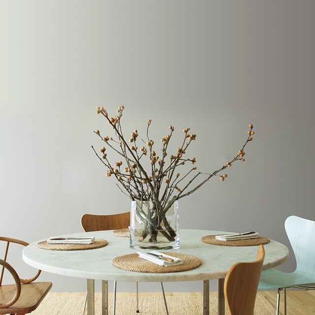
In a compact dining area, the round marble table becomes the focal point against light neutral walls. The beige and grey palette keeps the room airy, while the wood chairs and a rattan accent add texture. A vase with dried branches on the table adds height without cluttering the surface. Natural daylight from the window makes the marble top gleam. The mix of marble, wood, glass, and rattan works because the light wall color lets each material stand out without looking busy.
Modern Entryway with Warm Beige Walls and Bench Seating
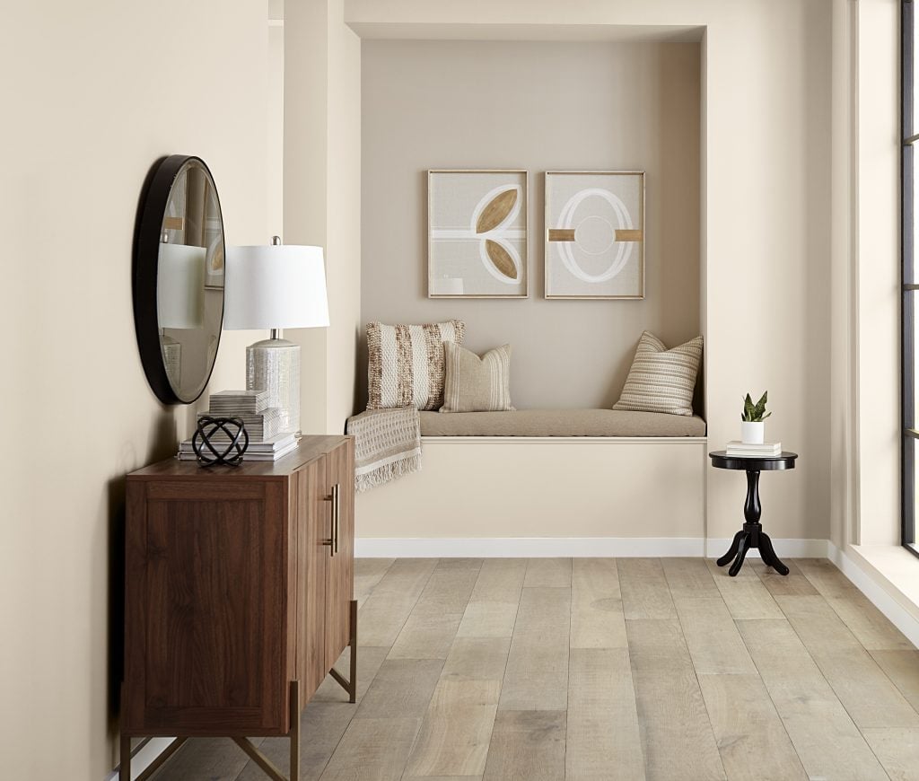
A warm beige entryway can feel cozier than a stark white one, but it still keeps the space open. A cabinet on the left offers storage for keys and mail, while bench seating in an alcove provides a spot to sit and put on shoes. A round mirror above the bench reflects light from a nearby window, making the area feel larger. A side table on the right holds a lamp for ambient light. The neutral paint color ties the different zones together, so the entryway reads as one cohesive space rather than a collection of furniture.
Transitional Dining Room with Light Cream Walls
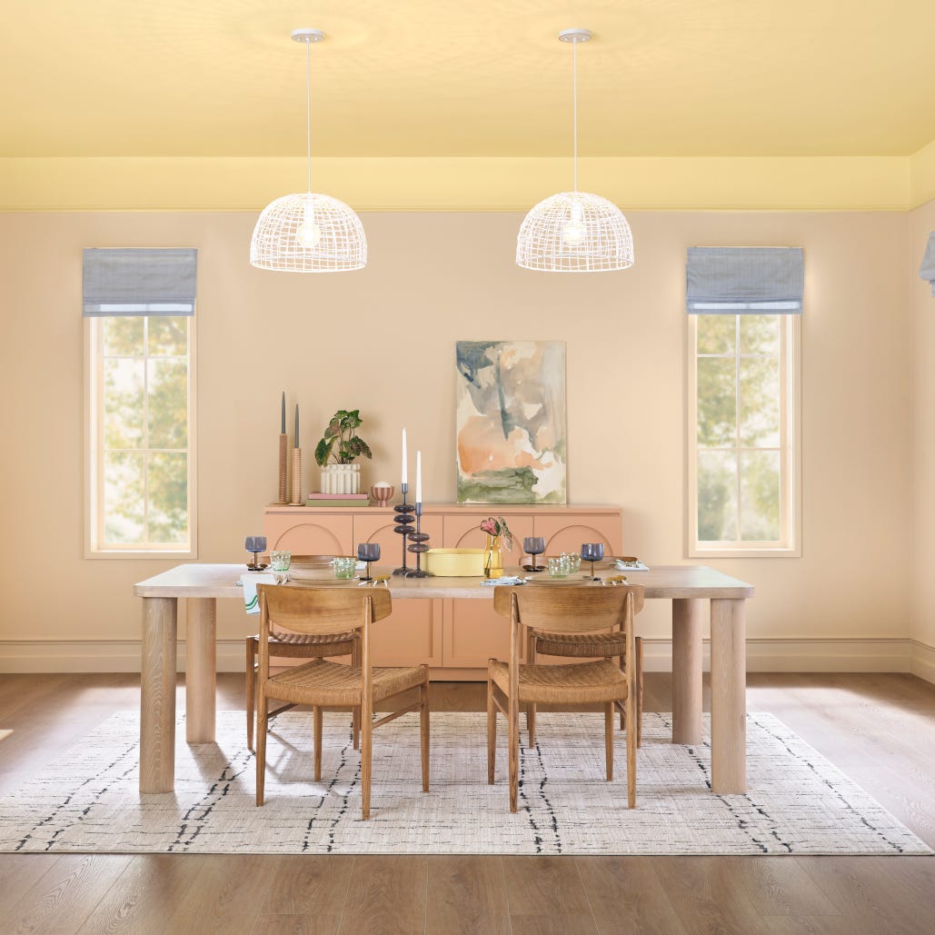
A precise observation about this dining room is that the light cream walls allow the peach painted sideboard to stand out without clashing. The dining set sits centered under pendant lights, with the sideboard against one wall offering storage for dishes and glassware. Blue accents in the woven chairs and the wood tones of the table add depth. The transitional style mixes traditional furniture shapes with a more relaxed color palette, so the room feels dressed up but not stiff. The light cream walls are a safe choice that lets the sideboard color do the talking.
Traditional Living Room in Neutral Beige and Cream, Natural Light
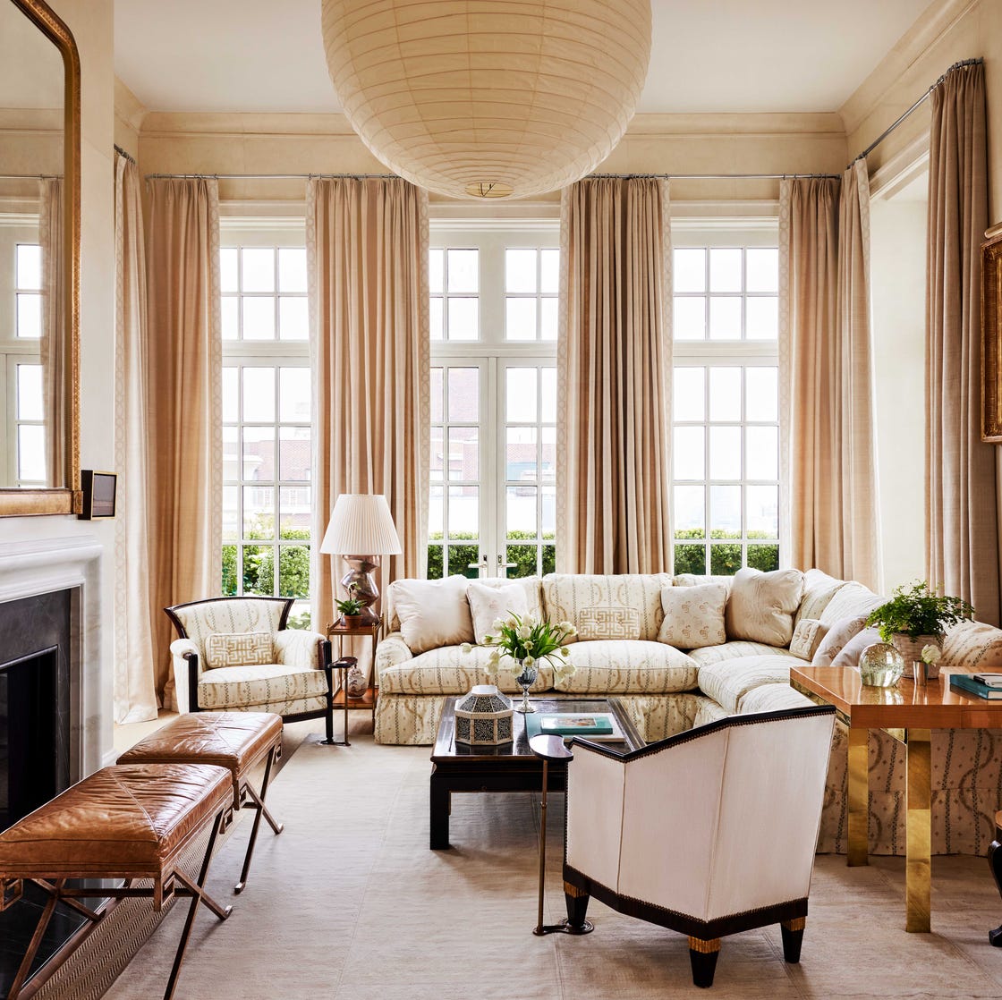
This living room proves beige and cream walls don’t have to be boring when the room has the bones for it. A large overhead light fixture anchors the seating arrangement, and natural light keeps the palette from feeling flat. The sofa, armchairs, and ottomans are all upholstered fabric pieces, and the coffee table adds a wood and metal element. The stone fireplace surround and metal accents give the room texture. The palette here is strictly neutral beige and cream, which works when the room has enough square footage to carry it.
Modern Neutral Living Room with White Sofa and Shelving
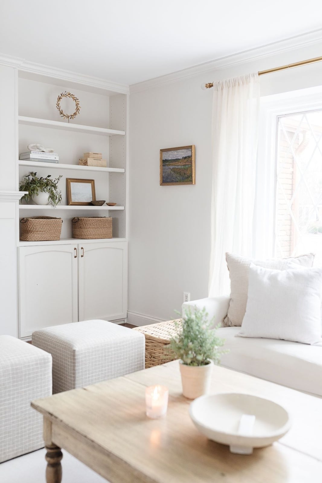
A white sofa can feel stark, but here it works because the room leans into natural materials. The built-in shelving is painted white, and the woven baskets and wooden coffee table add warmth. The wicker and glass accents prevent the room from feeling too sterile. A candle on the coffee table adds a soft light source, and the window brings in natural light during the day. The layout has the sofa facing the shelves, which makes the shelving the focal point rather than a TV or fireplace. For a renter, this setup is easy to replicate: paint the walls a warm white or beige, and bring in baskets and wood tones. The white sofa and shelves stay clean-looking when you keep the palette simple and let the textures do the work.
Traditional Living Room Corner with Off-White Walls
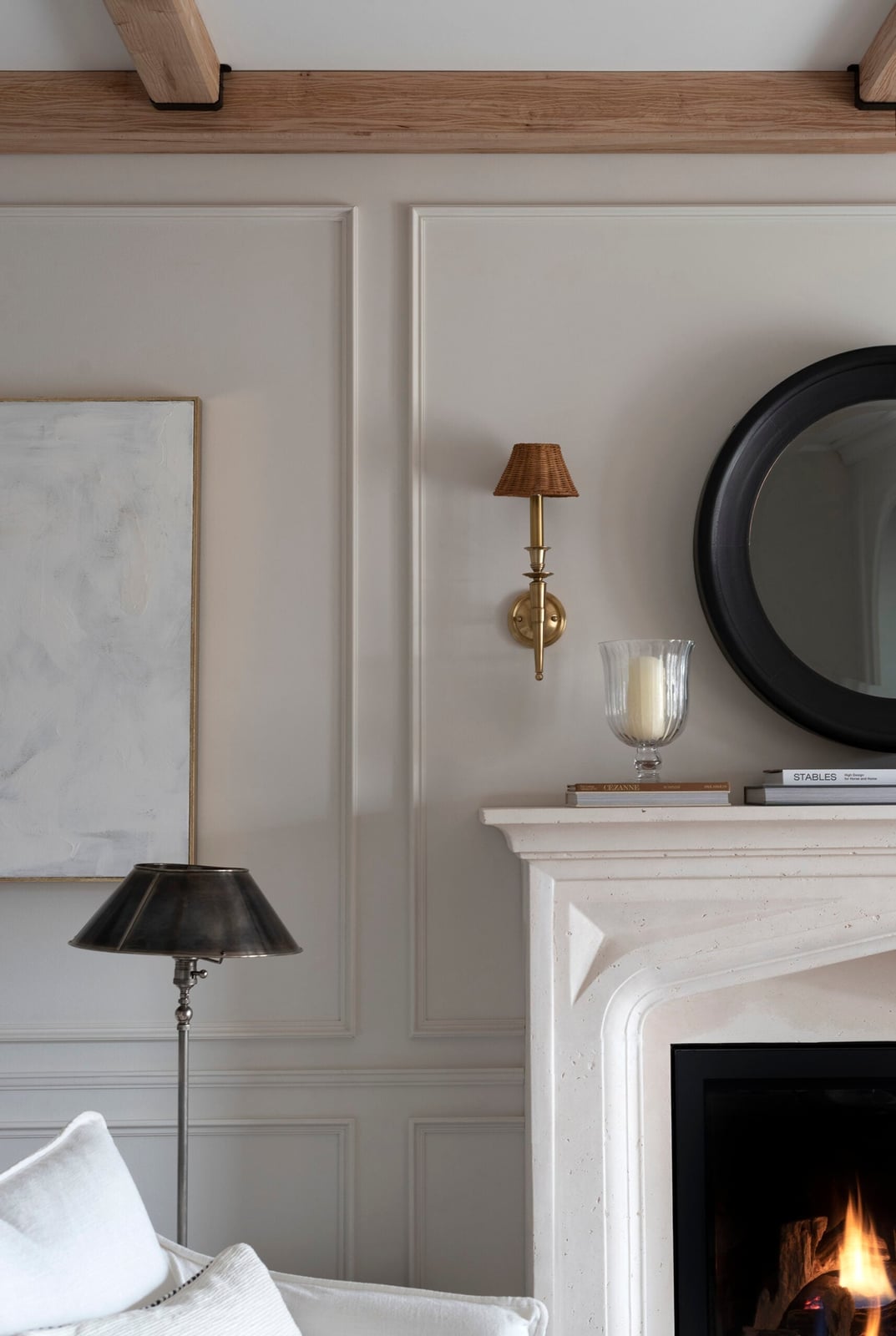
The off-white walls in this corner vignette let the ornate fireplace surround take center stage. The fireplace is made of stone, and the mirror above it reflects light from the sconce and floor lamp. The black accents in the lamp and mirror frame add contrast without making the room feel dark. The palette stays in the off-white, beige, and black range, which is a classic combination for a traditional living room. The wood floor and metal details on the fireplace tie the materials together. This setup works best when the fireplace is the hero element and the walls stay simple.
Compact Home Office with Neutral Green Walls
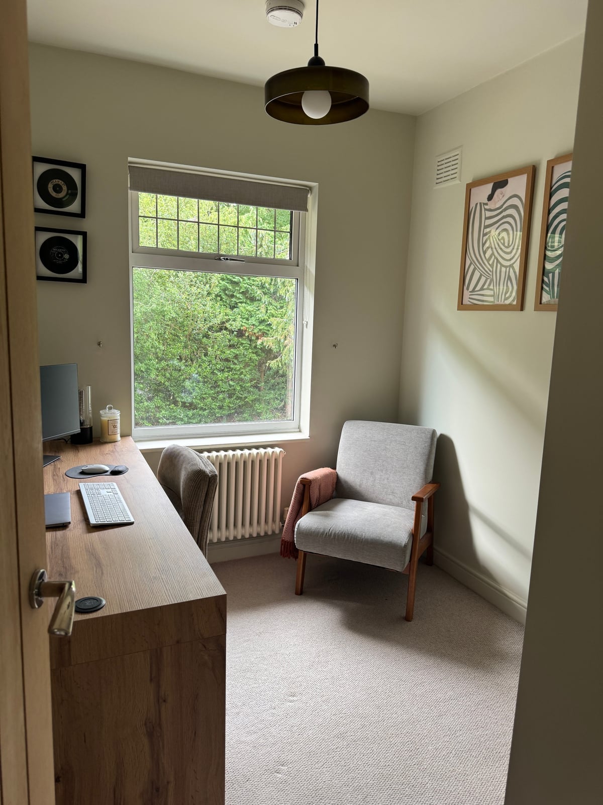
A compact home office benefits from neutral green walls because the color adds depth without making the room feel smaller. The desk and armchair are wood and fabric, and the artwork on the wall brings in a personal touch. The natural light from the window and the ceiling light keep the room bright enough for work. The neutral green palette is calm and easy to live with, and it pairs well with wood tones. For a small space, keeping the walls in a muted green and the furniture in natural materials helps the room feel larger than it is. The layout is simple: desk, armchair, and artwork, which is all you need for a functional home office.
Modern Organic Bedroom with Neutral Walls and Garden View
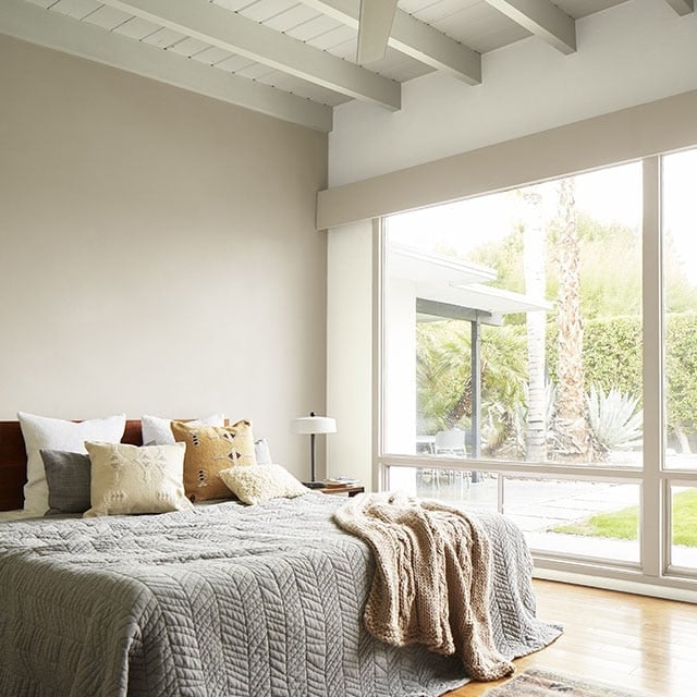
A white or off-white wall can feel cold, but here the neutral walls work because the room has a large window with a garden view. The bed is centered in the room, and the pillows and blanket are linen and cotton in beige and grey tones. The wood elements in the bed frame and floor add warmth, and the natural daylight from the window makes the room feel airy. The palette is strictly neutral, beige, and grey, which fits the modern organic style. The garden view is the standout feature, and the neutral walls let the view take center stage. For a bedroom, this setup is calming and easy to maintain, and the neutral palette makes it simple to swap out bedding or decor.
Final Thoughts
Choosing a neutral paint color is less about finding a safe choice and more about finding the right undertone for your light and your life. Cream walls read differently in north-facing rooms than in south-facing ones, so test a big swatch before you commit. Keep the finish in mind: flat or matte hides wall imperfections best, while eggshell handles high-traffic hallways and kids’ rooms. A well-chosen neutral lets the architecture, the art, and the afternoon sun do the work. That is the whole point: a color that steps back so the room can step forward.