Paint color sets the tone of a room faster than any other element. The right shade can make a space feel polished, calm, or dramatic without a single piece of new furniture. This article collects 29 classy paint colors that work across living rooms, bedrooms, and beyond.
Each look keeps the wall color as the hero, with the rest of the room playing a supporting role. Whether you lean toward deep blues, soft pinks, or earthy greens, these examples show how a single color choice can anchor an entire space.
Deep Blue Walls Create a Timeless Living Room
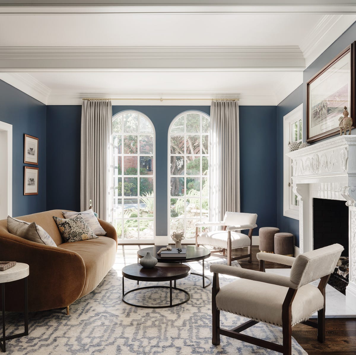
Symmetry anchors this room, with the fireplace as the center point and arched windows balancing each side. The deep blue walls wrap around a curved sofa in cream, giving the space a settled, formal feel without turning stiff. Light from the windows keeps the dark color from closing the room in. A layout built around a single axis works well here because the blue acts as a constant backdrop, letting the furniture lines do the talking.
Olive Green Walls in a Traditional Living Space
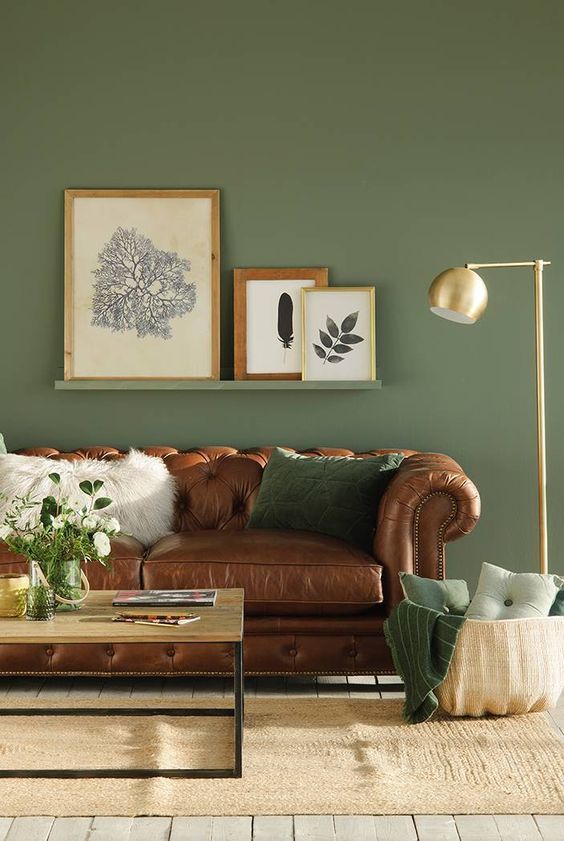
Olive green walls read as neutral but carry more presence than beige or gray. A tufted leather chesterfield sofa in brown anchors the room, while gold tones in the floor lamp and a woven basket add warmth without clutter. The green does not compete with the leather; it sits behind it, letting the sofa’s shape stand out. The palette here works because it stays within a narrow range of earth tones, with cream and brown acting as the bridge between the wall color and the furniture.
Dark Green Walls with Wood Paneling
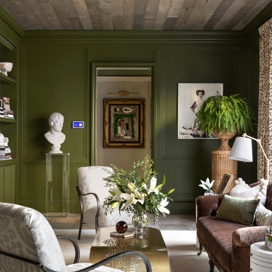
Can a dark wall color make a room feel larger rather than smaller? It can when the finish has texture. The wood paneling here is painted in the same deep green as the wall, so the surface reads as one continuous material rather than a pattern of vertical lines. The sheen is flat, which absorbs light and softens the boundary between wall and ceiling. A pair of armchairs in a lighter fabric and a glass coffee table keep the seating area from feeling heavy. Built-in shelving breaks up the green with the objects on display, giving the eye places to rest.
Rich Terracotta Walls for an Opulent Living Room
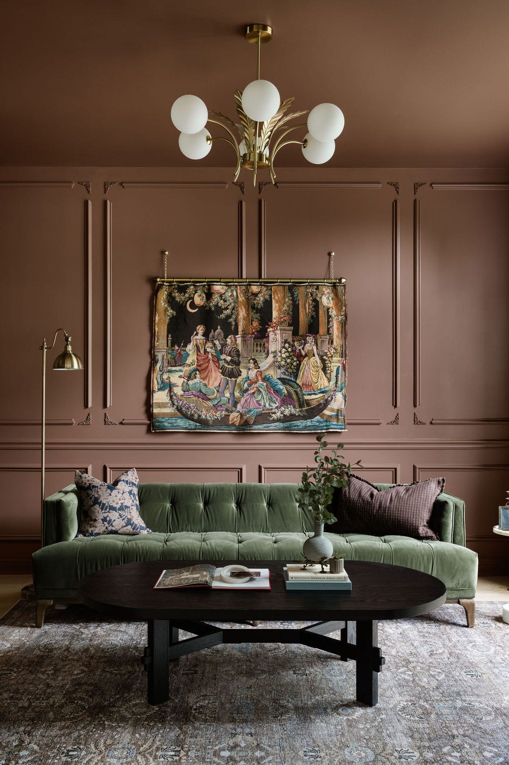
A velvet sofa in a muted green sits against terracotta walls, and the combination works because the two colors share a similar depth. The chandelier and floor lamp both cast warm light, which brings out the red undertones in the paint. A tapestry on the wall adds a layer of pattern without introducing a new color family. The room feels opulent because every surface has a tactile quality, from the velvet to the wood to the woven textile.
Eclectic Living Area with Olive Green Walls
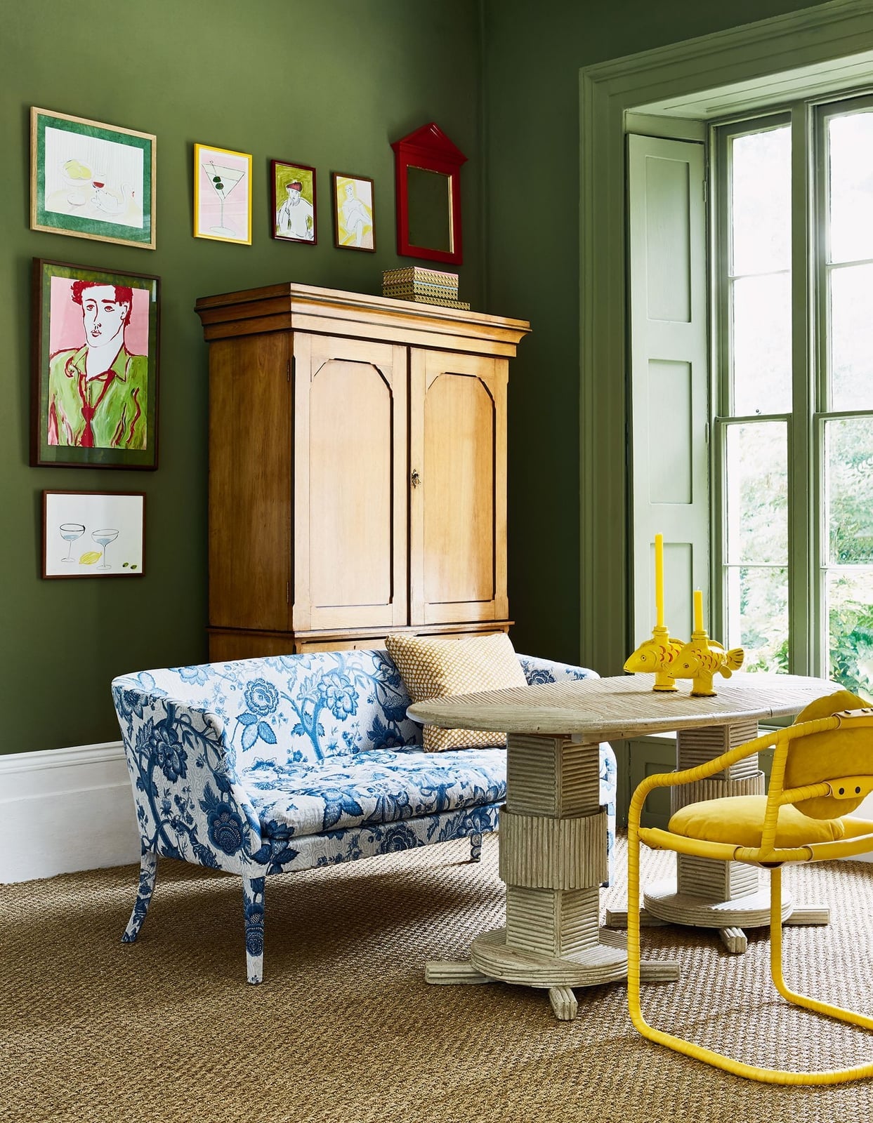
Mixing patterns works when one element sets the palette and everything else follows. Here the olive green walls stay quiet while a blue and white patterned sofa takes center stage. A yellow accent in the artwork and a white cabinet keep the look balanced. The green acts as a visual rest stop between the busy sofa and the framed pieces on the wall. The overall effect feels collected because the wall color is the one constant across the room.
Green Trim and Arched Bookshelf Niche
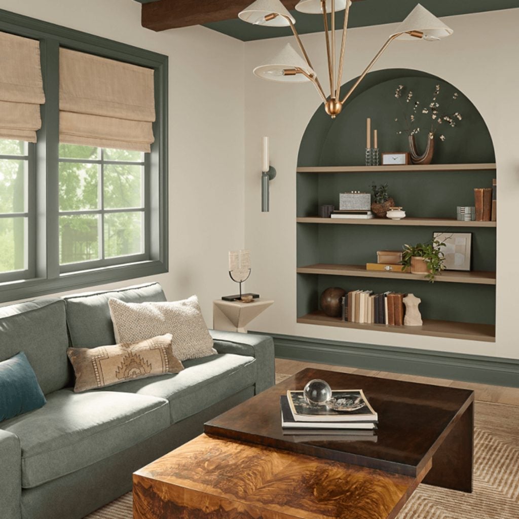
Wallpaper the whole alcove instead, and you would still have a focal point, but the painted arched niche here does the same job with less material cost and no pattern matching. The olive green trim frames the opening, and the same color on the back wall turns the alcove into a shallow stage for books and objects. A cream wall around it prevents a closed in feel. The wooden coffee table and sofa stay neutral so the green looks like an architectural feature, not a color experiment. For a renter, this is a weekend project: paint one wall and the trim around a built-in or a freestanding bookcase, then reverse it before moving out. No wallpaper to strip, no paste to scrape.
Pale Pink Walls in a Cozy Traditional Bedroom
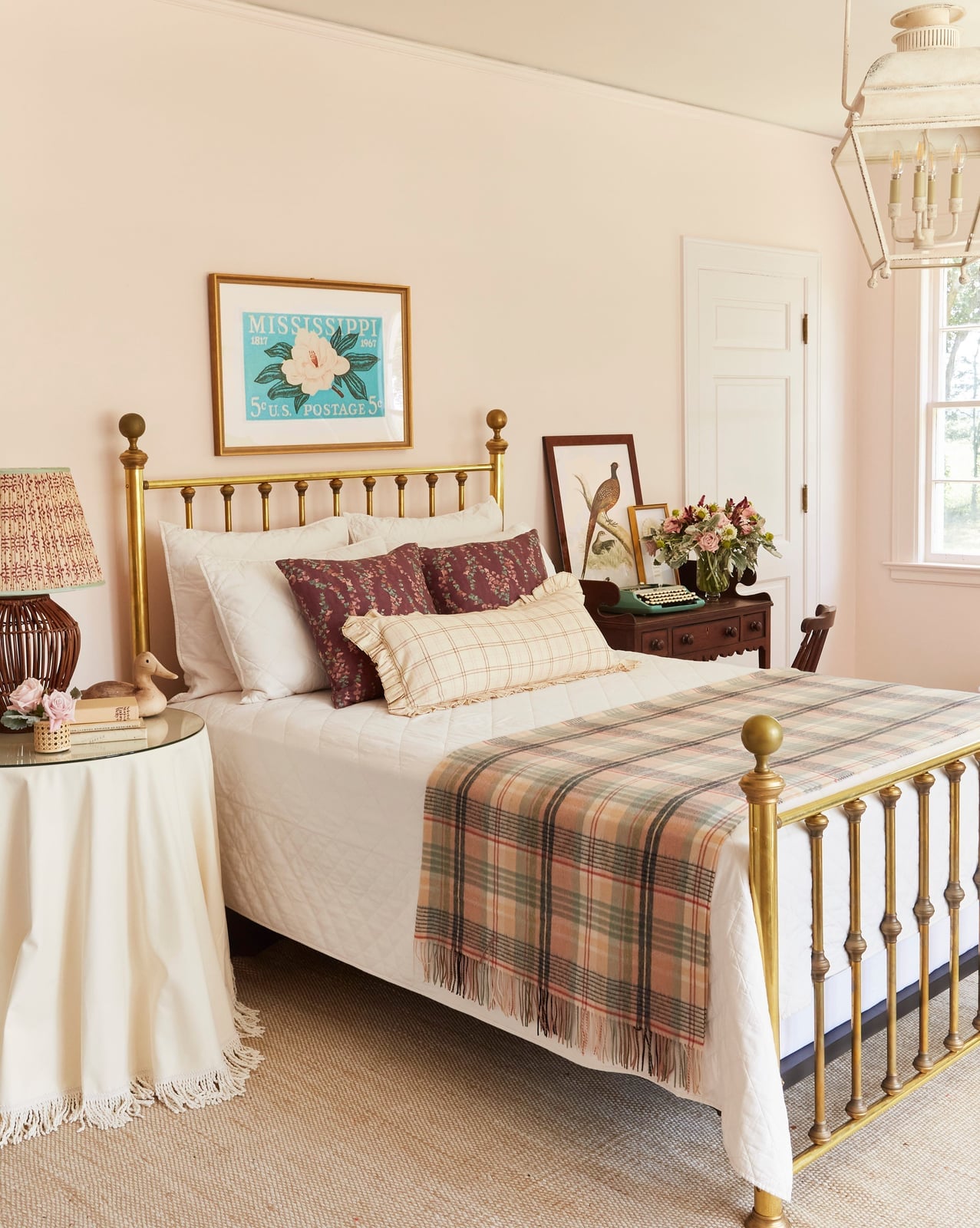
Pale pink walls read as a warm neutral in this bedroom, not a girlish pastel, because the brass bed frame and plaid throw bring weight and texture. The chandelier adds a formal note that keeps the pink from skewing too sweet. The color sits just above white on the tonal scale, so it reads as daylight hitting the wall rather than a deliberate paint choice, until you notice how it softens the edges of the room.
Deep Red Walls in a Traditional Bathroom
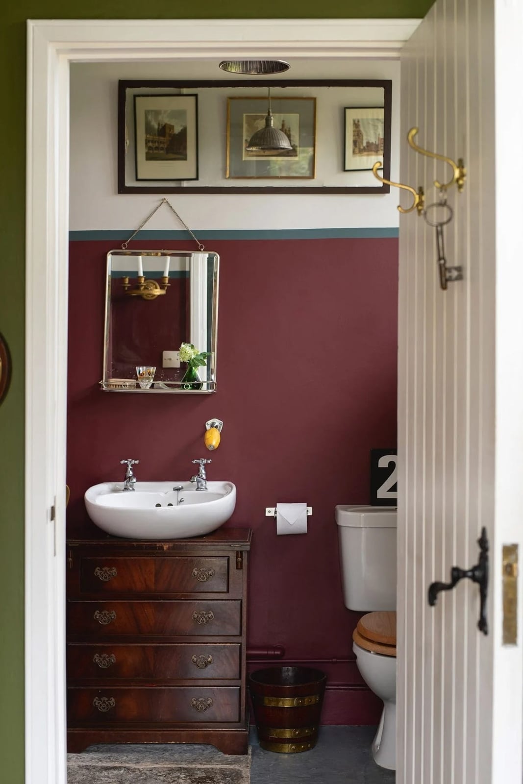
Deep red walls in a compact bathroom are a gamble that pays off here because the antique wooden vanity and brass mirror break up the color with warm metal and wood grain. The white sink and toilet provide contrast. Red is a high-saturation color, so it works best in a space that gets natural light. This bathroom has a window, which prevents the walls from turning flat and muddy. The ceramic fixtures and painted wood trim hold up fine against steam as long as the room has ventilation.
Modern Hallway with Two-Tone Deep Red Walls
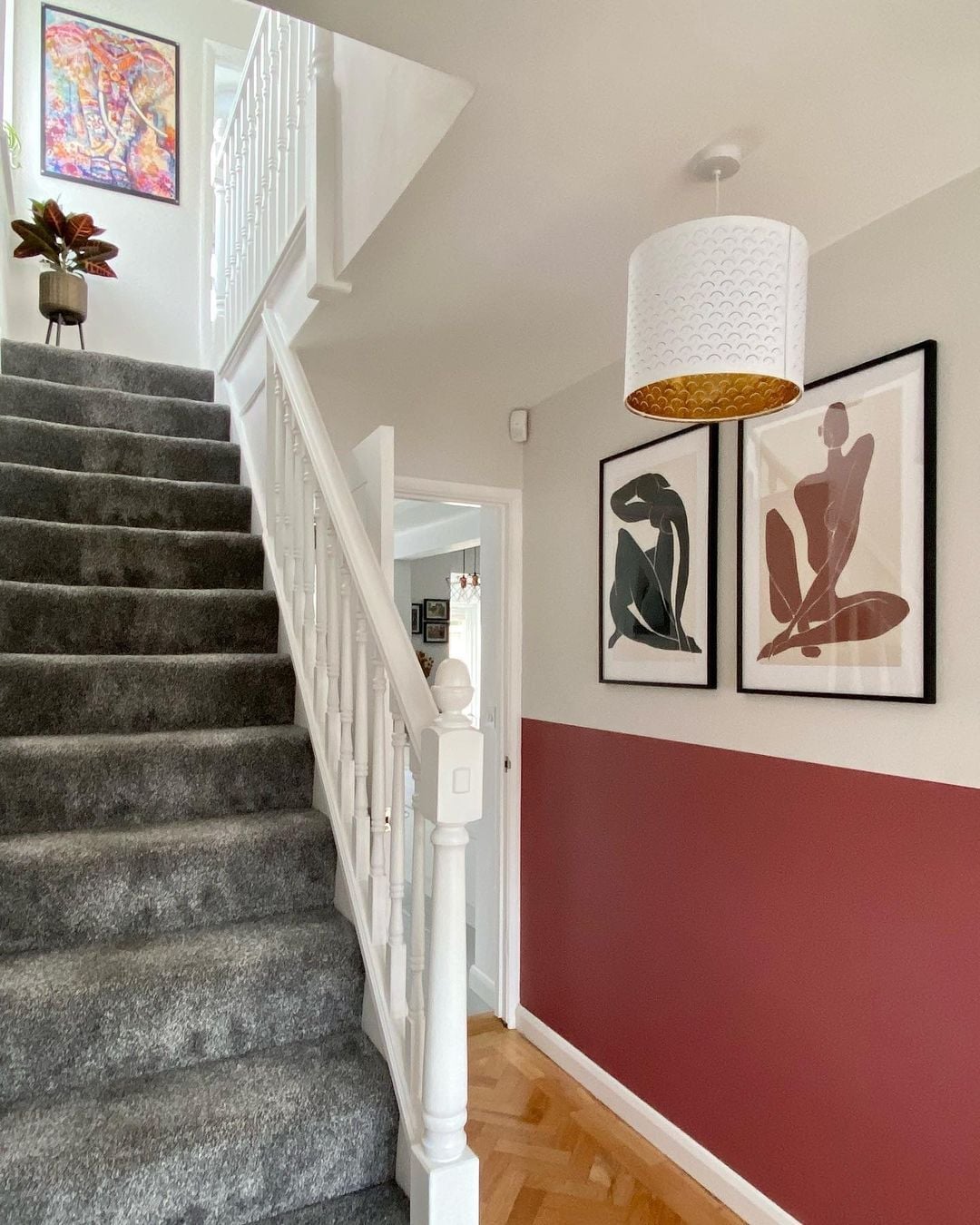
Can a hallway handle a dark color without feeling like a tunnel? This one does by splitting the wall into two zones. The lower half is a deep red, painted to about chair-rail height, and the upper half is a light grey. The stair railing and the white treads keep the eye moving upward, and the pendant light at the landing adds a bright anchor. An abstract print on the upper wall breaks up the grey and ties back to the red. Two-tone paint is a smart way to test a strong color in a high-traffic area. The darker lower section hides scuffs better than a single light color would, and the lighter upper half keeps the space from feeling closed in.
Pale Pink Walls and Green Wardrobe in a Bedroom
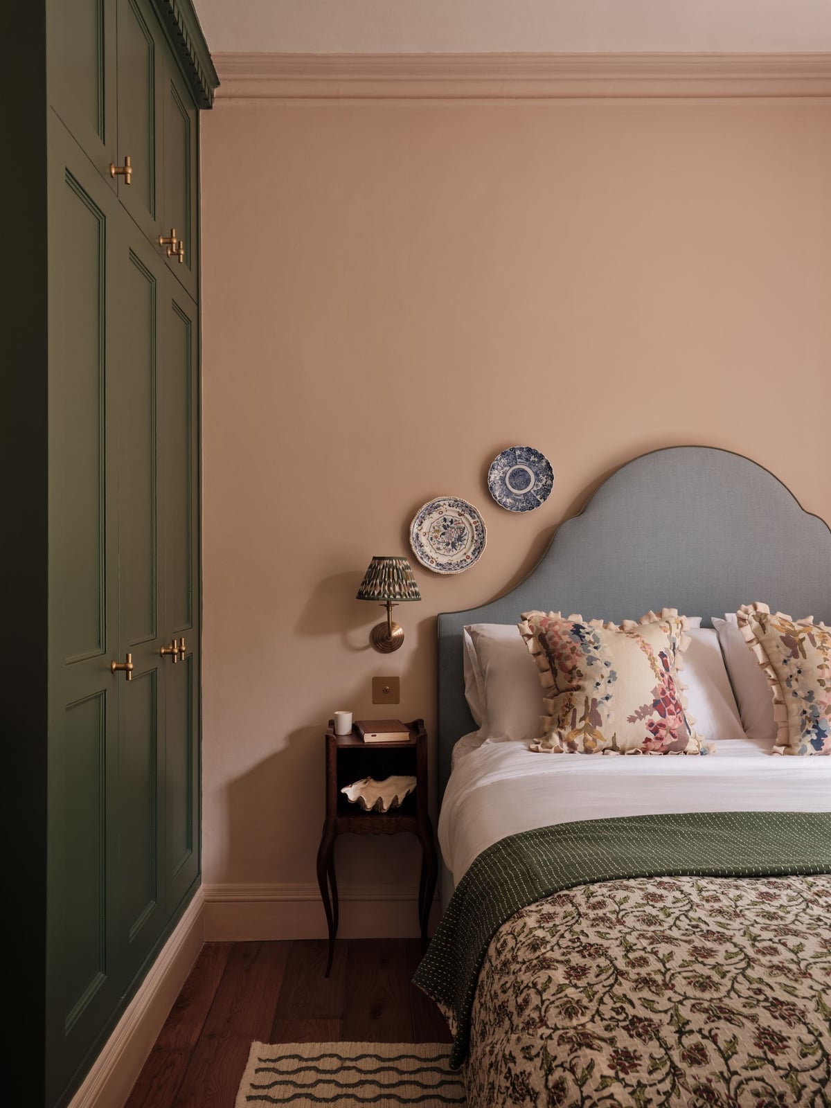
Pale pink walls and a green wardrobe create a color contrast that feels balanced, because the two hues share the same soft saturation. The blue floral pillowcases and the ceramic lamp base add small doses of pattern and metal. The wardrobe becomes the anchor piece in the room, and the pink walls soften the bulk of a tall wood cabinet. Paint the wall behind a large furniture piece a lighter color than the furniture itself, so the piece looks grounded and not looming.
Light Blue Walls with an Eclectic Gallery Wall
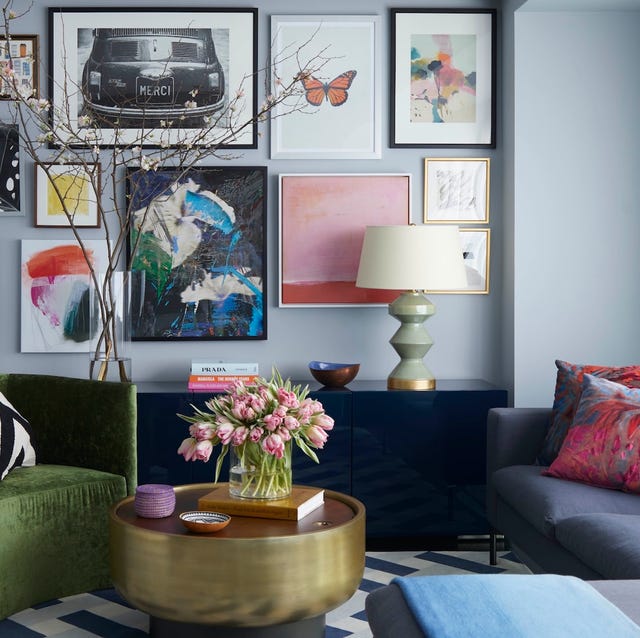
A gallery wall can unify a room without a single matching frame. Here lacquer, metal, and glass frames cluster above a navy cabinet, with the light blue wall as a quiet backdrop. The mix of pink, green, and gold accents keeps the display from becoming a uniform grid. A table lamp and natural light hit different frame finishes, so the collection changes as the day moves. Let the wall color be the neutral. Light blue is airy, not cold, and it lets a busy gallery wall hold attention without visual competition. A gold coffee table adds a reflective note that echoes the metal frames.
Deep Blue Built-in Bookshelves and Cabinetry
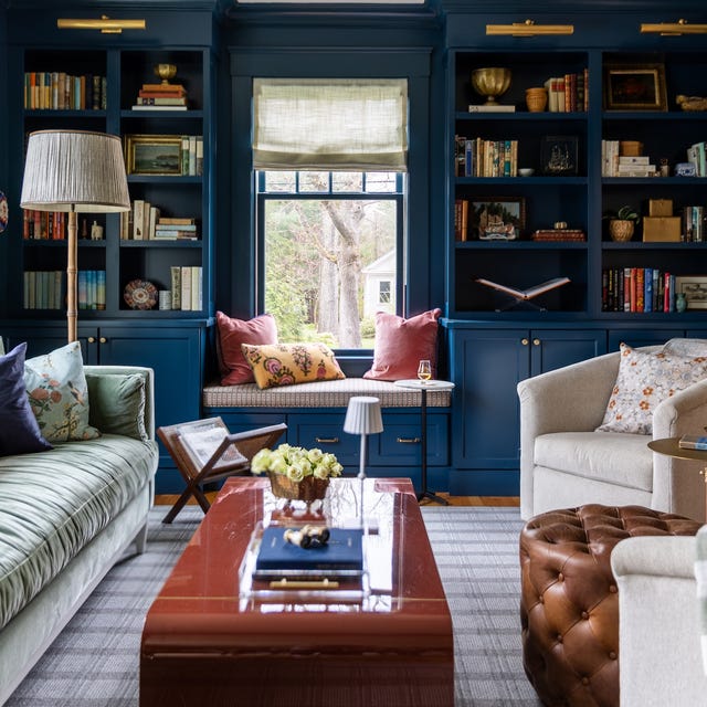
Built-in cabinetry often goes white or cream. Deep blue is the close alternative that adds weight without darkening the room. Here the bookshelves flank a window seat, with upholstered seating in cream tones and a floor lamp for warm light. The deep blue reads as a furniture piece, not just paint, because the color is consistent across shelves, frames, and lower cabinets. Overhead sconces and natural light keep the blue from feeling heavy.
For storage, the built-in approach means everything has a designated spot. Books, ceramics, and small objects sit on open shelves, while lower cabinets hide less decorative items. The blue ties the cabinetry to the room rather than letting it recede. A cream sofa and armchair with an ottoman keep the seating light, so the deep blue stays anchored without pulling the space dark.
Pale Pink Walls in a Transitional Living Room
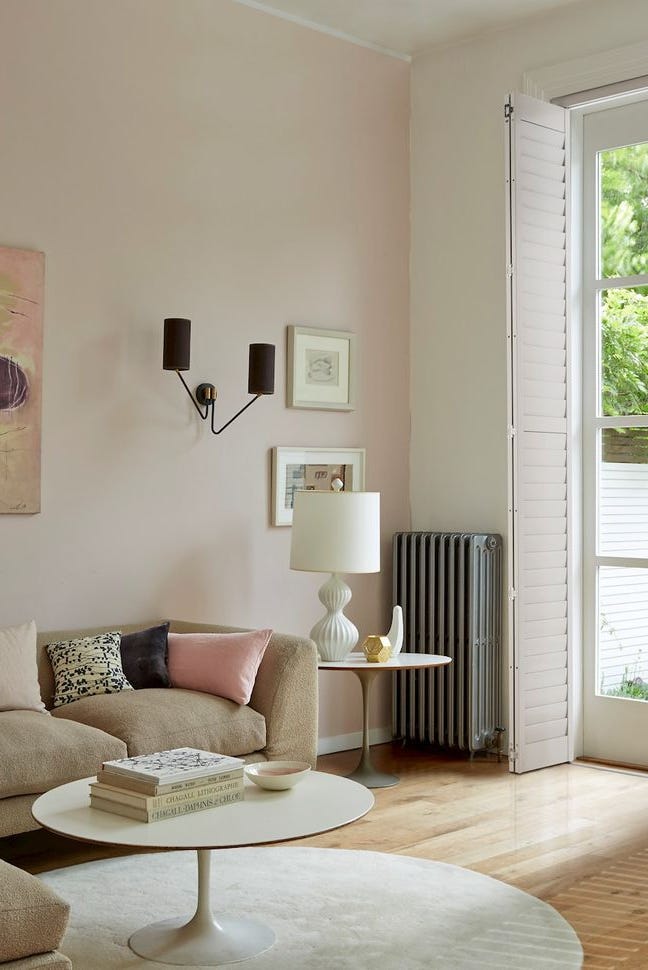
Pale pink walls sit between beige and grey here, with a sofa and side table in soft neutral tones. The paint reads as a warm neutral rather than a girlish shade because the fabric, metal, and wood pieces lean transitional. A wall sconce and natural light hit the walls evenly, so the pink stays subtle. The palette is a mix of pale pink, beige, and grey. What breaks the expected sweetness is the metal lamp and the wood coffee table. They ground the pink with texture and weight.
Deep Burgundy Walls and Coffered Ceiling in a Bedroom
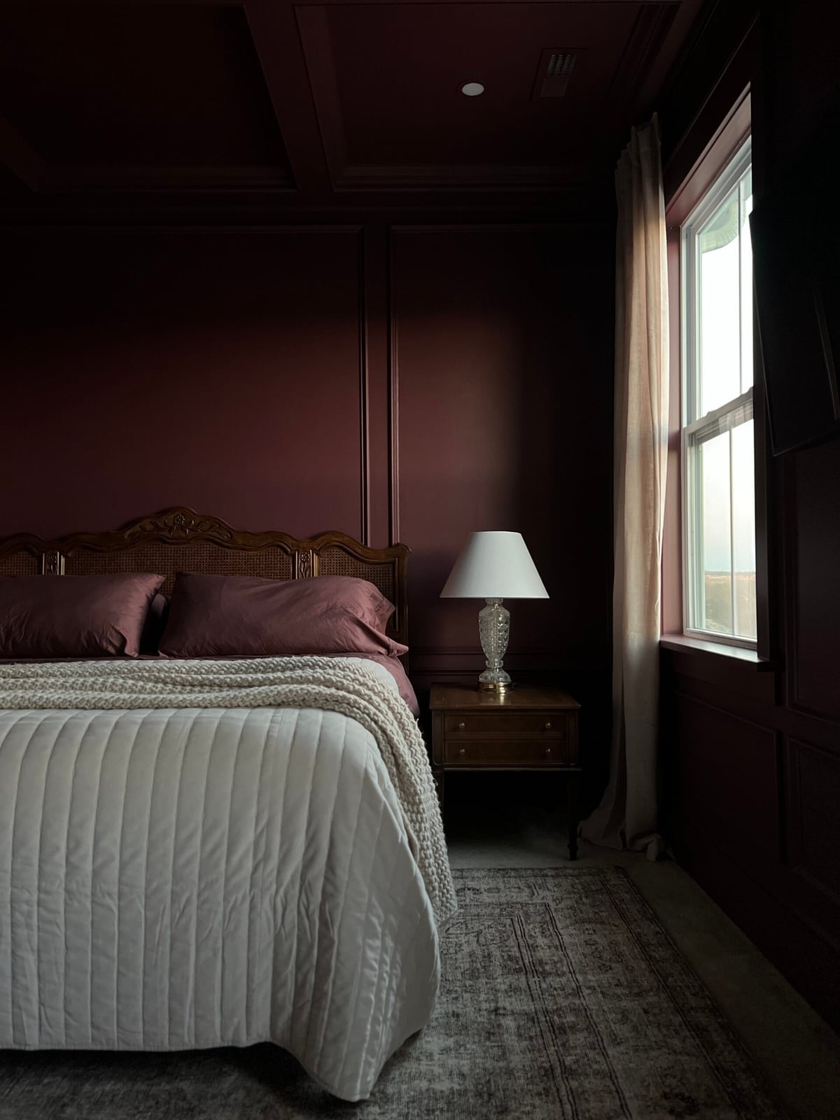
Deep burgundy walls and a coffered ceiling make this bedroom feel enclosed in the best way. The color is consistent across walls and ceiling, so the room wraps around the bed like a jewel box. A cream headboard and nightstand lamps add contrast, while a table lamp on the nightstand casts warm light that softens the burgundy. The palette sticks to deep burgundy, cream, and wood tones. Natural light from the window cuts through the deep color and prevents a cave-like feel. The bed centered on the wall is the logical anchor for such a strong color.
Light Blue Walls in a Modern Living Area
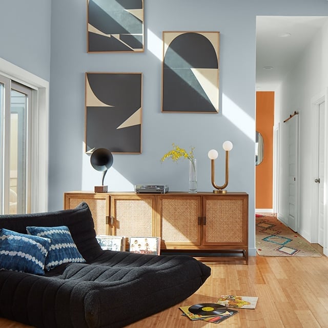
Light blue walls work best when the room stays simple. Here a sofa and a credenza sit against the wall, with a floor lamp and abstract art as the only wall decor. The palette is light blue, wood tones, and black. The wood credenza and cane details add warmth, while the black floor lamp and art frame keep the look crisp. The window hits the wall directly, so the blue stays bright.
For a modern layout, the sofa and credenza define the living area while a hallway opens beyond. The light blue unites both zones without making the open plan feel disconnected. Overhead light adds even illumination in the evening. The abstract art is the only bold element on the wall, and the light blue lets it stand out without competing.
Mustard Yellow Walls in a Modern Farmhouse Bedroom
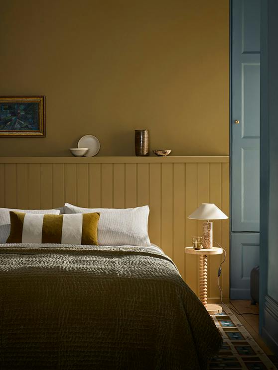
Mustard yellow walls give this modern farmhouse bedroom a cheerful anchor without going full primaries. The color warms the wood paneling and plays well with the olive green and blue accents in the bedding and accessories. A centered bed with a tall headboard keeps the layout simple, so the wall color stays the main event. If you want the same effect without repainting the whole room, try a mustard yellow throw or a single painted accent wall behind the bed.
Purple Walls with a White Fireplace in a Modern Living Room
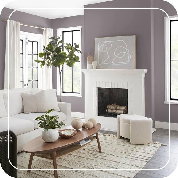
A practical rule for bold wall colors is to pair them with a large white element that resets the eye. In this modern living room, the purple walls are balanced by a white fireplace and a beige sofa. The wood tones in the coffee table and ottoman add warmth, while natural daylight from the window keeps the purple from feeling heavy. For a renter-safe version, use peel-and-stick wallpaper in a muted lavender or a deep violet removable film on the fireplace surround.
Vibrant Ochre Yellow Walls in a Dining Area
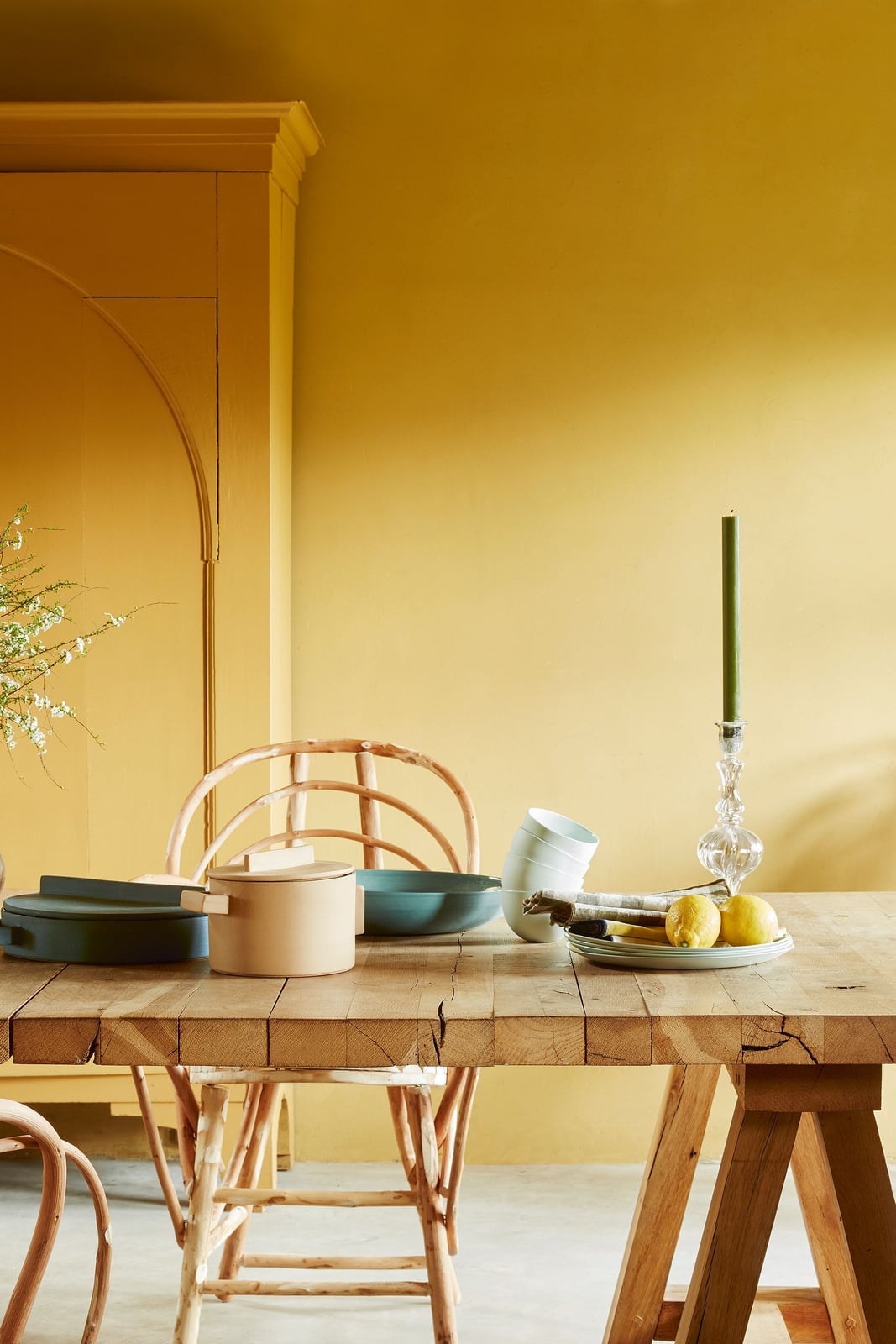
Ochre yellow walls can feel intense next to a plain white dining set, but here they get a softer partner in teal and wood tones. The modern rustic room centers a wooden table with four chairs under warm natural light, while a rattan cabinet and ceramic tableware keep the look grounded. The ochre reads as energetic rather than harsh because the beige floor and cream ceiling give the eye a place to rest. For a similar effect without the full commitment, paint the back wall of a built-in cabinet or a single alcove this shade.
Pale Blue Walls and Sofa in a Coastal Farmhouse Living Room
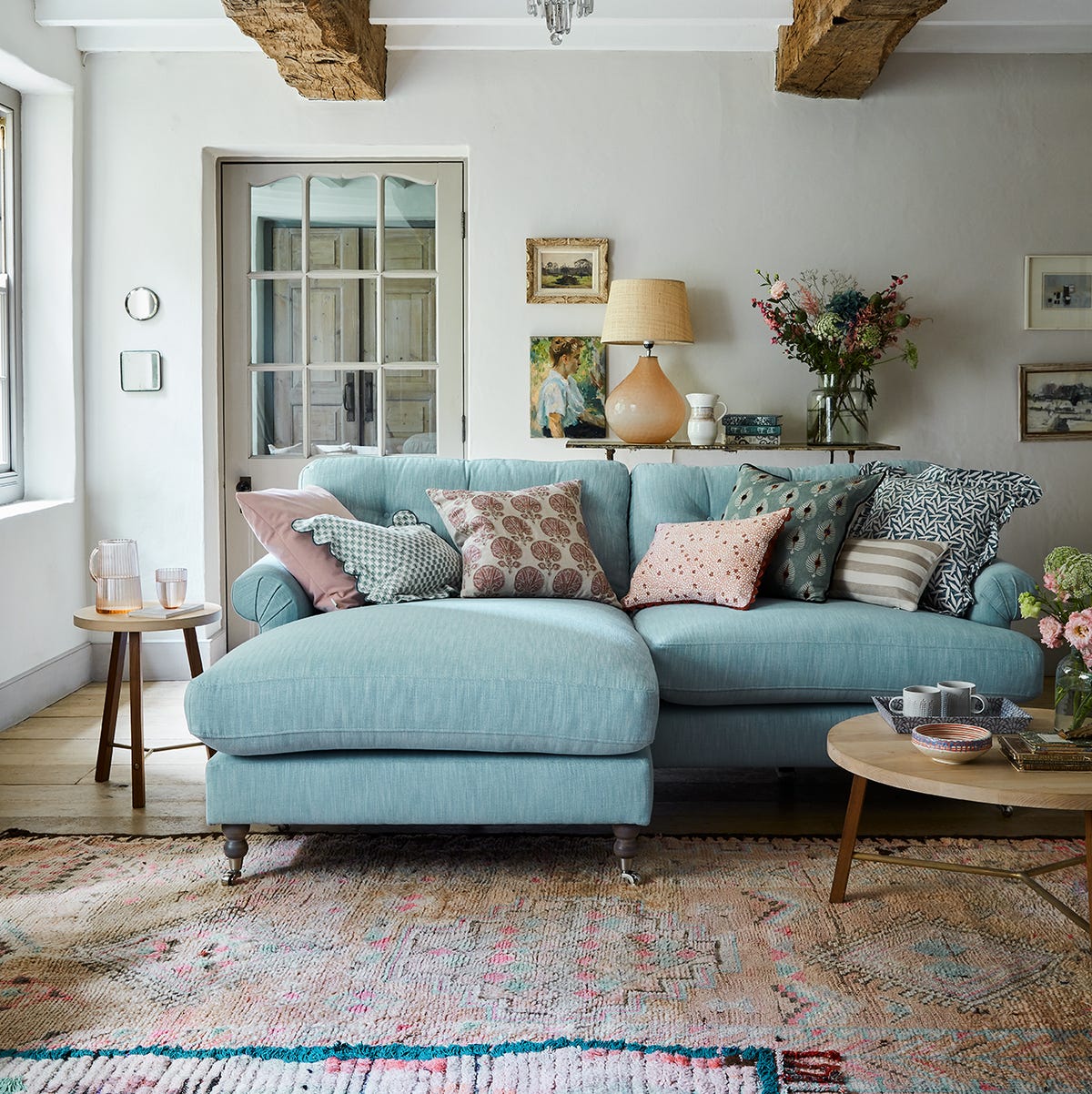
The pale blue sectional sofa and matching walls create a seamless coastal farmhouse look that feels airy rather than washed out. The cream rug and pastel pink pillow add contrast without breaking the soft palette. Linen upholstery and woven side tables keep the materials light, which works well in a room with bright natural light. For durability in high-traffic areas, choose a washable slipcover in a similar blue or a performance fabric that resists fading.
Dark Grey Walls in a Modern Home Office
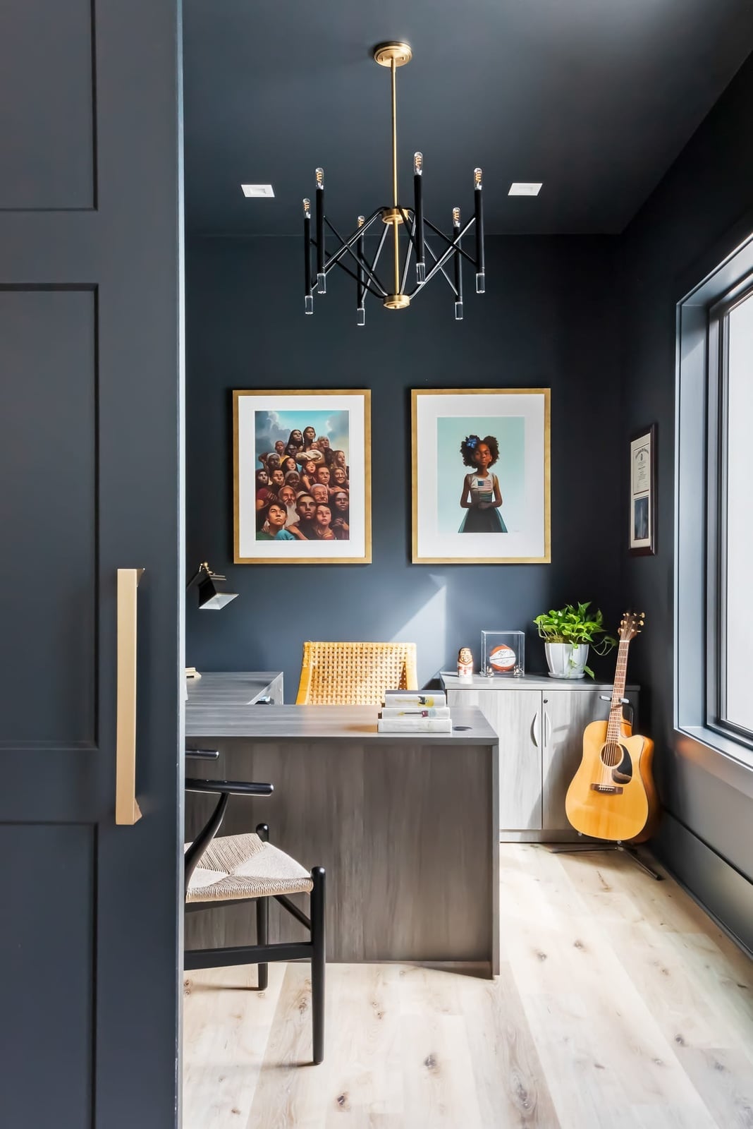
Dark grey walls in a home office can feel cocooning rather than cave-like when the room has good natural light and a mix of materials. Here, the wood desk and gold accents keep the space from turning flat, while the geometric chandelier adds a sculptural element overhead. The layout places the desk and credenza along one wall, leaving the floor open for movement. For a lighter take, paint the wall behind the desk in dark grey and keep the other three walls a soft off-white.
Textured Cream Walls in a Boho Dining Room
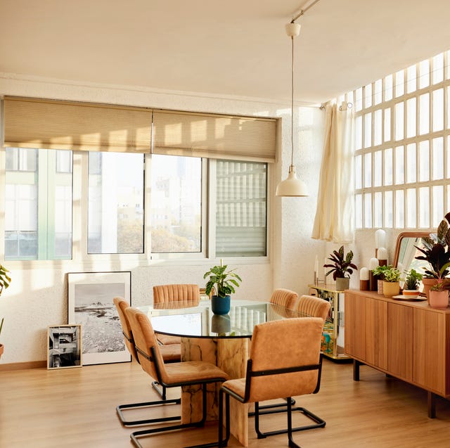
A practical rule for textured paint is that it does more than add color. It changes how light hits a wall, softening edges and making a room feel wrapped in something tactile. In this boho dining room, the cream walls have a subtle grain, like linen or coarse plaster, that catches the light differently depending on where you stand. The round table and chairs sit on a warm wood floor, with a rattan sideboard and a few potted plants adding natural texture that echoes the walls. A glass pendant hangs above the table, letting the finish on the walls stay the main event. The result is a dining space that feels grounded without feeling heavy. The texture adds enough visual weight that the room does not need busy patterns or extra decor to feel finished.
Terracotta Painted Sloped Ceiling in a Transitional Bathroom
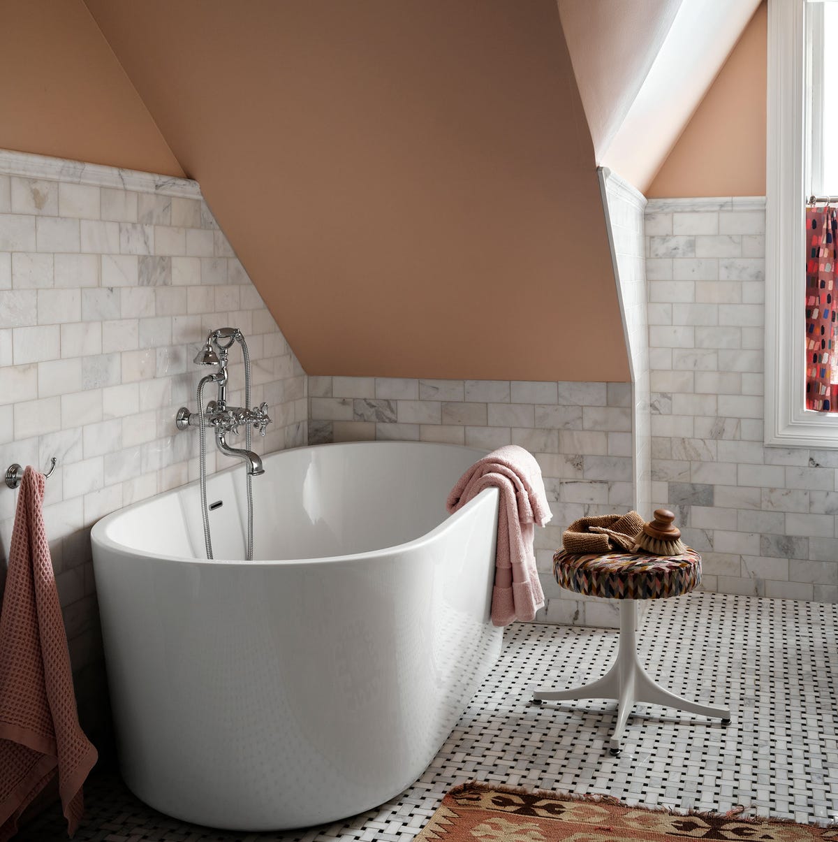
Painting a sloped ceiling a warm terracotta draws attention upward and makes the room feel taller than it is. In this transitional bathroom, the sloped ceiling is painted terracotta while the walls stay white, with grey marble tile on the floor and a black metal shower curtain rod. A freestanding white tub sits centered under the slope, with a small wooden stool and a soft rug nearby. The window light hits the painted ceiling, warming the whole space without making it feel dark. The trick is keeping everything else neutral so the ceiling stands out as a deliberate feature.
Greige Paint Color in a Modern Living Room Corner
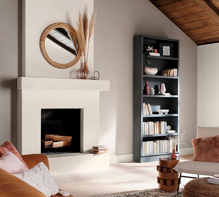
Greige works best when you lean into the gray side or the beige side, not both equally. In this modern living room corner, the greige walls lean warm, closer to beige, with a stone fireplace surround and a wood mantel. A cream armchair sits near a bookshelf, and a terracotta throw adds a pop of color. Natural light from the window keeps the walls from looking flat, while ambient room light warms the greige further. The corner feels calm and pulled together without the color competing with the fireplace or the furniture.
Two-Tone Beige and Olive Green Walls in a Dining Room
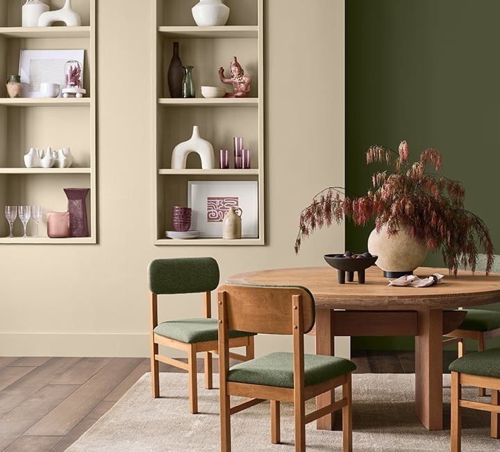
Two-tone walls can look like a decorating magazine trick, but this dining room shows how natural the effect can be. The lower half of the wall is a warm beige, and the upper half is a muted olive green, with a clean line between them that follows the height of the floating shelves on one wall. The round dining table has upholstered chairs in a light fabric, and the wood tones in the table and shelves tie the two colors together. The olive green stays earthy and not too dark. The trick to making two-tone work is choosing colors that share a similar undertone, so the transition feels smooth and not abrupt.
Serene Light Blue Walls in a Modern Living Room With Sectional Sofa
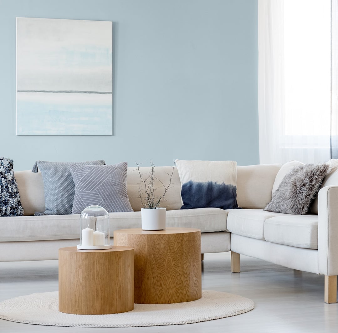
Light blue walls can make a living room feel larger and more open, especially when paired with light furniture. In this modern living room, the walls are a soft light blue, and the large sectional sofa is a pale cream, with round coffee tables in a light wood tone. Artwork hangs above the sofa, and natural light fills the room with a soft overhead light for evenings. The light blue is calm enough to let the furniture and art stand out, but it still gives the room a clear identity.
Pale Pink Walls with White Ornate Trim in a Traditional Living Room
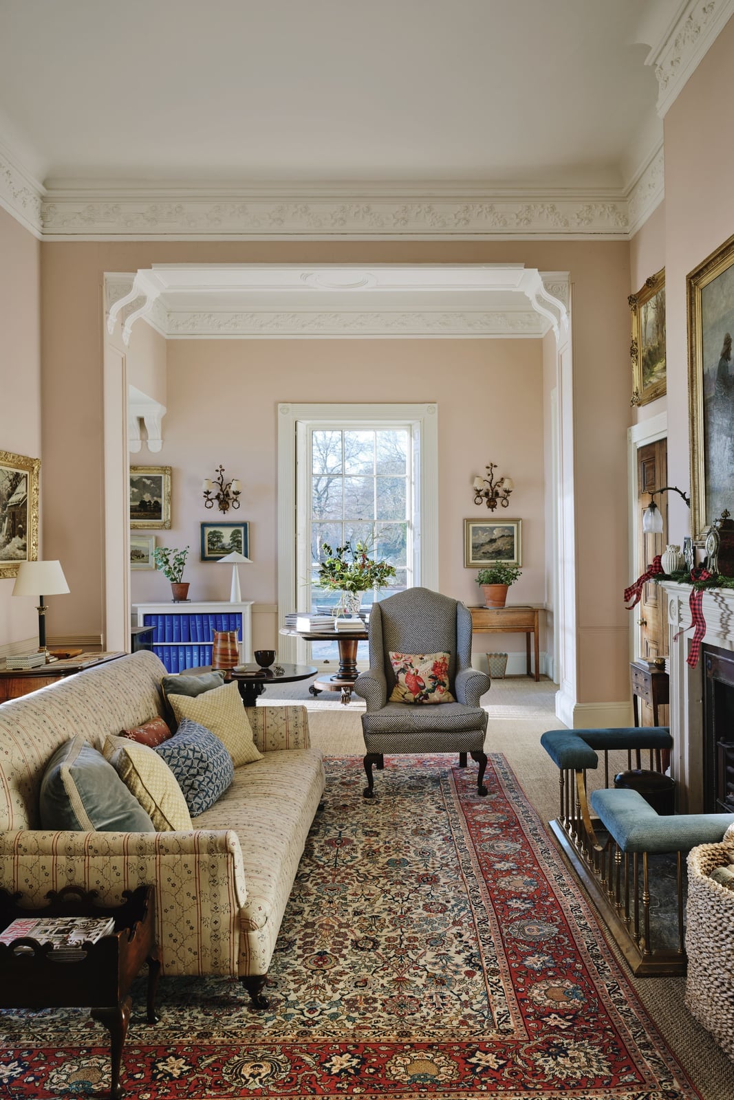
Pale pink reads as a neutral when it has enough company. White ornate trim frames each wall like a mat around a print, giving the color a crisp boundary that keeps it from feeling sugary. The traditional setting leans on real materials rather than pastels: wood, plaster, glass, and fabrics in cream, blue, and red keep the room grounded. A sofa and armchair face the fireplace, and wall sconces add warm light that shifts the pink toward beige after dark. The trick is the ratio. Pale pink covers the field, white trim holds the edges, and the furniture pulls the eye away from the paint long enough that the room feels collected, not decorated.
Warm Wood Cabinetry in a Modern Kitchen
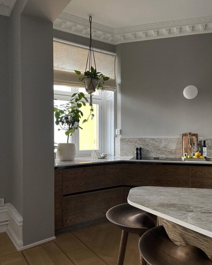
A modern kitchen often defaults to all-white or all-grey cabinetry, so warm wood is the bolder choice. Here the wood tone is the hero element, and the room stays back. Marble countertops and stone surfaces add a cool, solid counterpoint, while the grey and white palette lets the cabinetry hold the visual weight. The layout includes a functional island, and overhead pendant lights keep the focus on the materials.
For renters who cannot swap cabinets, the same effect comes from adding wood elements that are not permanent. A butcher block cart, open wood shelving, or a single wood-paneled cabinet door introduces the warmth without a full renovation. The effect relies on contrast. Warm wood against cool stone and grey walls feels deliberate. Against more wood, it would just feel brown.
Beige Painted Walls with a Blue Sectional Sofa
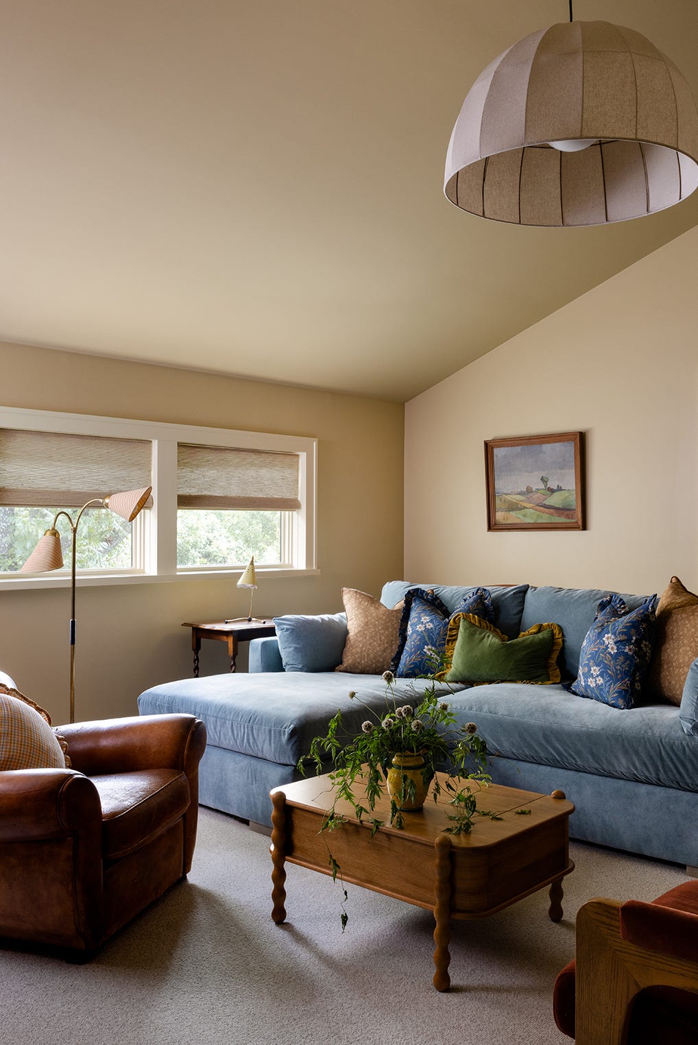
A large blue sectional sofa dominates the room, so the beige walls do not compete. They provide a quiet backdrop that lets the blue, brown, and gold accents register without visual noise. The room has natural light from windows and a floor lamp, which keeps the beige from drifting into flat or muddy territory. The palette works because the beige is a true warm neutral, not a cool greige. That warmth connects to the brown leather and gold tones in the space, while the blue sofa provides the clear contrast. The principle is anchor and support. The sofa is the anchor, and the wall color is the support. Swap the sofa for a different color and the beige would need to shift too.
Beige Walls in a Modern Farmhouse Bedroom
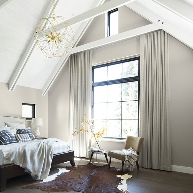
The vaulted ceiling with a chandelier draws the eye up, so the beige walls act as a quiet middle ground between the architectural feature and the floor. A large window floods the room with natural daylight, and table lamps add softer light near the bed. The palette stays beige, grey, white, and brown, with a cowhide rug introducing pattern without adding a new color. The modern farmhouse style relies on this restraint. Beige on the walls lets the wood furniture, metal accents, and fabric textures do the work. The principle is hierarchy. The ceiling is the statement, the bed and window are the focus, and the walls are the background. When each element knows its job, the room feels spacious rather than bare.
Final Thoughts
Choosing a paint color is about finding the shade that feels right for how you live. Deep blues and greens bring a room inward, making it feel cozy and intentional. Pale pinks and blues keep things light without feeling sterile. Reds and terracottas add warmth and weight, especially in smaller doses like a single wall or ceiling. Beige and greige remain reliable backdrops that let furniture and art take center stage. The best classy paint colors are the ones that still feel good a year later. Test a few samples on your wall, live with them through different light, and trust your eye.