Pink paint can walk a fine line between sugary sweet and seriously sophisticated. The trick is finding the right shade and finish to let the color do the work without overwhelming the room. These 31 classy pink paint colors show how versatile this hue can be when you treat it like a neutral or an accent, not a gimmick.
From dusty rose to barely-there blush, each look keeps the space around the color simple and lets the pink anchor the room. You will get real room examples that prove pink belongs in living rooms, bedrooms, bathrooms, and even on front doors, all without crossing into juvenile territory.
Dusty Rose Walls for a Serene Living Room
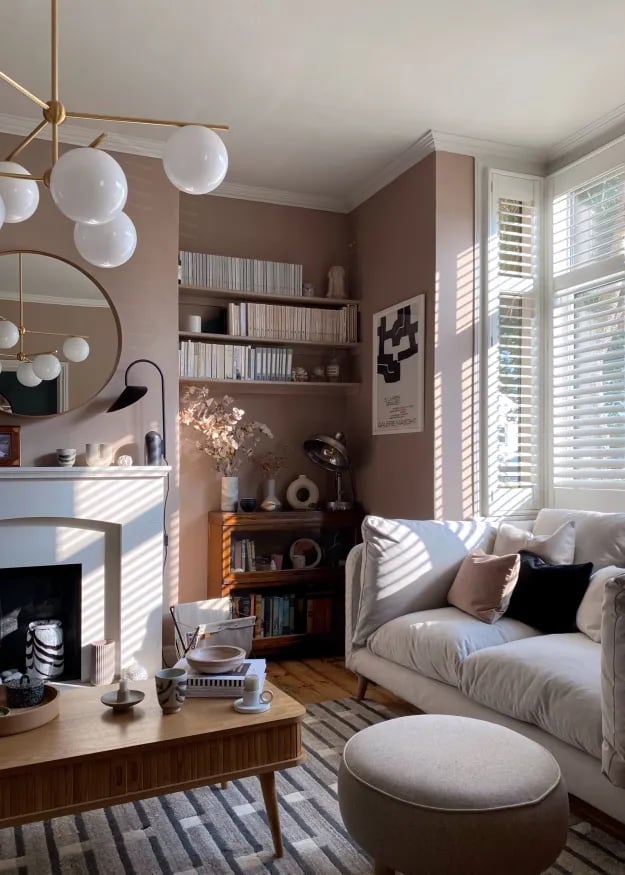
A dusty rose wall color sets a calm, grounded tone without feeling overly sweet. In this living room, the soft pink reads as a neutral against warm wood tones and natural light. The layout keeps the fireplace as the focal point, with the sofa and coffee table arranged for easy conversation. The palette stays restrained, letting the dusty rose walls and a few wood accents do the work. A single pendant light adds a modern touch without competing with the daylight.
Blush Pink Walls with Decorative Molding
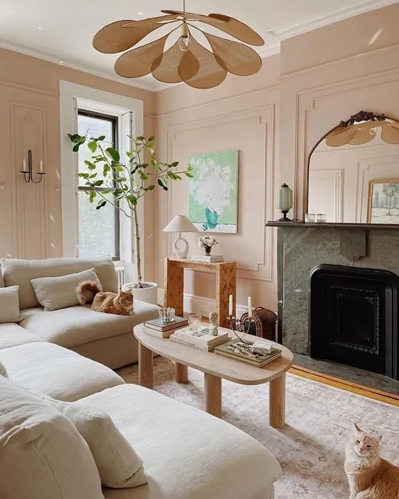
Blush pink walls with decorative molding offer a way to add structure and softness at the same time. The molding creates clear visual lines, which keeps the color from feeling too casual or one-note. In this living room, the pink pairs with cream upholstery and natural wood tones, while stone and linen add texture. Wall sconces provide a warm glow that plays against the matte finish of the paint. The sectional sofa faces the fireplace, and the oval coffee table keeps the flow open. The combination of blush pink and molding works because the color stays light and the architectural detail gives it a reason to be there.
Dusty Rose Pink Bathroom for a Calming Retreat
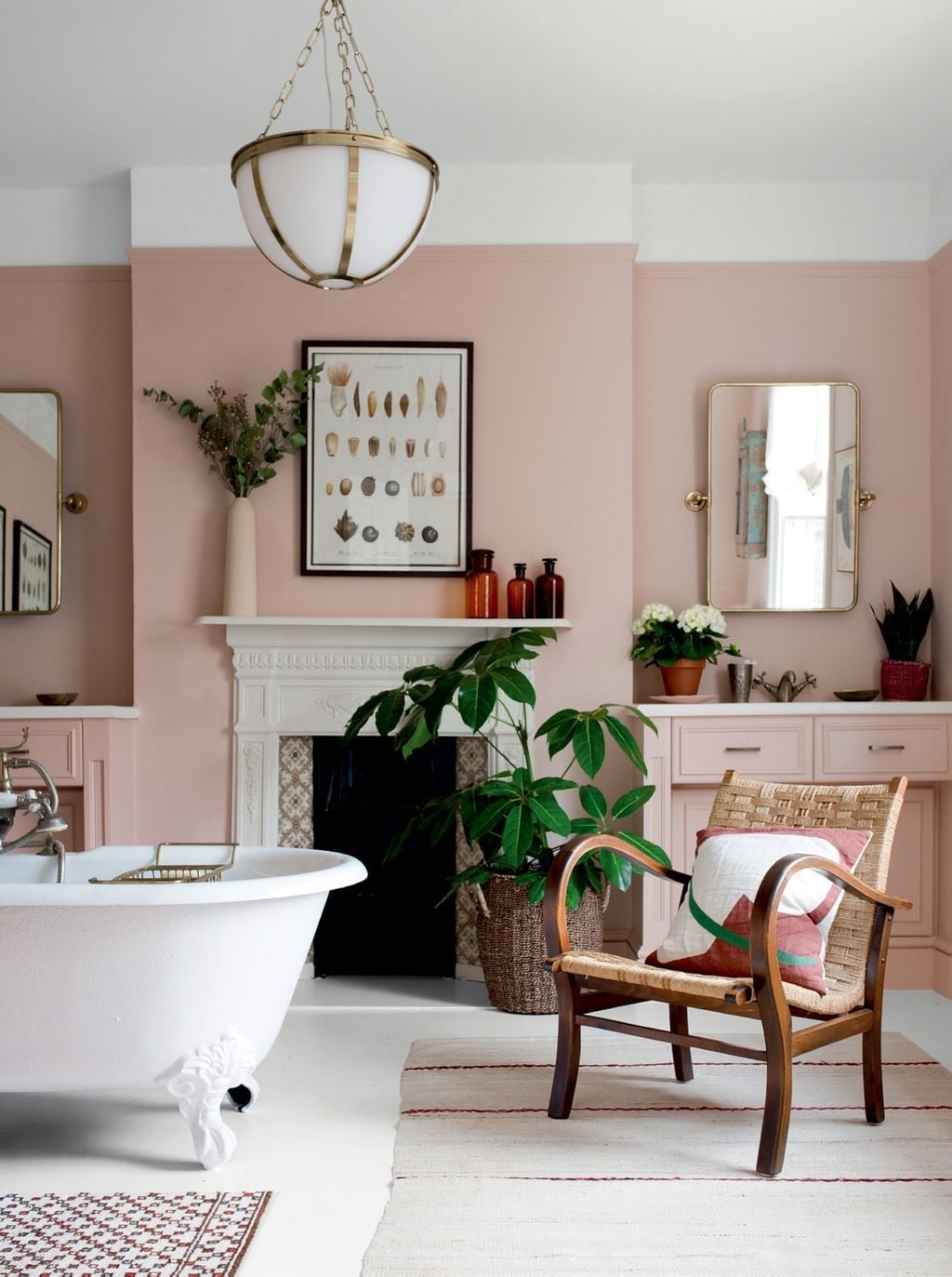
Can a dusty rose pink bathroom feel both classic and relaxing? Yes, when the shade leans muted and the materials stay clean. In this bathroom, the dusty rose paint covers the walls and the vanity, creating a cohesive look that wraps the room in soft color. White marble and tile balance the pink, while brass fixtures add warmth without going heavy. The bathtub sits as the main feature, with a chair and mirror nearby for a practical layout. Natural light from the window softens the paint even further, making the space feel calm rather than loud. The key is letting the pink be the star while keeping everything else simple. Dark wood accents ground the room and prevent the palette from floating.
Rich Pink Walls in a Traditional Living Room
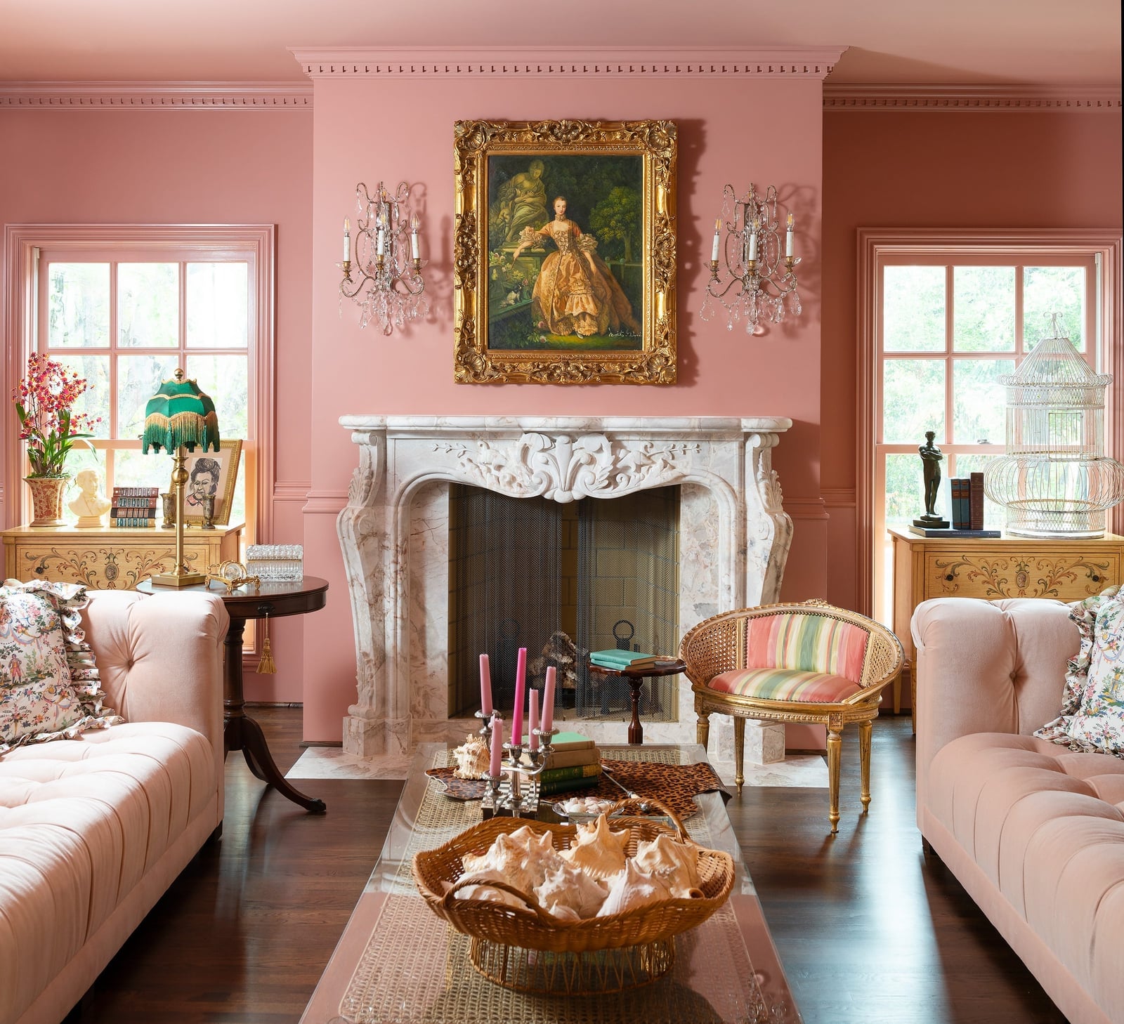
Rich pink walls in a traditional living room bring a sense of formality that lighter pinks cannot match. The deeper shade works with gold accents and marble to create a polished look. In this space, the fireplace sits centered with tufted sofas on either side, and an ornate mirror hangs above. Chandeliers and natural daylight both hit the pink walls, which shift slightly depending on the light source. The style leans on symmetry and classic materials, but the pink keeps it from feeling stiff. What defines the look is the ratio of color to neutral: the pink dominates the walls, but the furniture and trim stay light and bright.
Dusty Pink Paneled Front Door for Farmhouse Charm
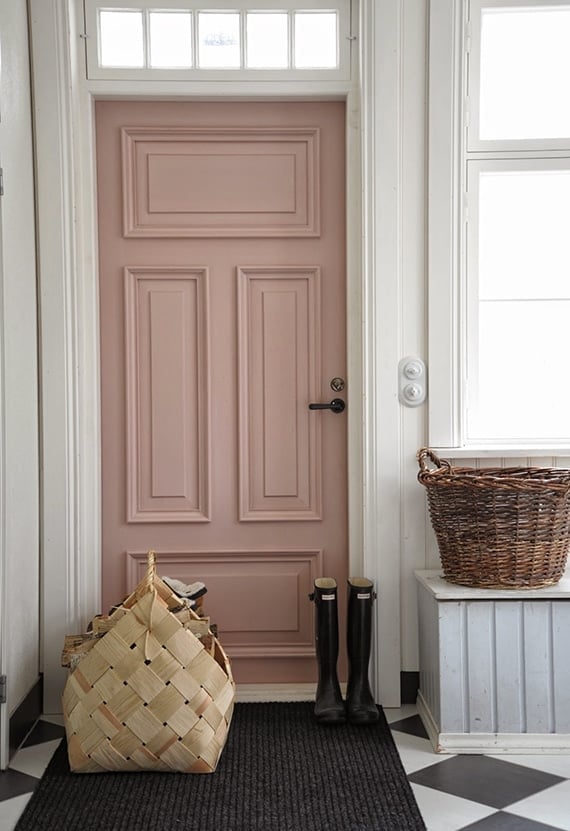
A dusty pink front door is a renter-friendly way to change the look of an entry without touching floors or walls. Paint on a paneled door can be undone before moving out, and it takes a weekend and basic tools to apply. In this farmhouse entry, the pink door sits against white trim and natural wood accents. Wicker baskets and boots by the door add a practical, lived-in feel. The dusty pink shade is muted enough to feel neutral but warm enough to stand out from beige or gray doors. It pairs well with wood tones, which keep it from reading as too pastel. The result is a front door that feels intentional and inviting, not loud.
Maximalist Bedroom with Pink Walls and Ceiling
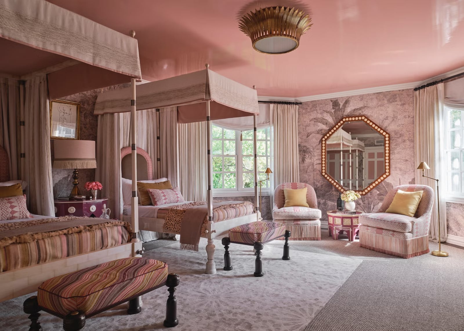
Consider skipping the accent wall. A pink ceiling paired with pink walls wraps the room in color, and a maximalist bedroom can handle that commitment. The palette here leans into pink, gold, beige, and brown, with two four-poster beds, patterned upholstery, and an ornate mirror. Natural light and lamps provide balanced illumination. The layout includes a seating area, which gives the large room a clear destination beyond the beds. When the walls and ceiling match, the eye travels upward without a hard stop. That makes a busy room feel intentional rather than chaotic.
Modern Bedroom with Cohesive Blush Pink Design
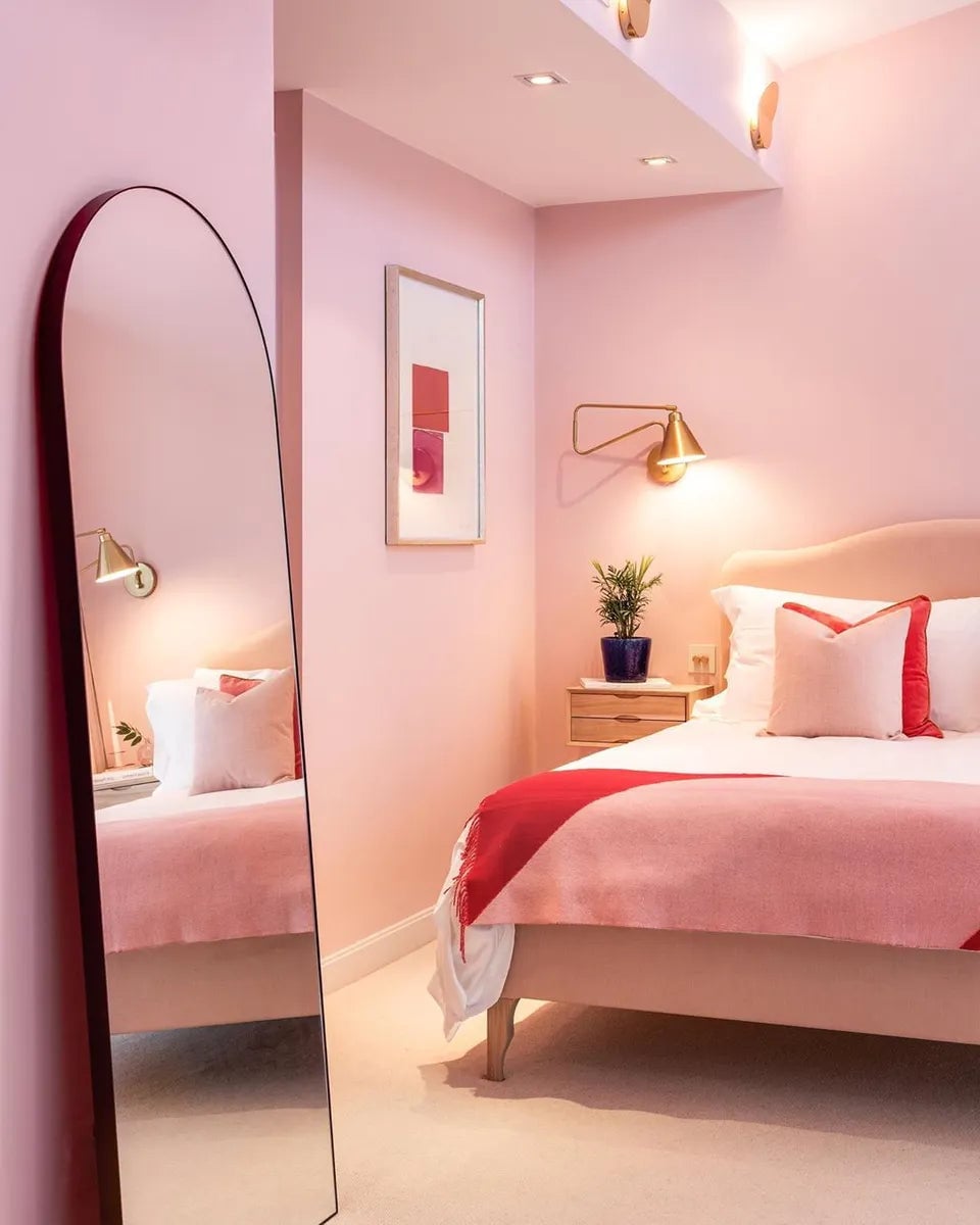
Blush pink paint covers both the walls and the bed frame, creating a cohesive look in a compact modern bedroom. White and red accents add contrast without breaking the calm. Wall sconces and natural light keep the space bright, while the mirror reflects the blush tones back into the room. The trick here is matching the furniture finish to the wall color. It reads as deliberate and makes the small layout feel larger. For a renter, a peel-and-stick wallpaper in a similar blush shade on the wall behind the bed can echo the same effect without a permanent paint job.
Soft Peach Pink Walls in a Contemporary Living Room
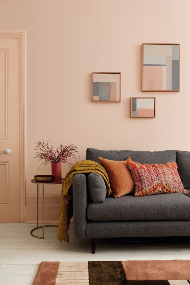
Soft peach pink walls work well in a roomy contemporary living room because the shade is warm without being sweet. The palette adds grey and ochre through the sofa, side table, and artwork, which keeps the peach from reading as too youthful. Soft ambient light helps the wall color feel muted and grown-up. The sofa faces the wall, making the peach the main event. The useful takeaway is to pair a peachy wall with warm neutrals and a single punch of ochre. That ratio keeps the room grounded and stops the pink from floating.
Peach Pink Wall as a Minimalist Display Backdrop
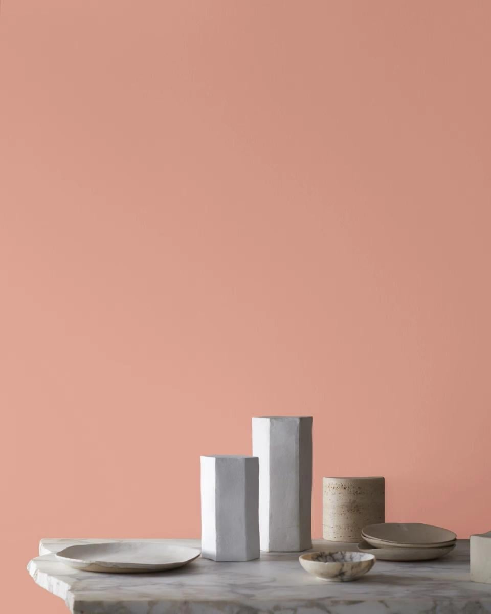
Can a peach pink wall support a minimalist display without overwhelming the objects in front of it? Yes, if the tone is right. This vibrant peach wall works as a backdrop for geometric vases and plates, letting the shapes stand out against the color. The lighting is soft studio light, which keeps the wall from casting harsh shadows on the arrangement. The principle here is contrast through value. A medium-saturated peach wall makes pale ceramics pop. If you have a collection of neutral objects, try painting the wall behind them a peach that is one step brighter than you think you need. The objects will do the rest.
Dusky Pink Wainscoting in a Traditional Bathroom
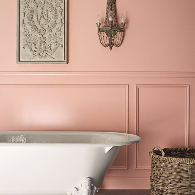
Dusky pink wainscoting brings color to a traditional bathroom without covering every surface. The white wall above keeps the space light, while the pink grounds the room around the clawfoot bathtub. Materials include tile, porcelain, and a wicker basket, which add texture without competing. Ambient light bounces off the white upper wall and softens the pink below. The useful rule is to stop the wainscoting at chair-rail height. That split gives the eye a break and makes a small bathroom feel taller. The dusky pink reads as neutral against white trim, so it works with most tile colors.
Dusty Rose Walls in a Cozy Bedroom Corner
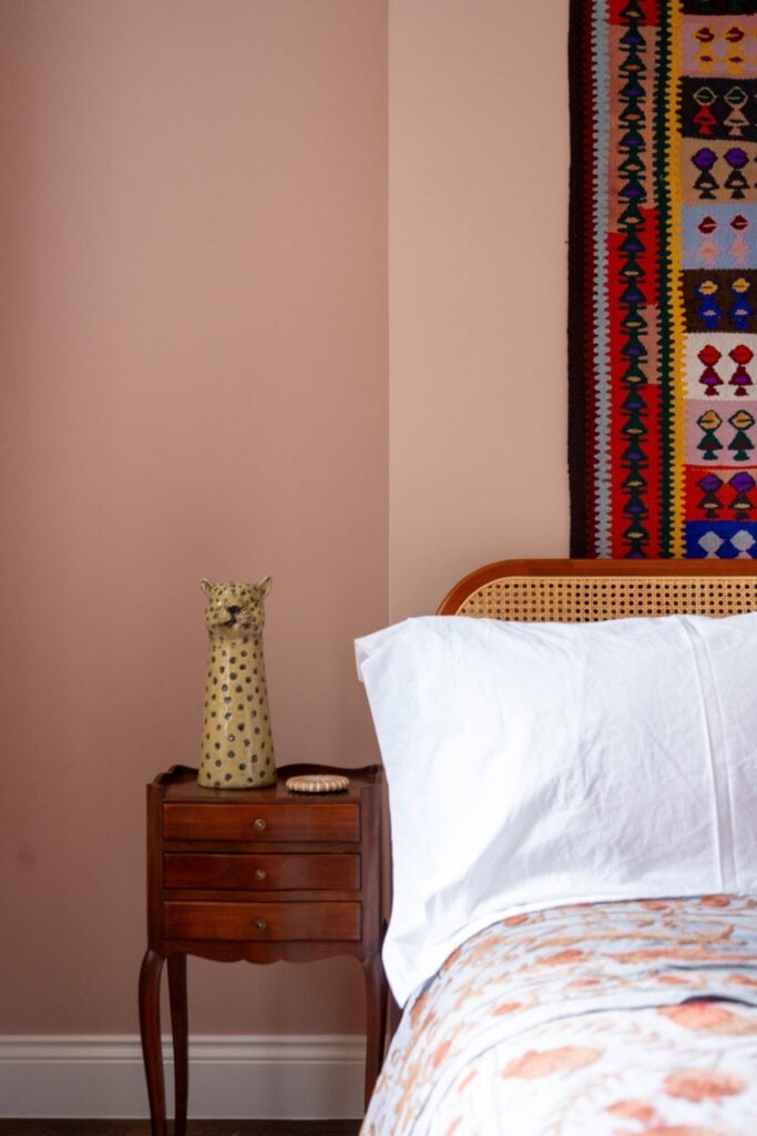
A compact corner can handle a stronger wall color when the layout keeps things simple. Here a dusty rose wall anchors a bedside vignette with a wooden table, a cane headboard, and a ceramic leopard. The muted pink looks neutral next to the natural wood and cane, so the corner feels balanced without being busy. The bedside table becomes the practical anchor: it holds a lamp and a few small objects, which is all a tight corner needs. A deeper pink like this one pairs well with furniture and decor that stay light in visual weight.
Pale Pink Bookshelf in a Transitional Living Room
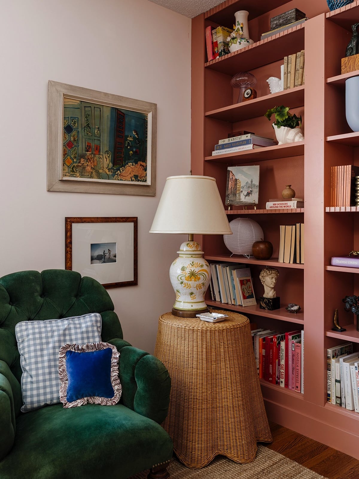
A pale pink bookshelf can work well in a transitional living room. Here the bookshelf holds books and a lamp, and the pale pink lets those objects stand out without competing with them. The tufted armchair in a warm tone and the wicker and glass accents keep the room grounded.
The palette here is pale pink, green, and gold. The green comes from plants and the gold from lamp details. The pink is the largest block of color, so it sets the mood without overwhelming the room. A pale pink piece of furniture like this one works because the surrounding elements are simple. If the room had more pattern or color, the pink would risk looking out of place.
Dusky Pink Walls in a Modern Room Corner
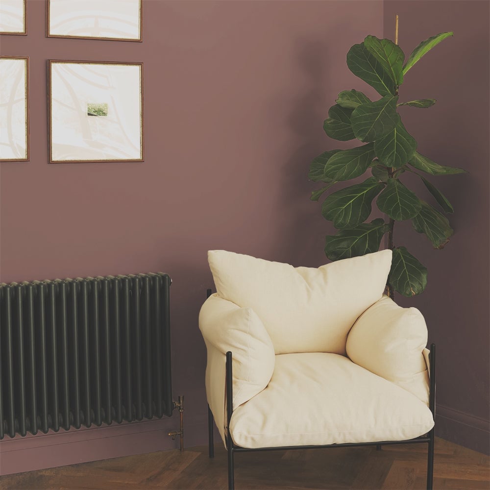
The dusky pink wall here is the anchor, but the room’s materials keep it from feeling too sweet. A cream armchair sits in the corner beside a dark green radiator, and a large plant adds organic texture. The metal of the radiator and the fabric of the chair are both matte, so the pink wall has nothing glossy to compete with. The plant leaves soften the line between the wall and the furniture. A dusky pink like this one works in a modern corner because it is not the only element of interest.
Soft Pink Walls Complementing a Brick Fireplace
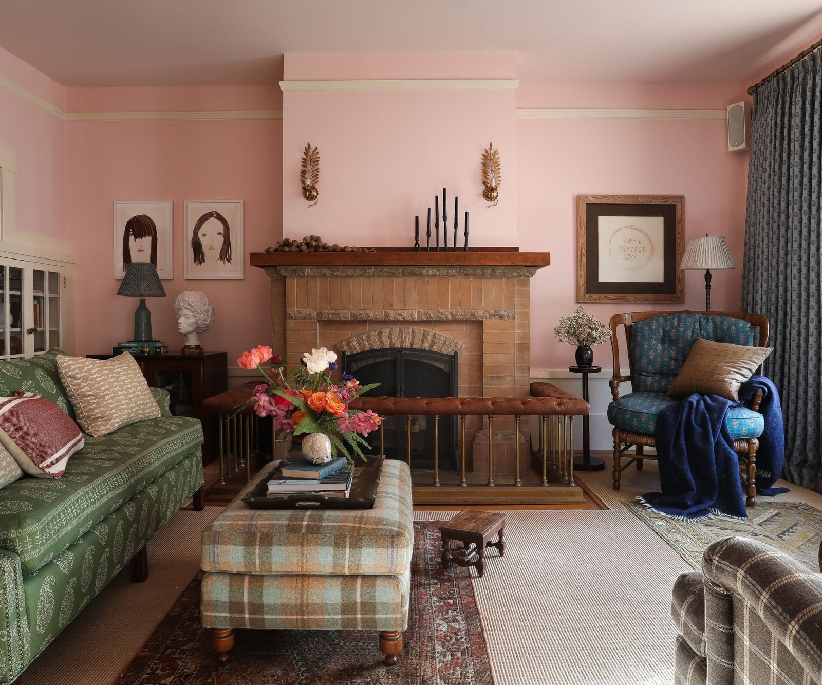
Soft pink walls and a brick fireplace make an unexpected but balanced pair. The pink is muted enough to let the brick’s texture and warm brown tones lead the room. A sofa and armchair in neutral fabrics and a wooden ottoman keep the seating area grounded. Natural daylight from a nearby window and lamp light at the seating level keep the pink from looking flat. The brick fireplace is the visual anchor; the pink walls support it without pulling focus. If you have a brick fireplace you want to keep but the surrounding walls feel dull, a soft pink is a low-commitment way to add warmth without painting the brick.
Dusty Rose Walls in a Serene Modern Bedroom
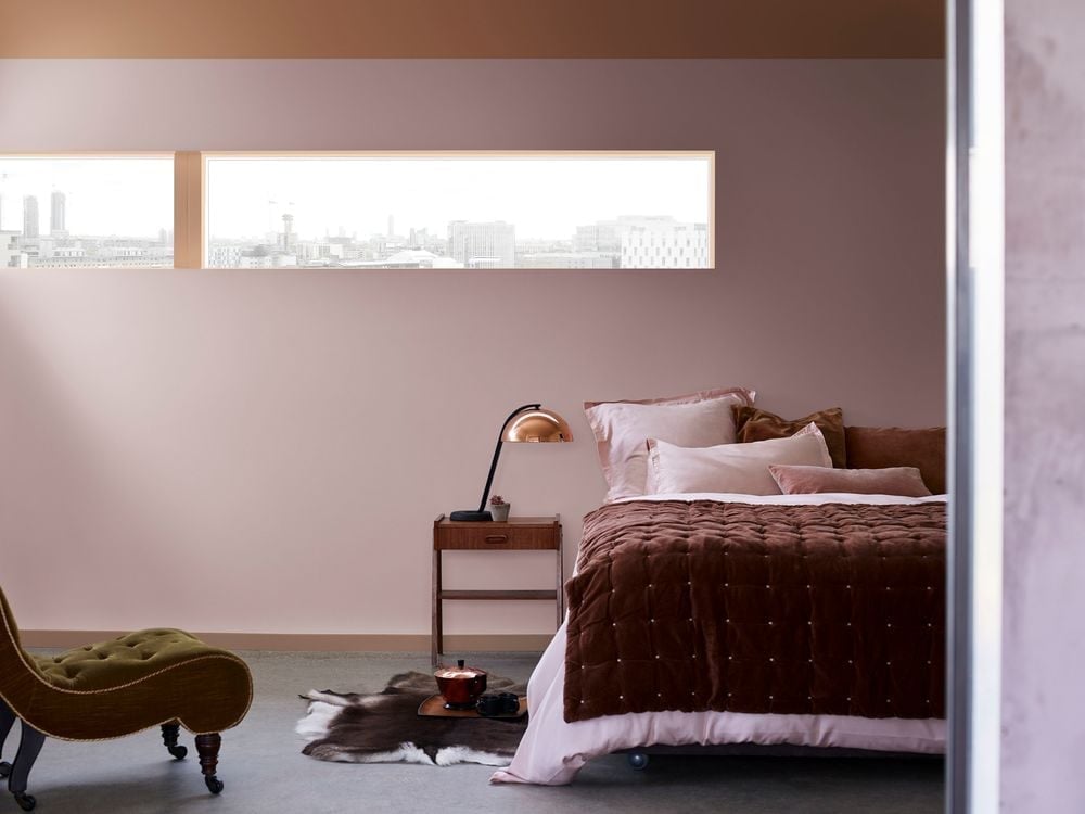
A bedroom benefits from a wall color that feels calm without being boring. Dusty rose does that here: it is soft enough for a restful space but has enough pigment to feel deliberate. The bed is centered, and the dusty rose walls frame it. A chair and nightstand in wood tones and a linen throw add texture without introducing a competing color.
The palette is dusty rose, brown, and cream. The brown comes from the wood furniture, the cream from the bedding and throw. This ratio keeps the room serene. A room like this one does not need much storage visible; the nightstand and a small chair handle the daily essentials. If you want a calm bedroom with more personality than beige, dusty rose is a solid choice.
Soft Pink Walls for a Modern Organic Dining Room
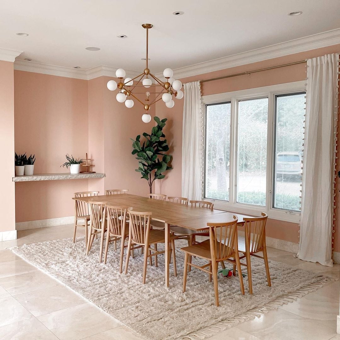
A dining room with soft pink walls and a large wood table sets the tone for a modern organic look that is grounded. The pale pink acts as a backdrop that lets the wood tones and the texture of a stone floor and rug stand out without competing. A statement chandelier hangs above the centered table, making the layout feel deliberate and spacious. To balance the sweetness, lean into the raw side of organic materials: unvarnished wood, nubby textiles, and matte finishes. The soft pink works as the bridge between warm neutrals and the natural world.
Peach-Pink Walls in a Coastal Bedroom
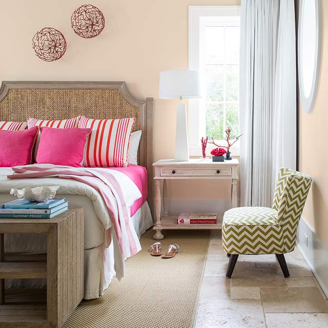
A practical rule for coastal decor is to let the wall color carry the salt-washed calm so the furnishings can stay airy. In this bedroom, peach-pink walls are paired with a rattan headboard, wood accents, and soft fabric to create a relaxed seaside feel. The palette brings in peach, pink, and subtle green tones that echo driftwood and sea glass without being literal. The bed sits against the wall, and the room feels spacious thanks to the light, warm hue. For renters, this look is easy to replicate with peel-and-stick wallpaper in a similar shade or a temporary washable paint film. Check your lease before making changes, but know that a single accent wall in this tone can shift the whole mood of the room.
Vibrant Pink Walls with Built-in Shelving
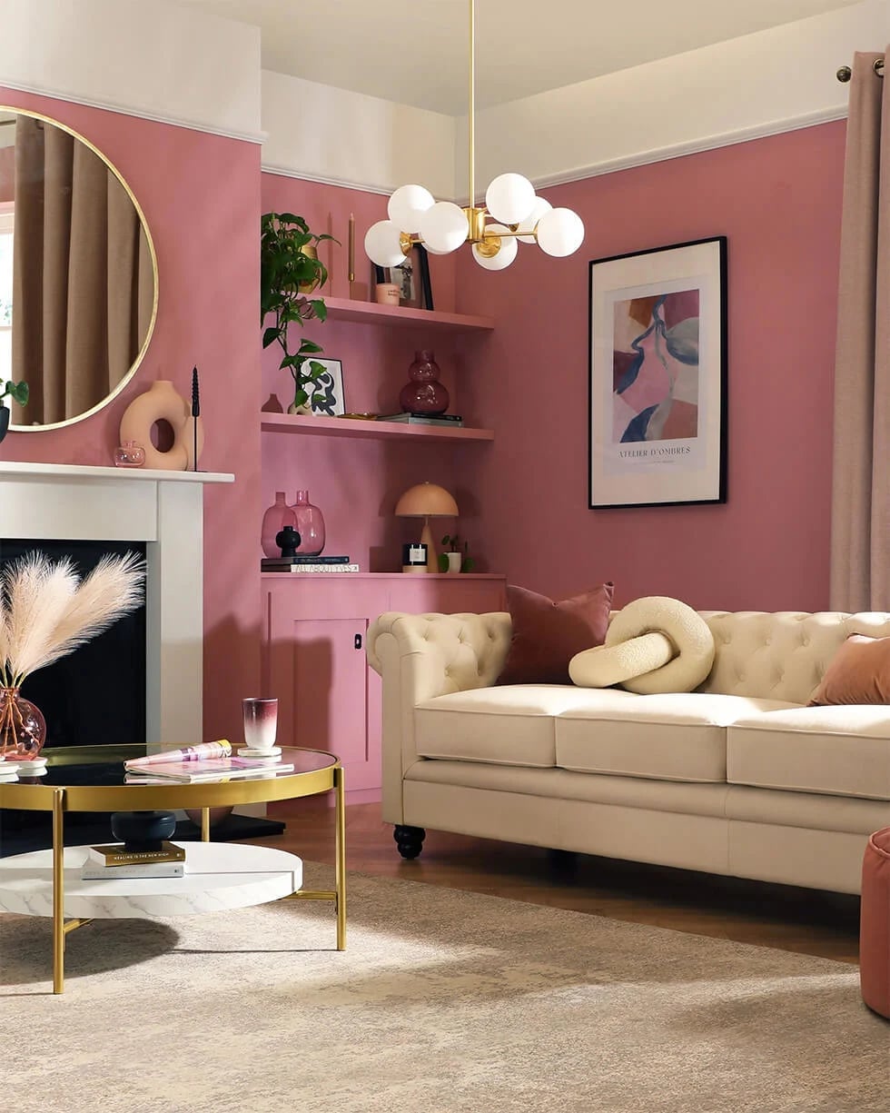
A vibrant pink wall might feel like a risk next to neutral built-ins, but here it works because the pink is saturated enough to hold its own without overwhelming the shelves. The living room uses a cream sofa and a round mirror to break up the pink, while gold accents in the light fixture and abstract art add warmth. The shelves are built into the wall, so the pink becomes a frame for the objects on display and avoids a full-room commitment. A modern chandelier provides ambient light that keeps the pink from feeling flat after dark. This approach lets you try a bold color in a contained area. If you are not ready to paint an entire room, a single wall with shelving is a manageable project that still looks deliberate.
Bright Pink Wall with Ornate Mirror and Gallery Art
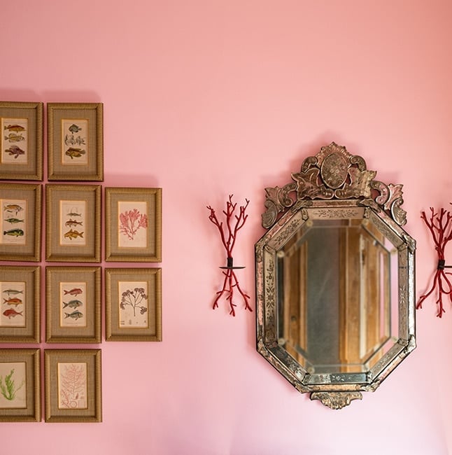
A bright pink wall does not need to compete with a gallery arrangement when the pieces are chosen for contrast. Here, an ornate antique mirror with a gold frame sits against the pink, surrounded by framed art that mixes silver and natural tones. The mirror reflects ambient room light, which keeps the pink from feeling heavy. The wall becomes a backdrop that unifies a mix of styles without demanding that they match. A curated collection of art and mirror pieces with enough visual weight holds its own against such a strong color; delicate items can get lost.
Rose Pink Bathroom Wall for a Touch of Elegance
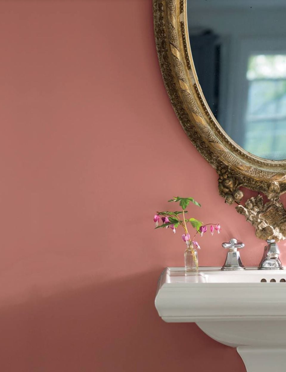
A compact bathroom gains elegance from a single rose pink wall that wraps the space in warmth without making it feel smaller. The pedestal sink and chrome faucet stay classic against the pink, and the soft ambient light keeps the look clean. The palette is simple: rose pink, white ceramic, and chrome. That restraint is what makes the pink feel polished. In a small room, keeping the other finishes neutral lets the color do the work. If you are working with a similar layout, consider painting only the wall behind the sink to create a focal point. The other walls stay light, and the pink appears as a deliberate choice.
Vibrant Coral Pink Wall in a Bohemian Living Room
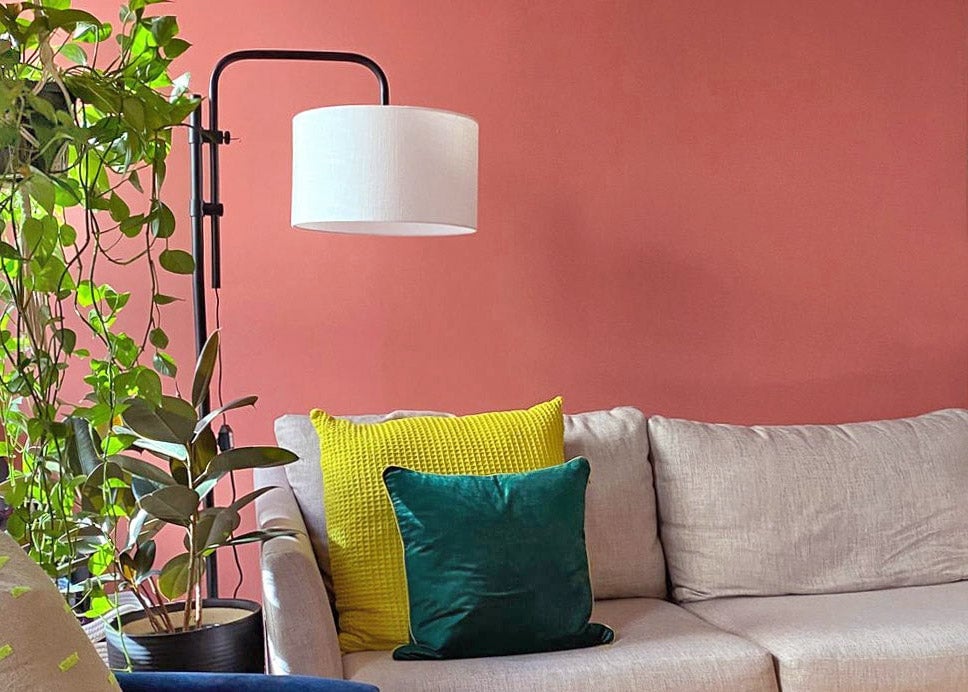
A vibrant coral pink wall acts as the backbone for a bohemian living room when the palette stays grounded. The coral looks warm and energetic next to the green of a large floor plant and the yellow accents in fabric and art. A neutral sofa and a simple metal floor lamp keep the focus on the wall’s saturation. This style works because the coral is the dominant color, but it is balanced by natural textures and enough negative space to let the eye rest. What defines the look is the ratio of bright wall to calm furnishings, roughly one bold surface to every three quiet ones.
Dusty Rose Walls and Sofa in a Modern Space
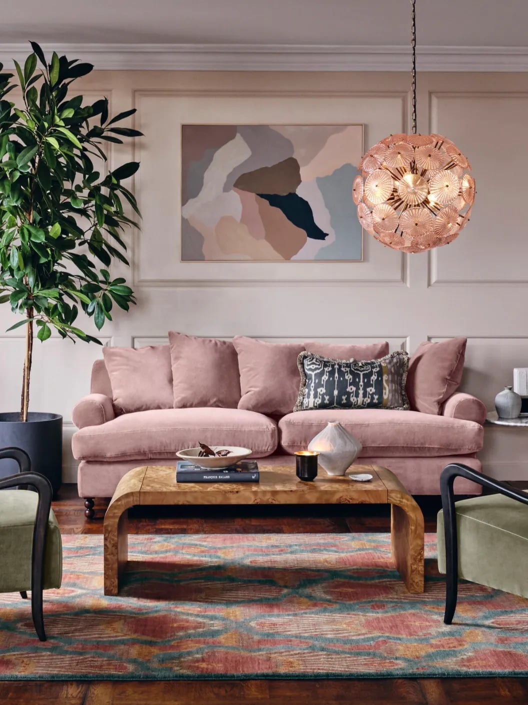
A modern living room pairs dusty rose walls with a plush velvet sofa in the same tone for a monochromatic base that feels cohesive but not flat. The curved sofa’s soft pink shape sits opposite a wooden coffee table, with a large plant adding green contrast and abstract art breaking up the wall. A pendant light provides focused illumination while ambient room light softens the edges. The dusty rose palette is carried through, but the mix of velvet, wood, stone, and glass introduces enough material variation to prevent a one-note look.
Pink Walls as a Backdrop for a Bohemian Gallery Wall
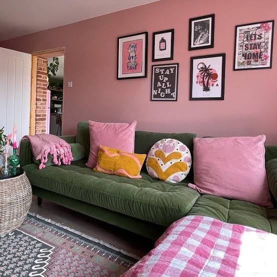
A pink wall works as a backdrop for a bohemian gallery wall when the art and objects introduce enough contrast. The warm pink reads differently under natural light than under ambient fixtures, so the wall shifts slightly throughout the day. A sofa placed against it grounds the composition, while a patterned rug and woven textures in wicker and fabric add variety. The gallery wall itself mixes frames and subjects, which prevents the pink from dominating. The practical rule is to let the wall color recede by layering pieces in front of it instead of leaving it bare.
Two-Tone Rose Pink and Beige Contemporary Walls
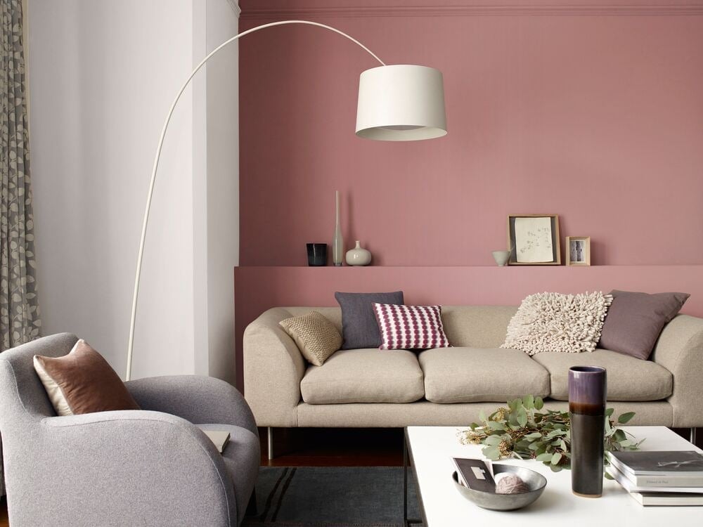
A two-tone rose pink and beige wall avoids the sweetness of an all-pink room by pairing the warmer rose with a neutral beige. The rose pink sits on the upper portion of the wall, with beige below, creating a horizontal division that adds visual structure without needing molding. Natural light from a nearby window hits the pink first, making it appear softer in the morning and more saturated in the afternoon. An arc floor lamp casts a warm glow that ties the two tones together. The beige anchors the seating area, where a sofa and armchair in neutral fabrics let the wall remain the focal point.
Bright Pink Painted Door for a Boho Hallway
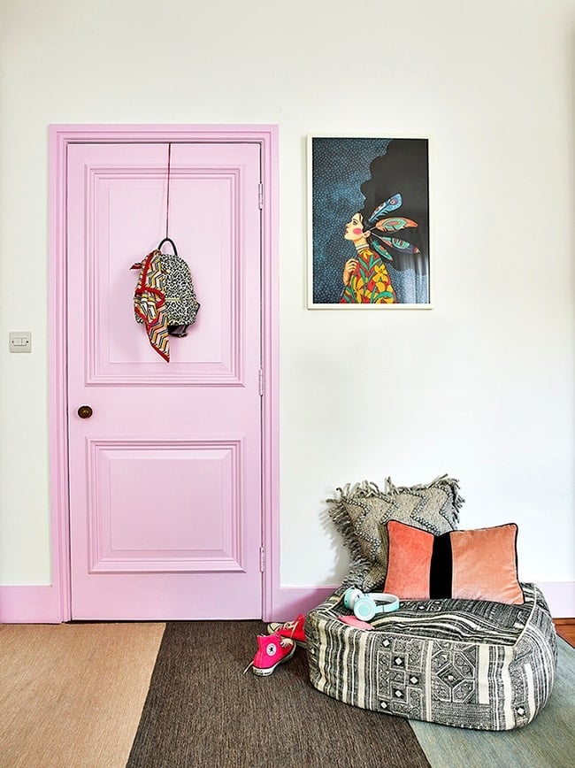
A bright pink painted door becomes the focal point of a compact boho hallway without requiring any structural changes. The door’s glossy finish catches the overhead light and contrasts with the grey and beige walls and the patterned pouf placed to the side. Artwork hangs nearby, but the door’s saturated color pulls the eye first. This is a renter-friendly swap because painting a single door requires only sanding, primer, and a weekend of dry time, and it can be returned to its original color before moving out. The woven textures of the pouf and any fabric accents keep the hallway from feeling too polished.
Pale Pink Walls in an Open-Plan Modern Organic Space
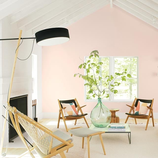
Pale pink walls can anchor an open-plan room without boxing it in. The soft pink reads as a neutral against wood tones and green accents, so the room keeps its airy feel even with a full seating area. A pair of armchairs and a wood coffee table sit comfortably on the rug, while a floor lamp adds warmth without fighting the natural light. The trick is letting the pale pink act as a backdrop rather than a statement. When the palette stays restrained, the walls support the furniture instead of competing with it. That restraint keeps an open-plan space from feeling scattered.
Pink Walls with a Bright Yellow Armchair
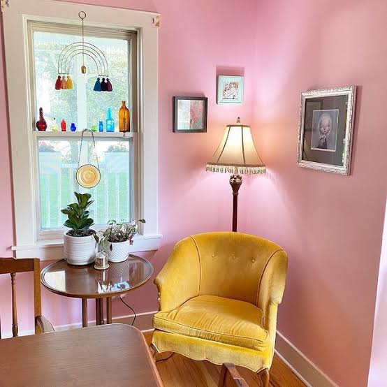
A practical rule for renting is that paint is reversible but furniture is portable. Pink walls paired with a bright yellow armchair prove that a bold color combo doesn’t have to be permanent. The yellow armchair sits by the window, catching natural light that warms both hues, while a lamp on a side table adds a second light source for evenings. The compact corner vignette keeps the look intentional without overwhelming the room.
The pink and yellow rely on a third color to settle them. Blue accents in the room, maybe a ceramic vase or a small object on the side table, stop the warm tones from feeling too sweet. If you’re renting, start with the yellow armchair. Paint the walls pink only when you’re sure the contrast works for you.
Pale Pink Walls in a Transitional Open-Plan Living Room
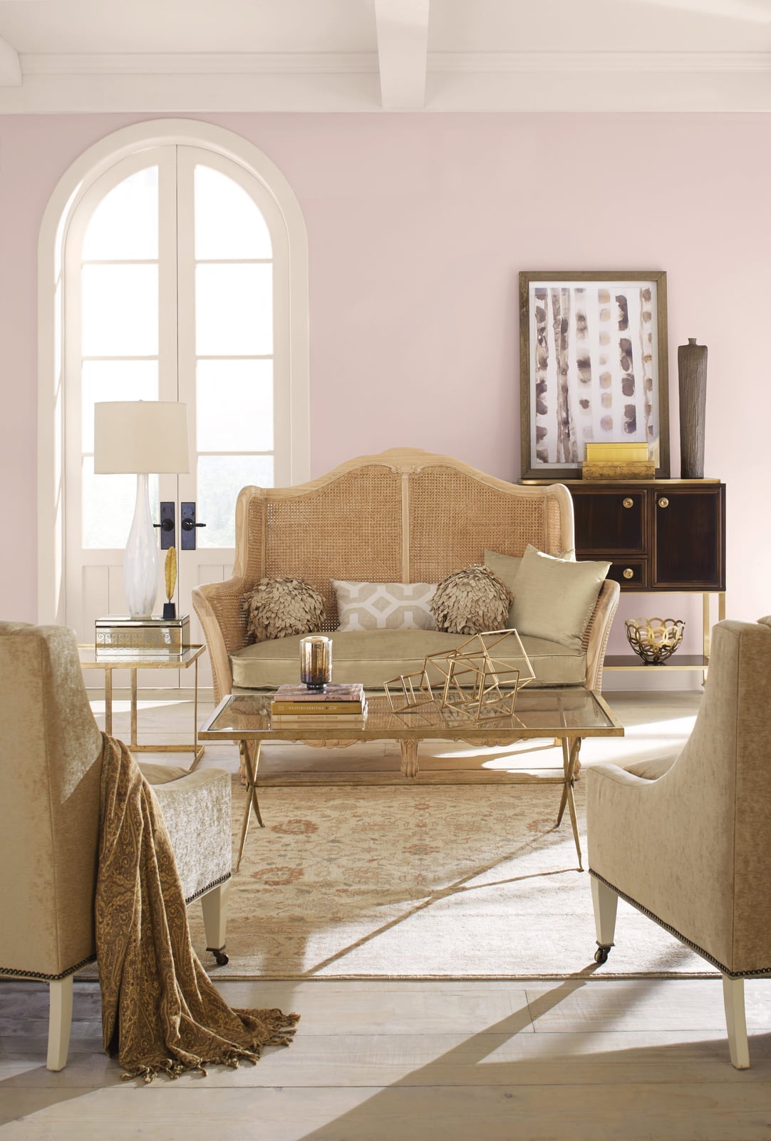
Pale pink walls in a transitional open-plan living room soften the traditional lines of the sofa and armchairs without making the space feel overly feminine. The beige and gold accents in the furniture and a table lamp keep the look grounded. The pink acts as a warm neutral, letting the rattan and wood pieces stand out. The window shifts the pink throughout the day, so the room looks different at noon than it does at dusk.
Minimalist Pink Walls with Sunlight Shadows
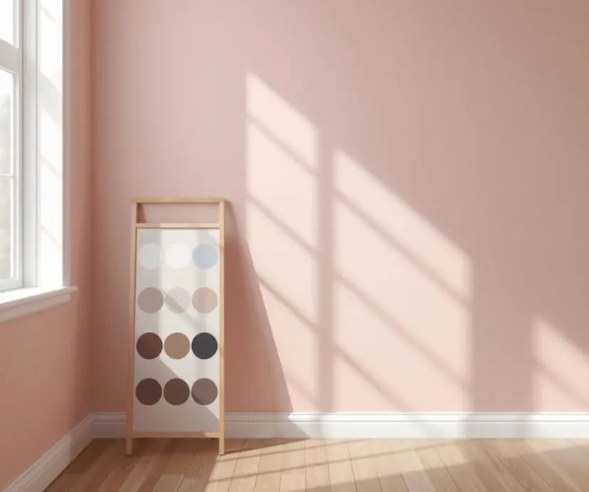
A precise observation about this minimalist room is that the pink walls do not need anything else. The room is nearly empty, just a wood floor and a display stand holding paint swatches. The real decoration comes from the window shadows cast across the wall. The shadows change with the sun, creating a pattern that shifts without any effort. For a minimalist space, the wall finish becomes the main event. The pink is soft enough that it does not compete with the shadows. It just sits there, letting the light do the work. That is the whole point.
Terracotta-Pink Walls with a Pink-Painted Fireplace
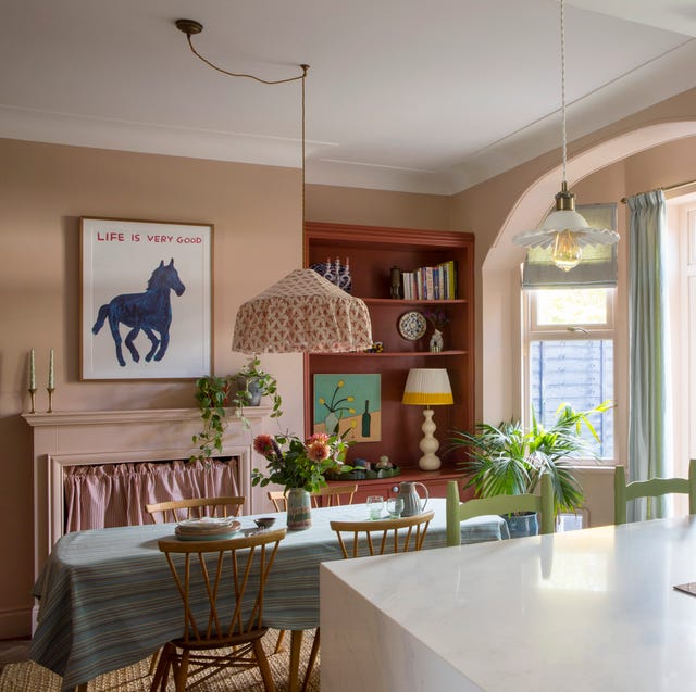
This could have been a safe beige dining room. Instead, the walls are a warm terracotta-pink, and the fireplace is painted the same shade. That continuity makes the fireplace feel built-in. The dining table sits centered under a pendant light, with chairs pulled up on both sides. A bookshelf against one wall adds storage without blocking the window.
The green accents, maybe in a plant or a textile, stop the pink from feeling one-note. The terracotta undertone keeps the room grounded, so the pink does not feel girly. It feels earthy. If you want a bold dining room but worry about commitment, paint the fireplace the same color as the walls. It ties the room together without adding another decision.
Glossy Oval Paint Swatch in Dusty Rose Pink
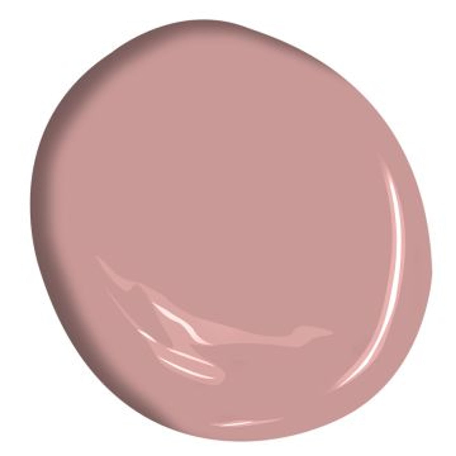
The glossy sheen gives the color a wet, dimensional look that a flat finish cannot match, catching studio lighting evenly across the curve. The minimalist presentation means the palette does not compete with anything else. The swatch shape itself is worth noting: an oval avoids the hard corners of a standard rectangle, so your eye reads the hue as softer and more organic. That shape trick works on a full wall too, if you cut in a rounded corner detail before rolling.
Final Thoughts
Classy pink paint comes down to restraint and context. Stick with muted, dusty, or peachy tones rather than candy-bright pinks, and pair them with natural materials like wood, stone, and linen to keep the look grounded. Matte or eggshell finishes work better than high-gloss for walls because they soften the color. For trim, doors, or cabinetry, a semi-gloss holds up to cleaning while still reading as intentional. The most successful pink rooms let the color sit quietly in the background or pop as one deliberate statement, not as a whole-house theme. Sample your top three shades on different walls first and watch how the light changes them throughout the day.