Color drenching is the trend that stops being a single accent wall and turns an entire room into one saturated statement. From navy living rooms to peach maximalist spaces, this look paints walls, trim, ceilings, and even furniture in the same hue for a moody, cohesive effect. It is bold, a little risky, and surprisingly forgiving once you commit.
This article rounds up 25 trendy color drenching ideas for 2027, each showing a different shade and room type so you can see the range before you pick your own. You will get practical notes on how each space handles light, texture, and contrast, plus what to watch for when you try it at home.
Deep Navy Velvet Living Room for Luxurious Color Drenching
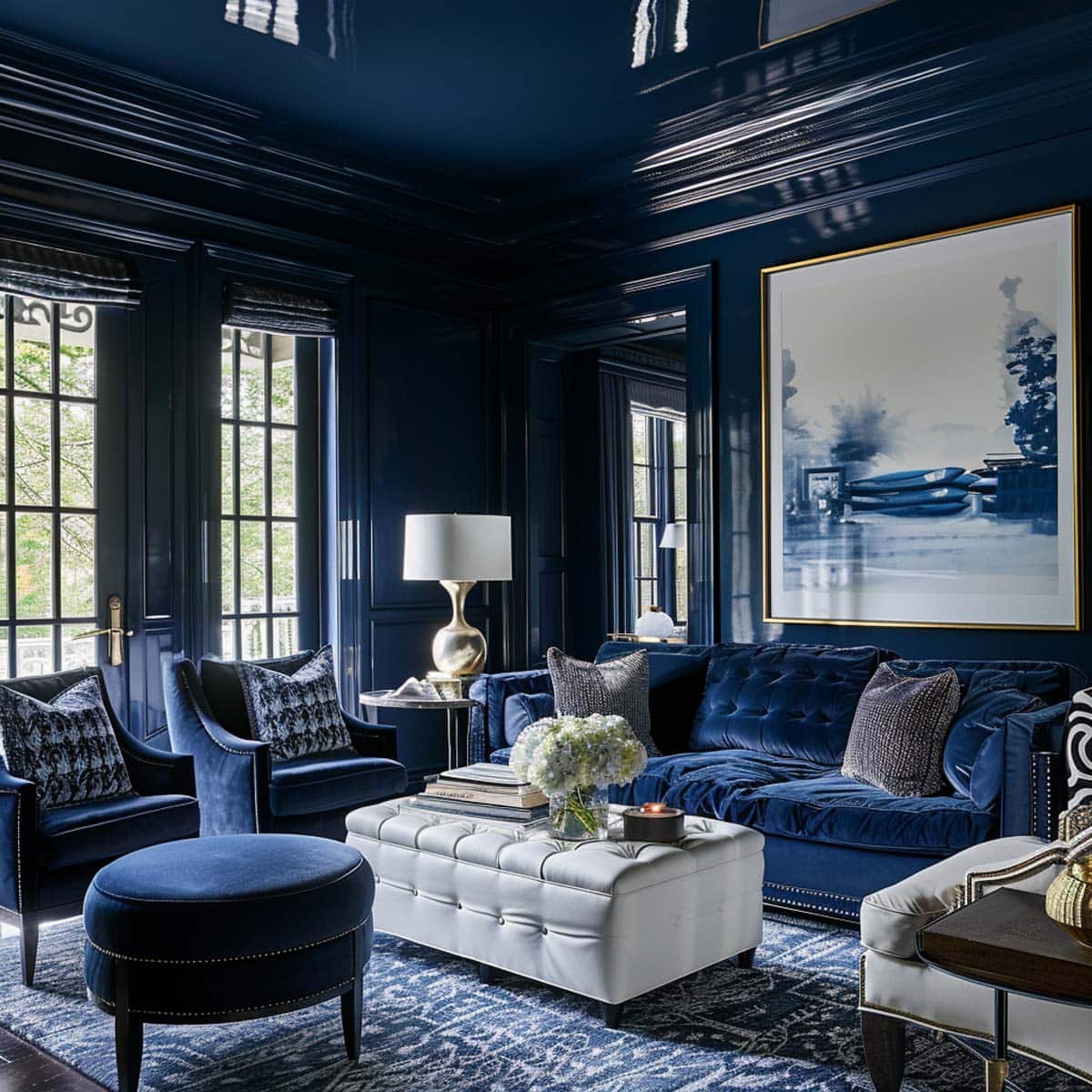
A deep navy velvet sofa and matching armchairs anchor this living room, proving that drenching the seating in one rich hue creates a cohesive, almost enveloping feel. The palette stops there: white walls and gold accents on the side table and artwork keep the room airy rather than cave-like. For a similar effect, limit the color to the upholstered pieces and leave the surrounding architecture neutral. That way the navy reads as a deliberate choice, not an overwhelming wave.
Terracotta Corrugated Metal Kitchenette with Textured Walls
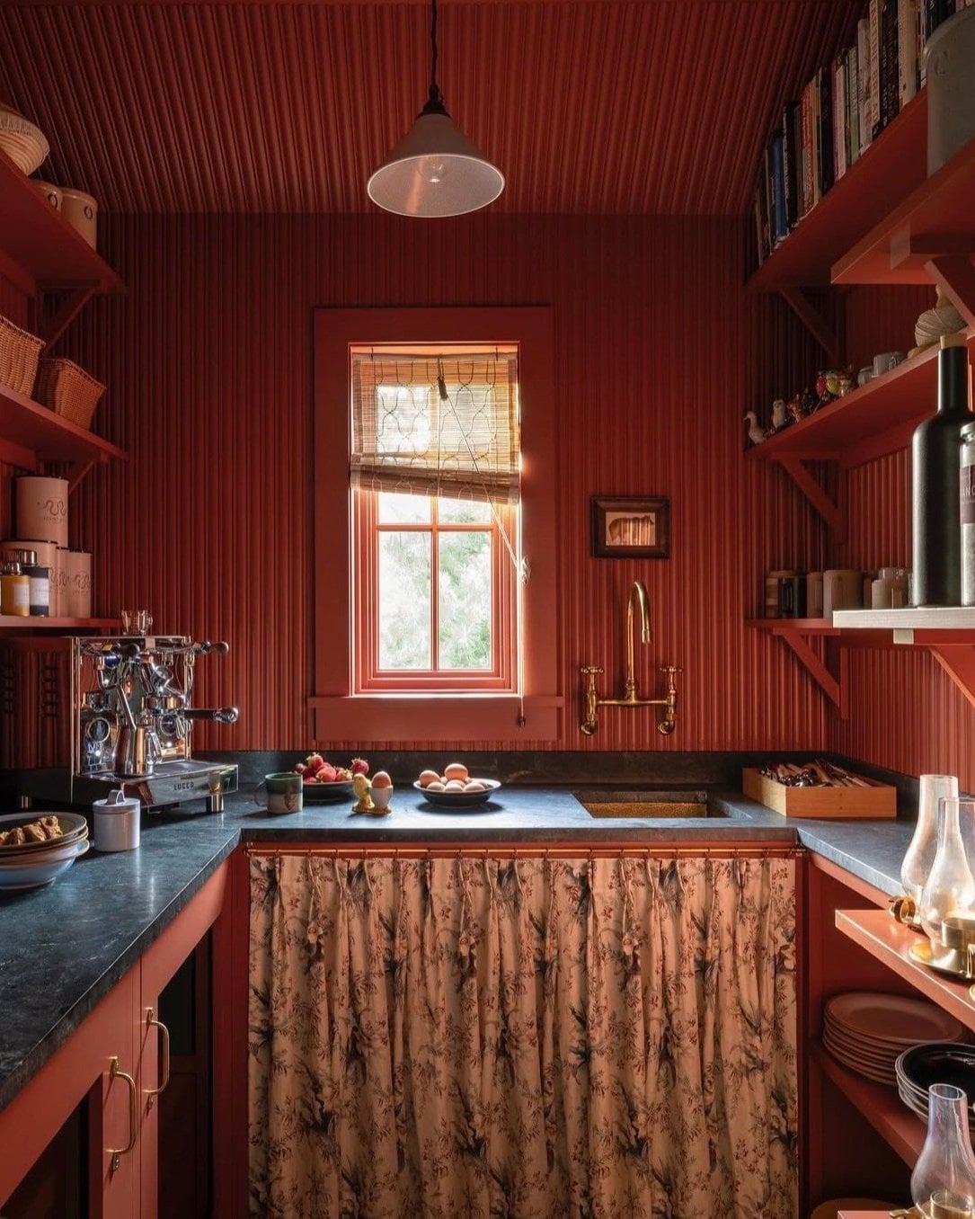
This compact kitchenette uses terracotta corrugated metal on both walls and cabinetry, a move that turns a practical material into the main decorative event. The texture catches natural light from the window and the pendant overhead, stopping the deep shade from looking flat. A floral curtain and dark gray stone countertop add contrast without breaking the terracotta story. What defines the look is the ratio: roughly two-thirds of the visible surface is the same finish, so the eye reads it as intentional. A single wood shelf or a different metal finish would break the immersion, so keep adjacent materials neutral or tonal.
Lacquered Deep Red Library and Dining Room Immersion
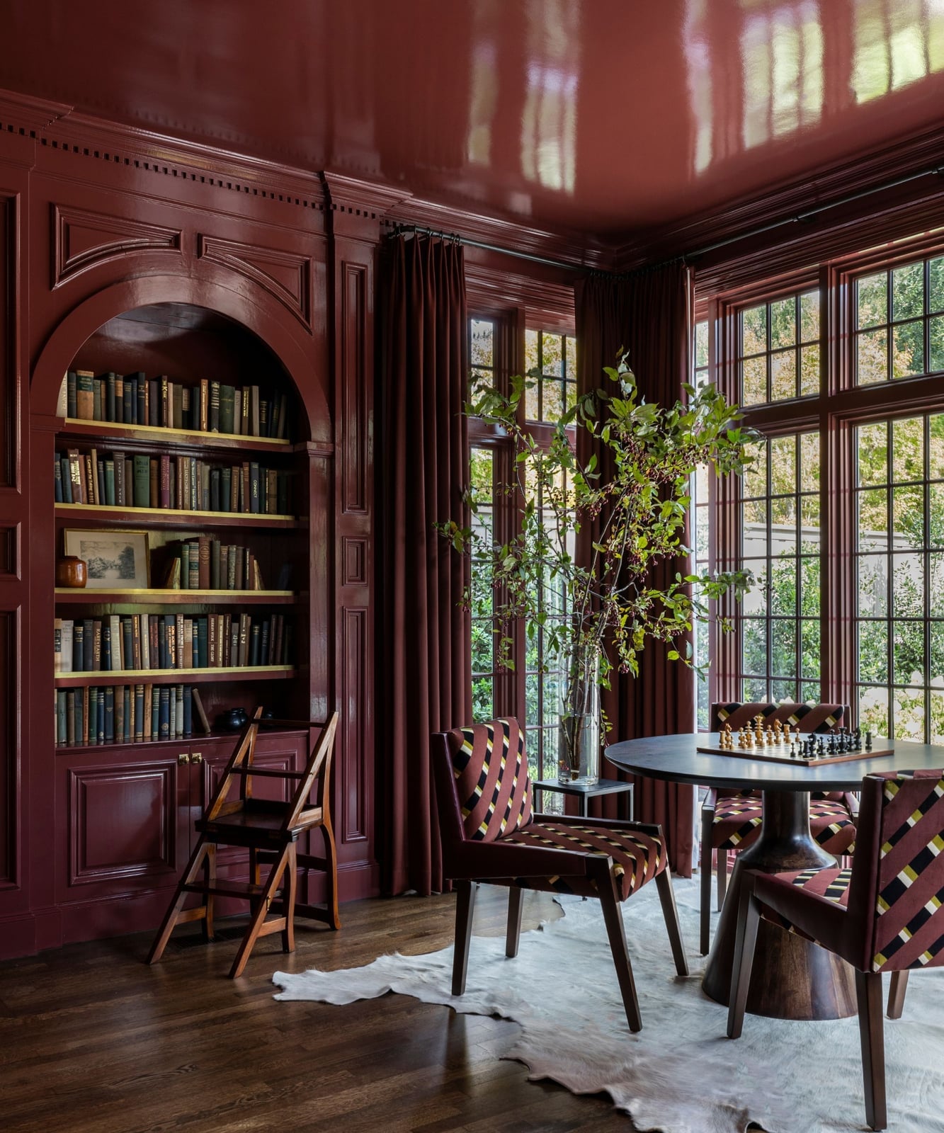
Can a room feel both dramatic and functional when every surface is the same deep red? This library-dining room answers yes. The lacquered walls, ceiling, and floor-to-ceiling bookshelves create a continuous shell that makes the space feel intimate rather than dark. A round dining table and chairs sit under a cowhide rug, adding texture that prevents the red from reading as flat.
Monochromatic Navy Blue Hallway and Staircase Design
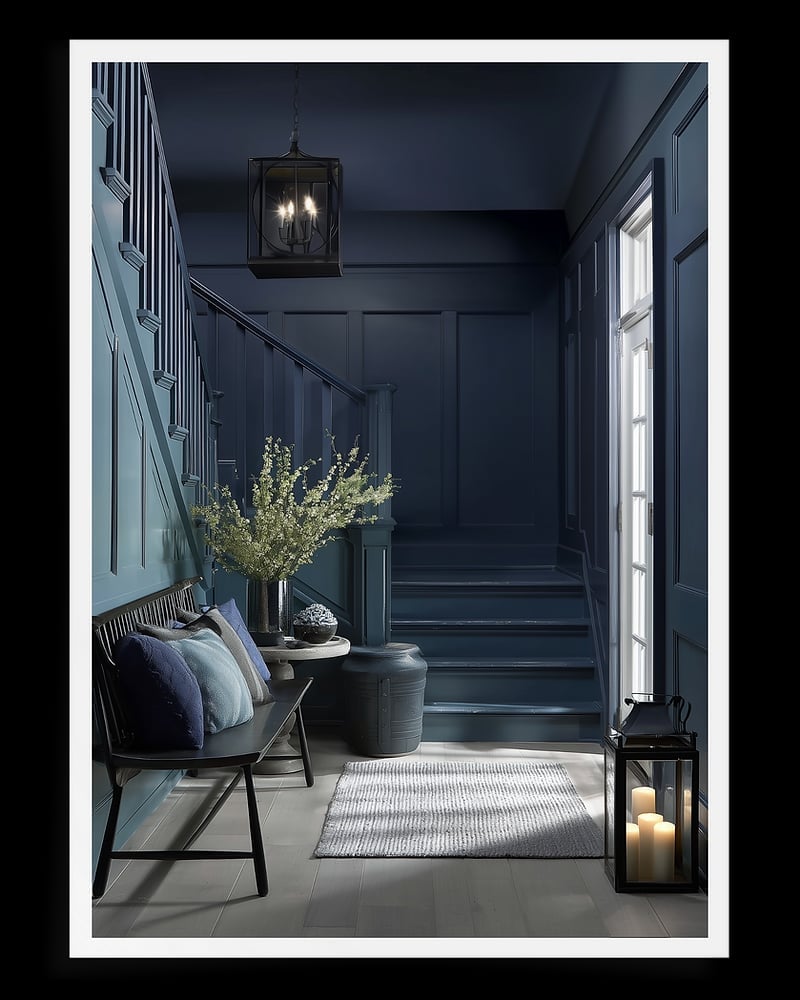
A monochromatic navy hallway uses the same shade on walls, stairs, and the bench at the bottom, creating a tunnel of color that draws the eye upward. The light gray rug and railing provide just enough contrast to define the steps without breaking the navy flow. An overhead lantern casts warm light that softens the deep blue, so the space stays welcoming rather than stern. The practical principle here is scale: in a narrow hallway, a single dark color can make the walls recede, but only if you include a light source every few feet to keep the path clear.
Plum Color-Drenched Bar Area with Glamorous Touches
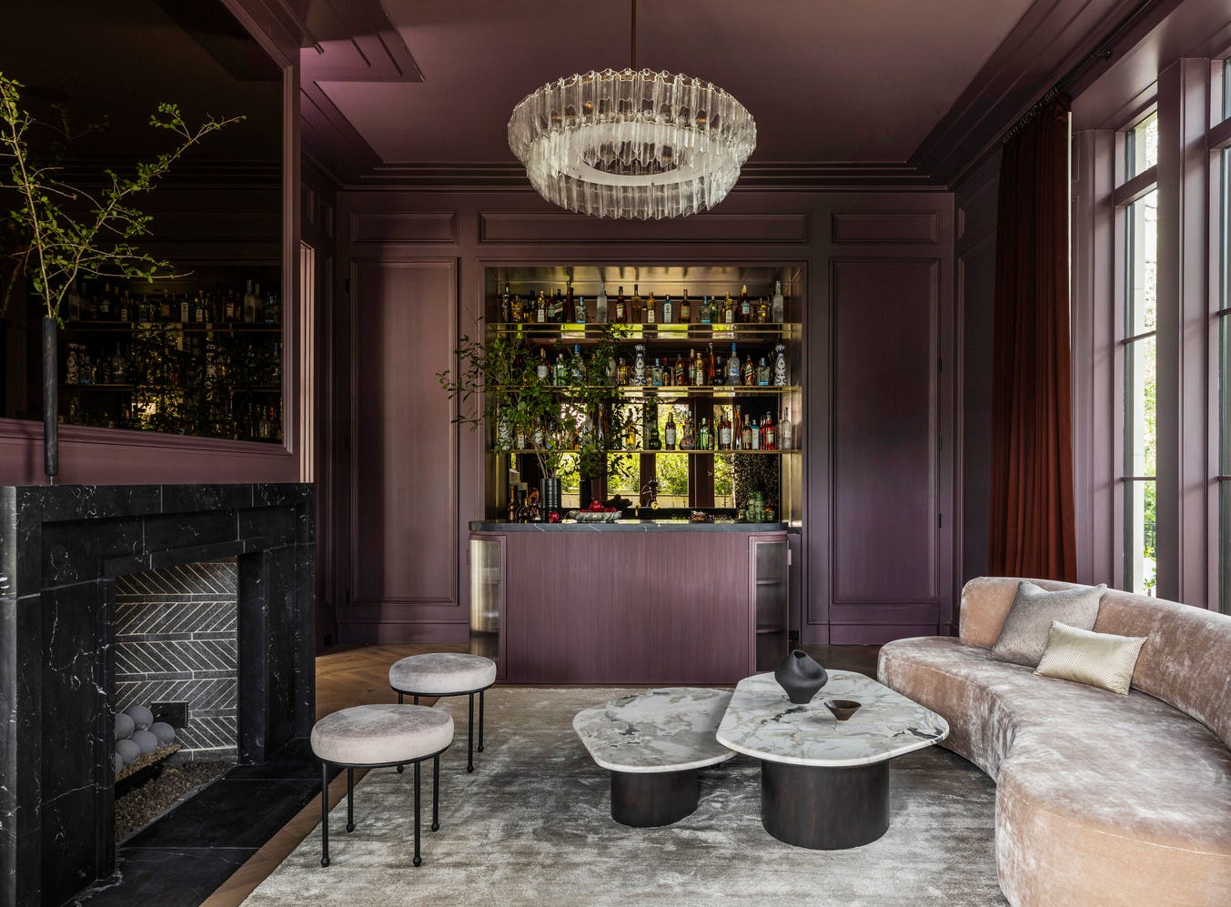
A practical rule for a color-drenched bar area: let one material carry the shade, then layer in metallics for contrast. Here, plum walls and a matching bar create the backdrop, while a curved velvet sofa in blush pink and gold coffee tables add glamour without competing. The fireplace and marble surfaces introduce texture, so the room feels rich rather than one-note. For this approach, keep the plum on hard surfaces like walls and cabinetry, and use softer furnishings in a lighter tone. That way the drenching stays dramatic but the space still breathes.
Ochre Yellow Walls and Doors in a Modern Eclectic Living Room
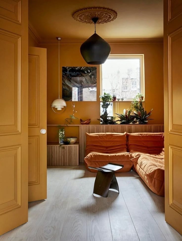
If the idea of painting everything the same color sounds like a lot, think of it as the opposite of white walls. White lets the furniture do the talking. Ochre yellow makes the room itself the point. A modular sofa in a neutral tone keeps the eye moving, while dark side tables and a wood veneer cabinet add heft without competing. The burnt orange notes in the palette stop the yellow from reading as too sweet. Keep the ratio around seventy percent of your main color and thirty percent of supporting shades. That way the color feels balanced.
Natural light from a window keeps the ochre from turning flat, and a single pendant light gives the seating area a clear anchor. The doors painted the same color as the walls extend the color drenching trick into the architecture, making the whole space feel wrapped. For a modern eclectic look, the key is mixing warm wood tones with the ochre and letting the metal on the side table break up all that warmth.
Olive Green Walls, Ceiling, and Trim for an Immersive Space
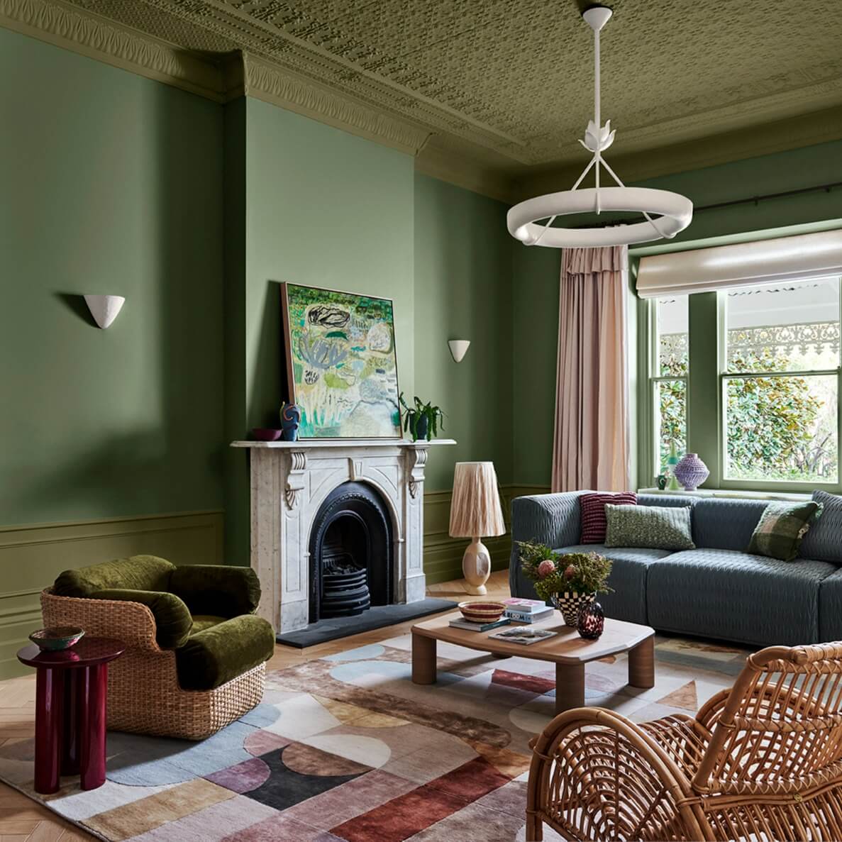
Painting the ceiling the same olive green as the walls changes how the room feels. The eye stops looking for a break at the top, so the space reads as taller and more wrapped. A blush pink sofa and a blue armchair sit against the green without clashing because the olive has enough yellow in it to bridge warm and cool. A renter-safe swap: use a low-VOC paint in a matte finish and plan to repaint the ceiling white before you move out. It takes an afternoon with a roller and leaves no permanent change.
Rich Green Living Room with Matching Fireplace Surround
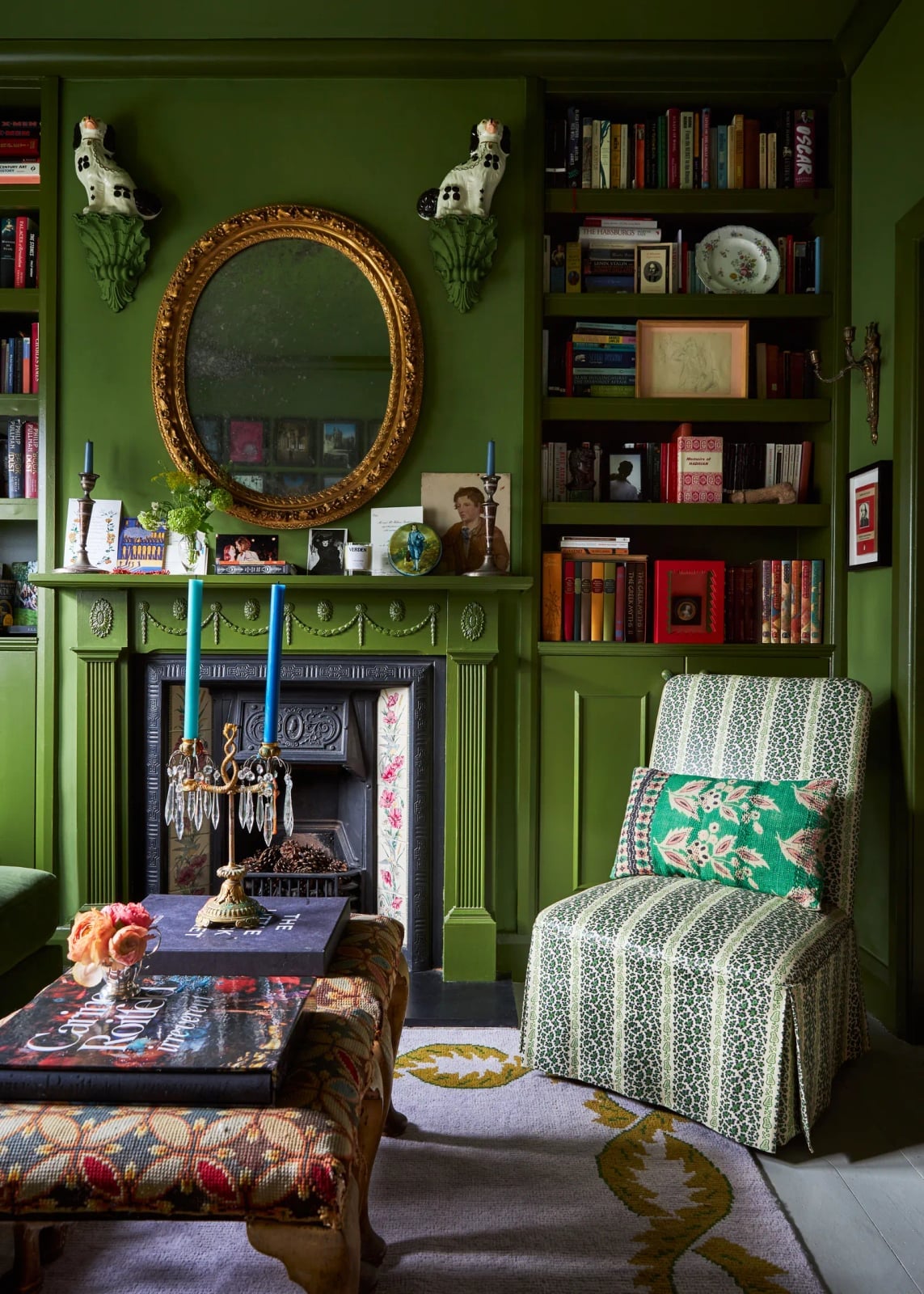
A green-painted fireplace surround is the anchor here. The whole room, walls, trim, and fireplace, shares the same rich green, so the fireplace blends in instead of standing apart. A patterned armchair in white and floral fabric offers a visual break, and an oval mirror above the fireplace reflects the natural daylight. Bookshelves on either side add vertical interest. When you paint everything the same color, use a mix of sheens. Flat on the walls, satin on the trim and fireplace. That subtle difference in light reflection prevents the room from looking like one flat box.
Teal Walls and Botanical Armchair in an Eclectic Nook
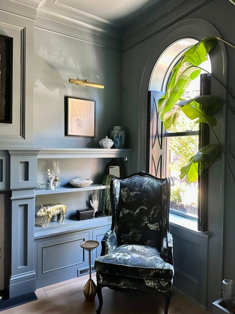
Teal walls wrap around built-in shelving in a compact corner, making the space feel like its own room. A velvet wingback chair in a botanical pattern, dark blue and green on gold, becomes the focal point. A plant on the shelving adds a natural shape against the painted wall. One styling variation to try: choose one patterned piece and let the wall color support it. The teal is deep enough to feel rich, but it stays in the background next to the chair. A wall sconce above the chair keeps the corner lit without taking up floor space.
Glamorous Deep Rose Bedroom with Monochromatic Walls and Doors
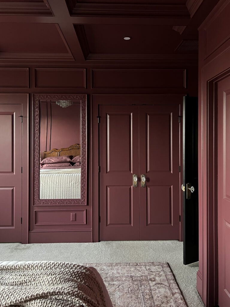
Deep rose paint covers the walls and the doors in this bedroom, creating a monochromatic shell that makes the room feel larger than it is. A cream rug and bed linens break up the color without competing, and a gold-framed mirror reflects light from a chandelier. One scale and proportion trick: when you paint the doors the same color as the walls, the eye treats them as part of the surface rather than interruptions. That makes the room feel continuous, which helps if the ceiling is low or the floor plan is awkward.
Vibrant Blue Bathroom with Gold Vanity Accents
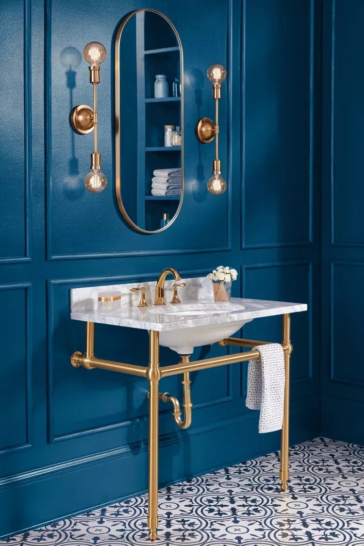
A compact bathroom benefits from a single strong color across walls and trim, which makes the room feel larger rather than boxed in. The vibrant blue walls here act as a backdrop for a gold vanity with a marble sink, and the wall sconces cast light onto the marble surface. The palette is blue, gold, and white, with the vanity and sink as the hero element. The brass finish on the vanity and sconces breaks the blue saturation without adding a second wall color, which keeps the drenching effect intact. This is a style mode room: the glam feel comes from the metal and stone against the bold wall color, and the ratio of blue to gold is roughly four to one, enough to ground the metallic accents. What breaks the scheme is the white marble, which provides a visual pause.
Deep Green Paneled Walls for a Modern Bedroom Immersion
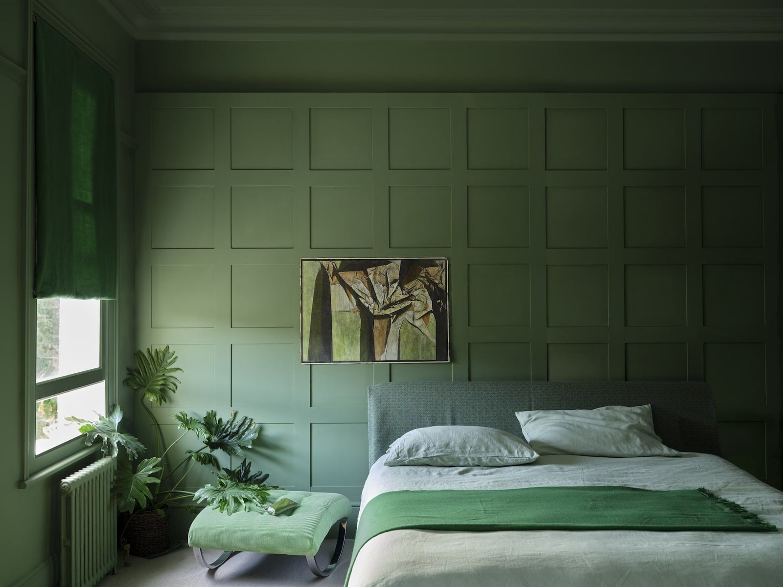
Paneled walls often stay white or neutral, but this bedroom sets the deep green directly on the panels for a modern take on traditional material. The full wall treatment covers the room in a single hue, with the bed centered between the panels and a small ottoman and plant adding softness. The painted wood panels define the space, and the fabric and linen on the bed provide contrast in texture.
Window light hits the panel grooves, creating shadow lines that keep the flat color from feeling heavy. The room is roomy enough to carry the deep green without closing in, and the ambient light bounces off the linen to soften the overall effect. This room is defined by the painted wood, with all wall surface covered in the paneling. The plant’s green leaves break the scheme, appearing as a different hue against the wall.
Dusty Rose Door and Wainscoting in a Traditional Bedroom
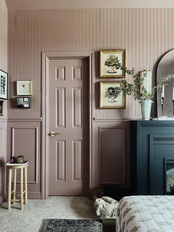
The door and wainscoting are painted in the same dusty rose, while the wall above stays a lighter shade, which makes the trim the focal point. The navy and gold accents in the artwork and fireplace anchor the pink tones. The compact bedroom uses natural light to soften the dusty rose, and the ambient room light picks up the gold frame. The door is the hero element here, and the wainscoting extends the color horizontally, making the room feel wider. The traditional look is defined by the painted wood and metal hardware, and the dusty rose to navy ratio is roughly two to one. The white wall above the wainscoting stops the drenching at the chair rail.
Vibrant Peach Walls and Fireplace in a Maximalist Living Room
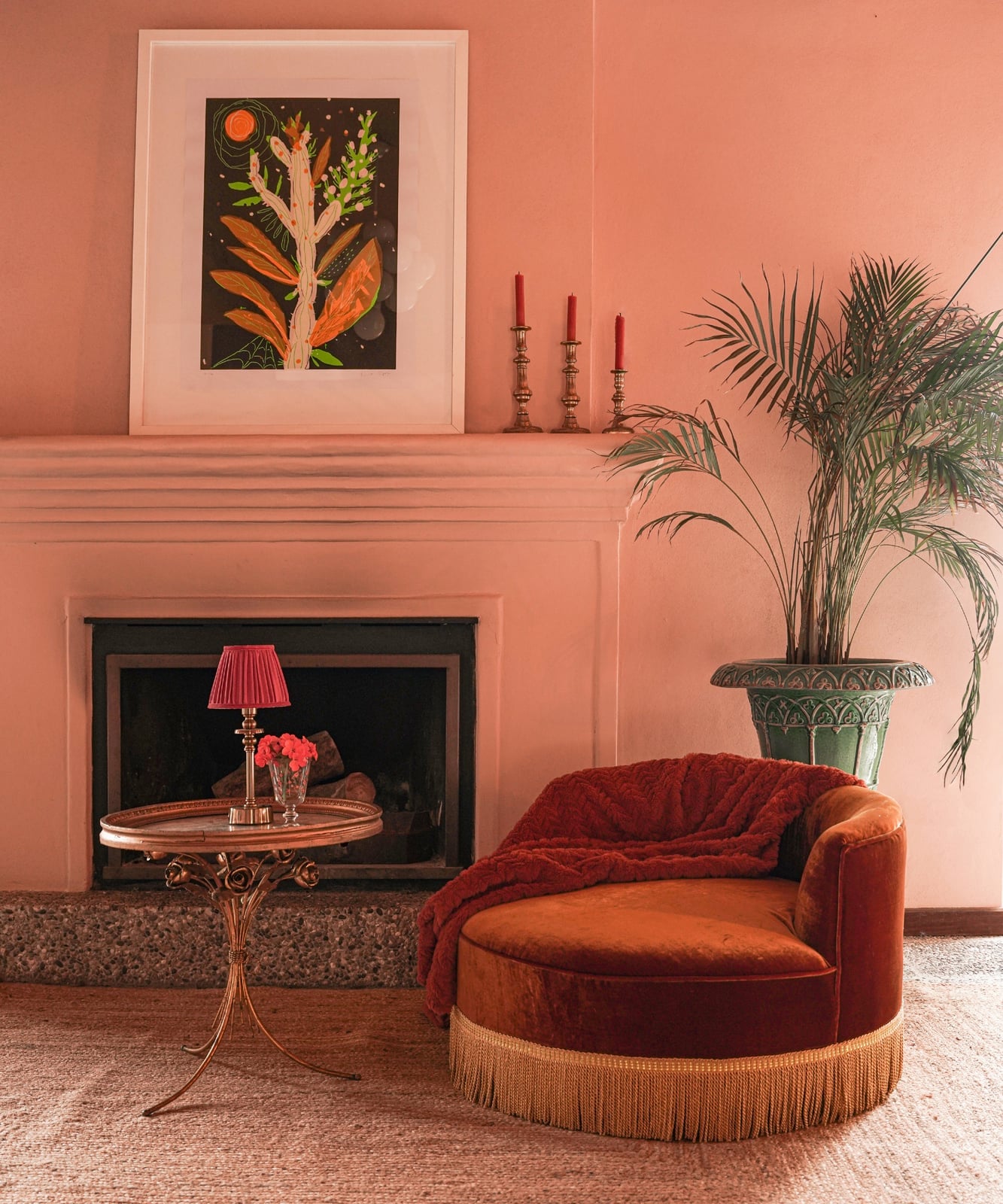
This is a compact vignette that uses peach walls and fireplace surround to create a warm, enclosed seating area. The curved armchair in a similar tone, the terracotta side table, and the large potted plant all sit within the peach envelope, while the gold and green accents add contrast. The fireplace and armchair are the hero elements, and the table lamp provides focused light that highlights the velvet texture of the chair. The maximalist look is defined by the layering of warm hues, with peach to terracotta at about a three to one ratio. The green plant and the gold lamp base introduce a cool note into the warm palette. The ambient interior light spreads evenly across the plaster and stone surfaces, keeping the space bright.
Deep Blue Modern Farmhouse Laundry Room Design
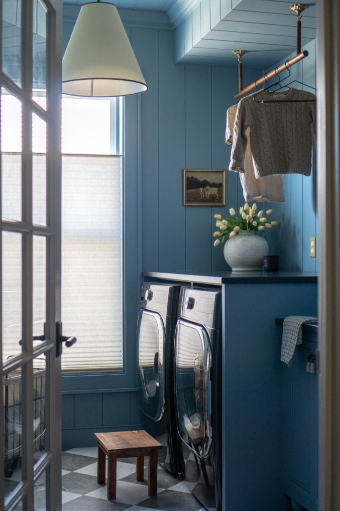
A laundry room with deep blue walls and cabinetry makes the task space feel deliberate. The washer and dryer sit within the cabinetry, and the white counter and open shelving break the blue at eye level, which prevents the room from feeling closed in. The wood tones on the stool and the metal of the pendant light add warmth to the cool blue palette.
The window balances the deep color, and the overhead pendant provides task light for folding. The room is roomy enough to carry the dark hue, and the white tile floor adds a classic farmhouse element. The defining look is modern farmhouse, and the deep blue to white ratio is about two to one. The wood stool and the metal light fixture introduce a natural finish into the painted room.
Saturated Navy Blue Hallway with Open Plan Feel
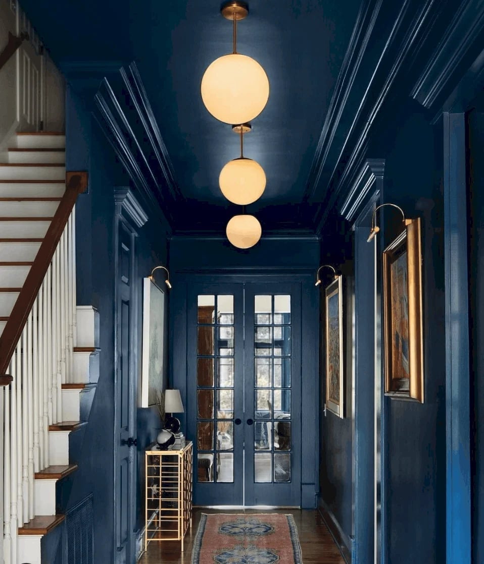
This hallway takes the saturated navy blue right onto the ceiling, which is the move that makes an open plan feel grounded rather than vast. The deep navy paint wraps the walls, ceiling, stair risers, and even the double doors, creating a single continuous volume. A console table and a pair of wall sconces add function without breaking the color field. The pendant light and natural light from the doors keep the space from going flat. For the style mode, the defining ratio is about 90 percent navy to 10 percent warm metal and glass, and the practical principle is that a fully saturated ceiling actually makes a hallway feel taller by removing the visual line where wall meets ceiling.
Striking Blue Cabinetry and Checkered Floor in a Utility Room
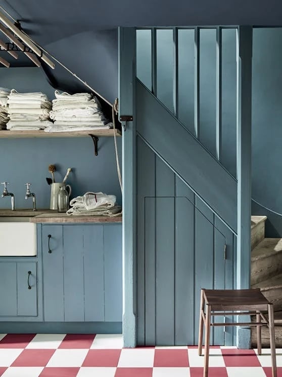
In a compact utility room, one bold color can define the space while the floor introduces contrast. Here, the blue cabinetry runs floor to ceiling, covering the walls in a single saturated hue. The red and white checkered tile floor breaks the blue field with pattern and warmth, while the white sink and open shelving keep the room balanced. The window brings in natural light to balance the deep pigment. For the palette mode, the blue and red sit opposite on the color wheel, so the ratio leans heavily on the blue at about 70 percent, with the red and white tile acting as the accent that keeps the room grounded.
Light Blue Hallway Leading to a Stained Glass Door
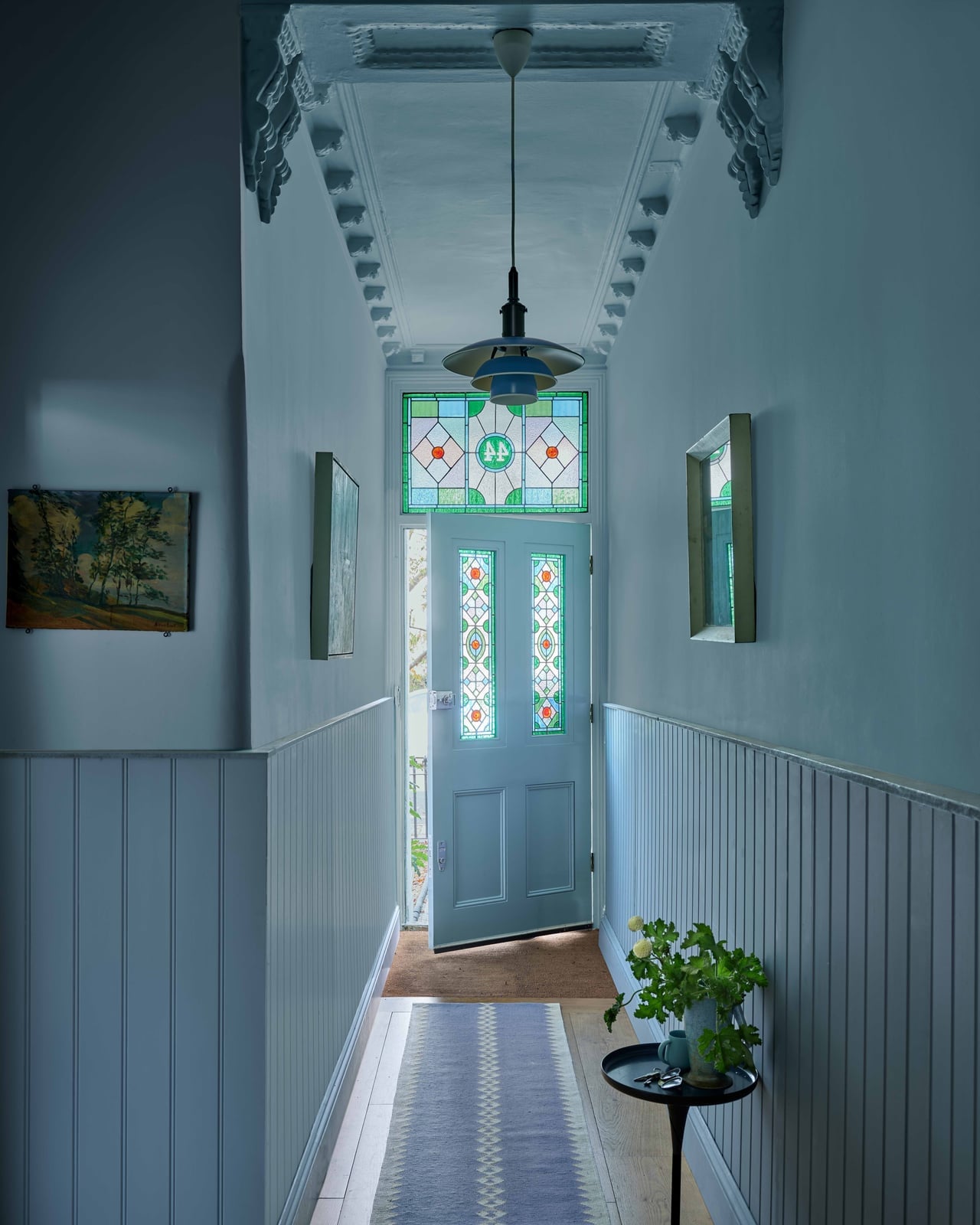
A light blue color drench creates an atmospheric wash, which makes it a close alternative to the deep navy approach. Here, the pale blue covers the walls, wainscoting, and ceiling, fading toward the stained glass door at the end of the narrow hallway. The stained glass introduces green, white, and warm amber tones that break the monochrome without competing with it. The pendant light hangs centered in the space, while the light from the door shifts the blue throughout the day.
For the hero element mode, the stained glass door is the focal point, and the light blue acts as a neutral backdrop that lets the glass pattern lead. The ratio is roughly 60 percent light blue to 40 percent stained glass and wood tones. A lighter color drench works best in narrow spaces because it expands the visual width instead of closing it in.
High-Gloss Teal Fireplace as Bold Traditional Focal Point
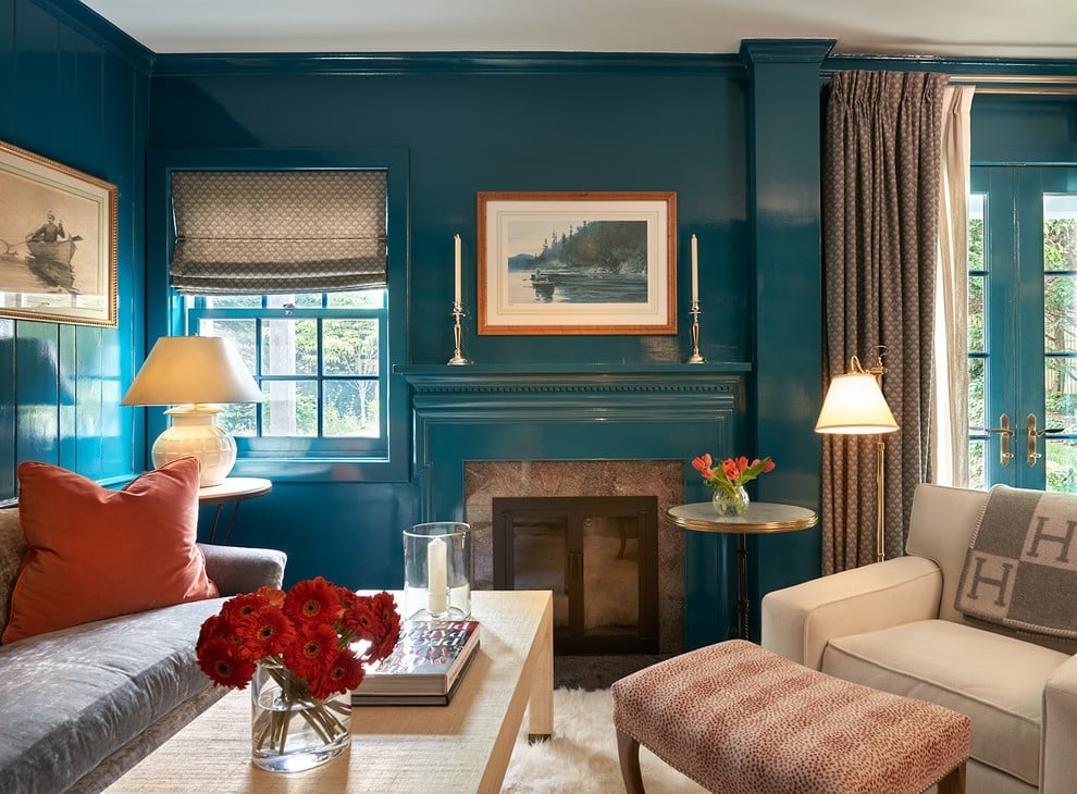
The high-gloss teal fireplace surround catches the light in a way that matte paint cannot, turning the traditional marble mantel into a reflective focal point. The deep teal extends from the fireplace face to the surround, while the orange and red tones in the sofa and armchair sit opposite on the color wheel, creating a deliberate warm contrast. The curtains and lamps soften the room without pulling focus. For the style mode, the teal is the defining color at about 50 percent of the visual weight, with the warm reds and oranges at 30 percent and the marble and neutral floor at 20 percent. The break comes from the glossy finish itself: it requires a smooth prep surface, so this is a project for solid wood or MDF, not textured walls.
Dusty Rose Paneled Wardrobe and Dresser in a Bedroom Corner
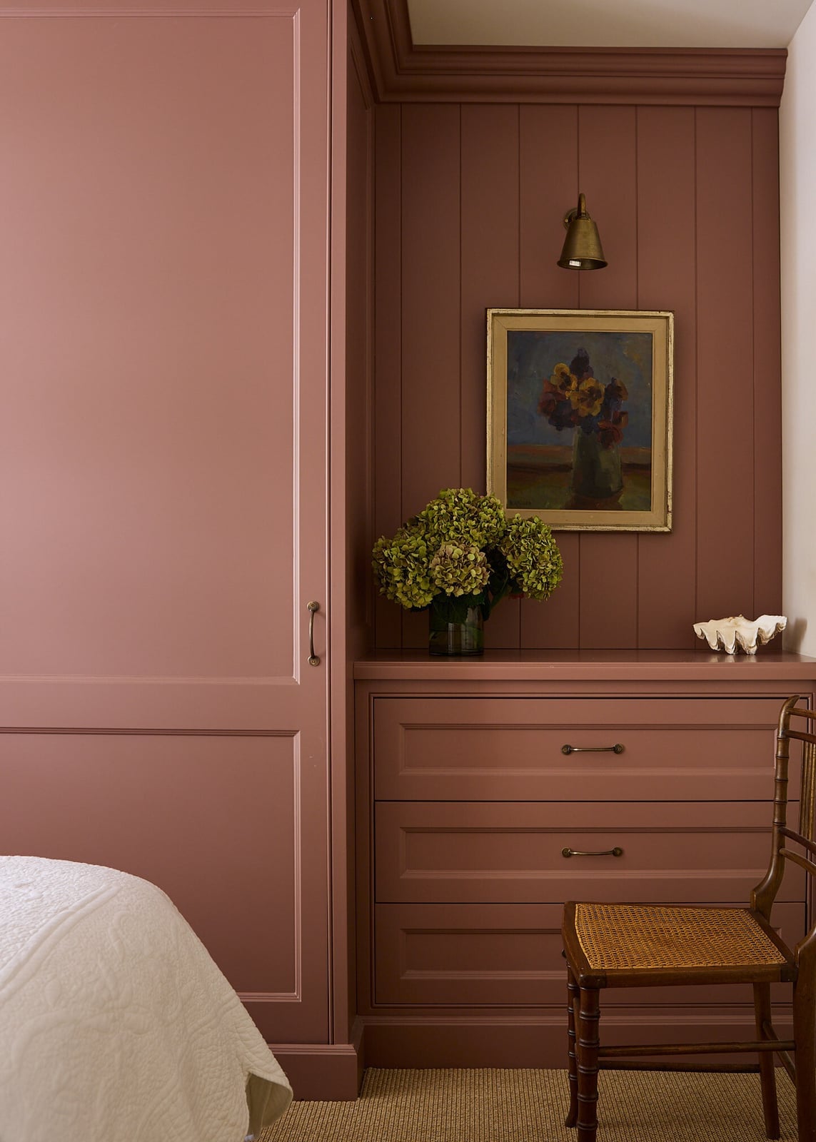
This bedroom corner uses dusty rose as a unified field across the paneled wardrobe, wall paneling, and dresser, creating a monochromatic vignette. The cream bed linens and brown rattan chair add texture without breaking the color story. The wall sconce provides warm ambient light that keeps the dusty rose from reading as flat. For the styling variation mode, the dusty rose covers about 70 percent of the visible surfaces, with the remaining 30 percent split between cream, brown, and the natural wood floor. A monochromatic corner works best when the furniture matches the wall color, because it makes the pieces recede into the architecture instead of competing with it.
Modern Kitchen with Dark Ribbed Cabinets and Marble
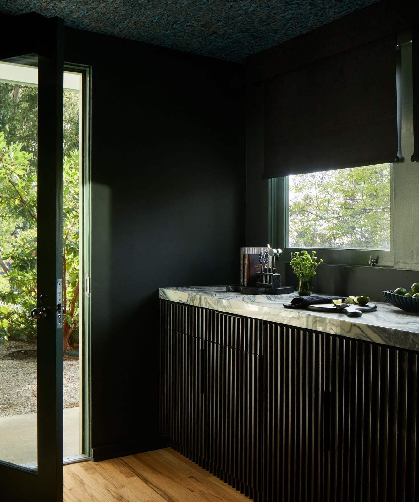
In a kitchen with dramatic cabinetry, let the cabinets lead and keep every other surface quiet. In this modern corner, dark ribbed cabinets run along the wall and meet a marble counter that catches the natural light from an open doorway. The ribs add vertical texture to the black finish, so the cabinets feel sculptural. A couple of green plants break up the dark mass, and the white marble keeps the room from turning heavy.
The palette stays in black, white, and green, which gives the space a crisp, tailored mood. Metal hardware on the cabinets and the wooden accents in the room balance the cool marble. The countertops and backsplash stay pale, because the dark cabinetry does the talking. The roomy corner view shows how an open doorway lets the kitchen breathe, so the dark finish never feels cramped.
Sage Green Walls, Ceiling, and Wardrobe for Serene Bedroom
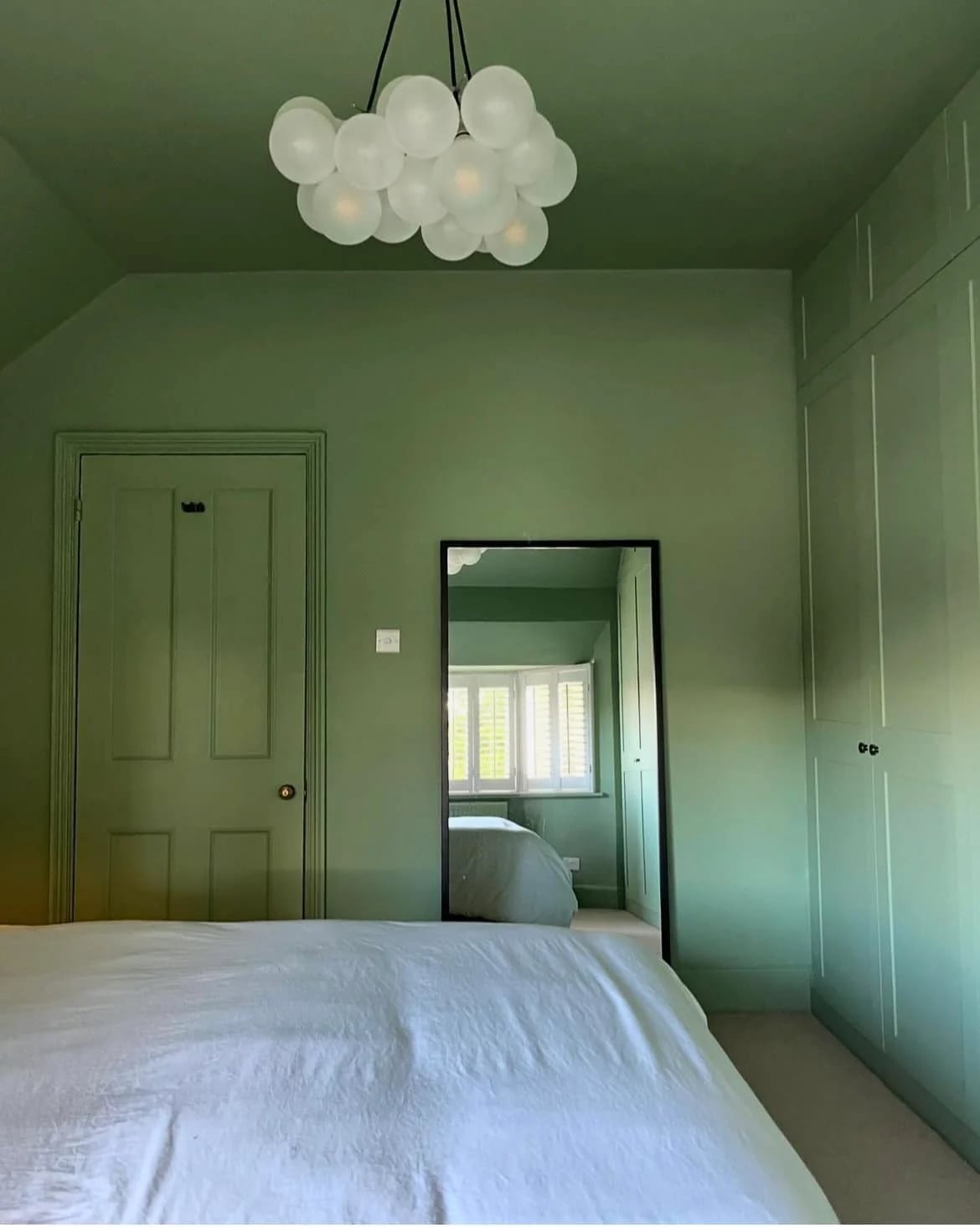
The sage green walls and ceiling wrap the whole bedroom in one calm color, and the painted wardrobe and door match the same tone. A modern pendant light hangs from the center, while natural light from a window softens the green. The bed faces the door, and the wardrobe sits against the wall, so the layout feels open and uncluttered. This full color drenching works because the shade stays muted, letting the wood floor and bed linens add warmth. For a similar effect, paint the trim and built-ins the same color as the walls to make the room feel larger.
Sage Green Home Office with Wooden Desk and Striped Blind
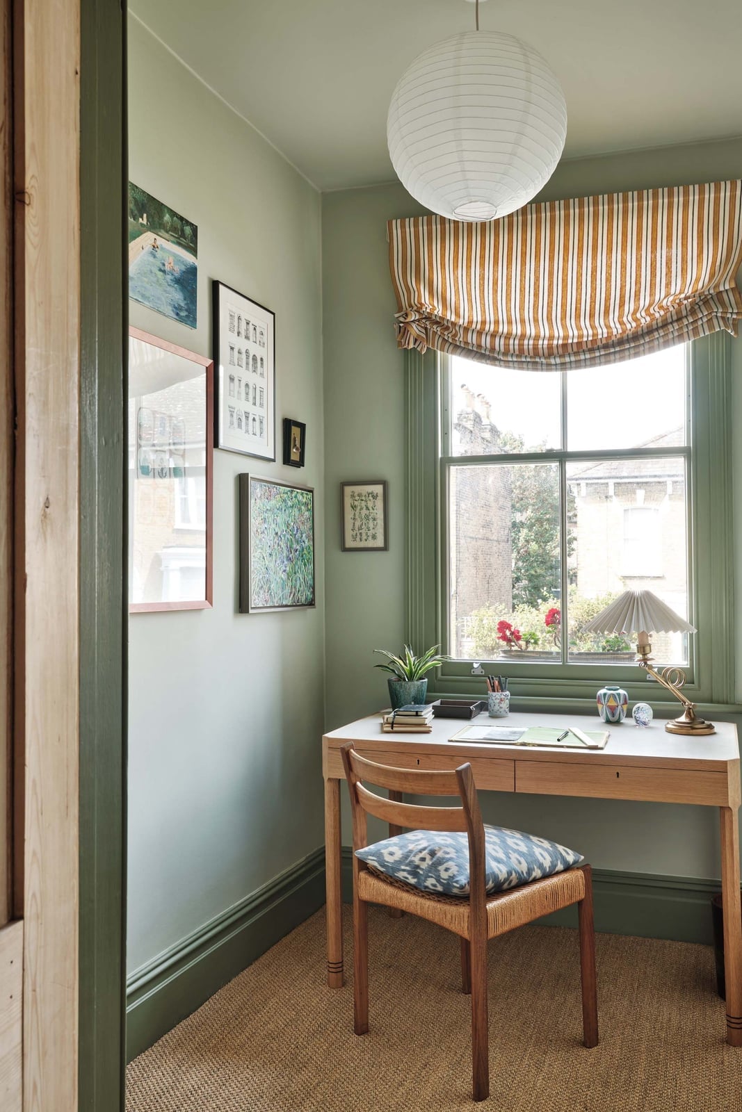
A practical rule for a small home office is to pick one wall color and let the furniture bring in contrast. Here, the sage green walls and trim frame a wooden desk that faces the window, so the natural light lands right on the work surface. A desk lamp adds task lighting for darker hours. The chair has a patterned cushion in a warm orange tone, which breaks up the green without fighting it. The roman blind in a stripe adds a Scandi touch, and the beige and white accents keep the room from feeling too green. This setup keeps the compact corner airy while still giving the eye a clear focal point.
Monochromatic Deep Teal Walls and Fireplace in a Trendy Living Room
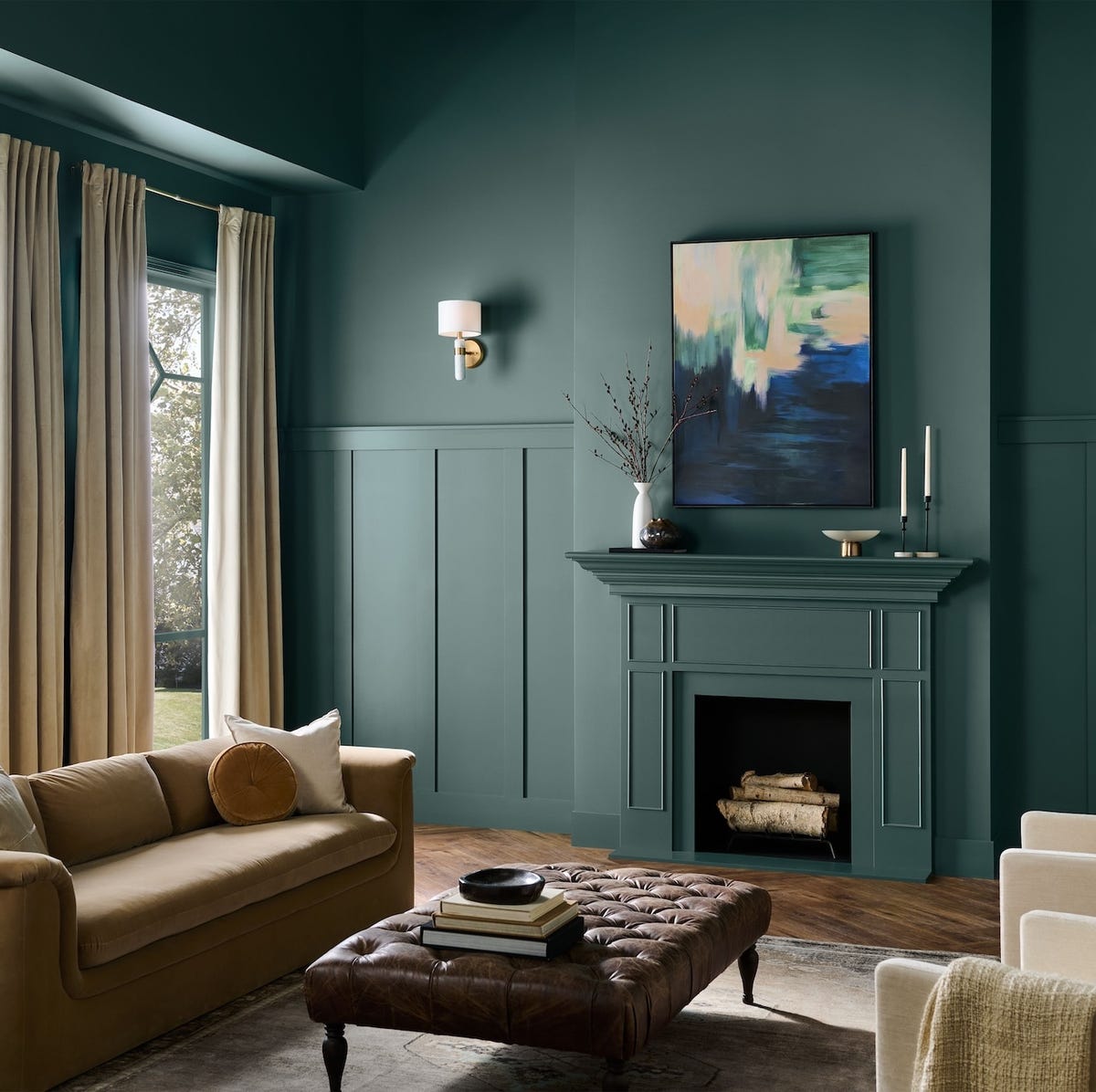
Compared to a white room, a monochromatic deep teal living room feels more intimate and enveloping. The walls and fireplace are painted the same shade, which makes the fireplace appear as a built-in part of the room. A sofa faces the fireplace, with an ottoman in front, and curtains in a similar tone hang by the window. A wall sconce adds warmth without breaking the color.
The beige and brown in the sofa, ottoman, and leather accents give the room a layered, lived-in feel. This trendy color drenching works best when you keep the furniture in the same family of tones, so the eye moves smoothly around the space. The roomy layout lets the deep teal wrap every surface, creating a calm, cohesive backdrop for everyday life.
Green Paneled Walls in a Cozy Traditional Living Room
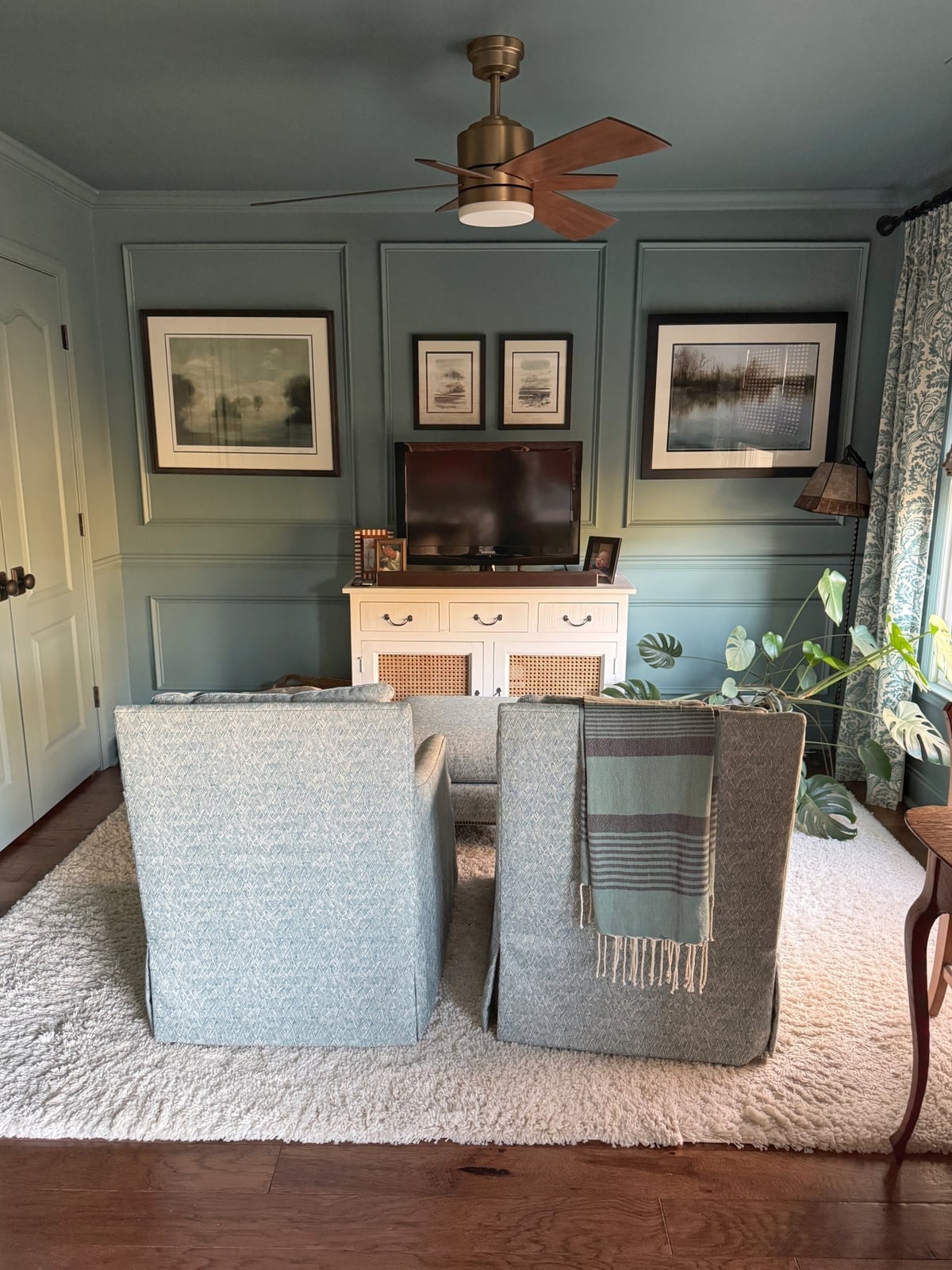
The green paneled walls set a traditional tone, and the white trim around the panels keeps the color from feeling heavy. Slipcovered chairs face a rattan cabinet, which adds storage without blocking the natural light from the window. A ceiling fan keeps the air moving in the compact room. The wood tones in the cabinet and the floor warm up the green, while the rattan texture brings a casual note. This paneling works well when you need a defined look but want the room to stay relaxed.
Final Thoughts
Color drenching works because it simplifies a room’s palette while amplifying its personality. The trick is choosing a shade you can live with on every wall and ceiling. Stick to matte finishes for walls to avoid glare, and use gloss on trim for subtle contrast. Test your color at different times of day, light changes the saturation. And if you rent, check with your landlord before painting ceilings or doors. A single color can transform a space more than you’d think.